Showing posts with label United States. Show all posts

Monday, June 18, 2018

Map of the states of North & South Carolina. (with) Plan of Charleston. London, published June 1 by I.T. Hinton & Simpkin & Marshall. Engraved & printed by Fenner Sears & Co. (1832)

On a trip to Asheville, North Carolina I was keen to come back with a map as a souvenier, but couldn't find anywhere in town that sold them. My wife and I therefore embarked on a bit of a goose (map) chase to out of the way antique shops on back roads 'till we came across a barn full of antiques. None of it was really interesting to me, and some of it fell into the category of "who would buy that"? Somehow, however, tucked in a corner, on a wall on the barn I found this fascinating specimen which I have since learned is properly titled: "Map of the states of North & South Carolina. (with) Plan of Charleston. London, published June 1 by I.T. Hinton & Simpkin & Marshall. Engraved & printed by Fenner Sears & Co. (1832)"


As always, a much higher quality, zoomable image of the map is available through Rumsey, but the one on that site is coloured, while mine is not.

The map comes from an atlas, as is clear from looking at it on Rumsey. The copy I have shows some interesting signs of that. There are a few small tears in it, where the binding must have been. It was framed when I bought it, so I have not been able to examine what's on its reverse, but close inspection shows that it must have been in a closed atlas for a long time before anyone ever opened it up. Each side of the page is slightly stained with an image of the opposite side. Look at these examples:


You may need to look quite closely, but there is definitely some staining to the paper from having likely been closed in a book, and possibly under pressure, for an extended period.

There are a few other elements of this map I find interesting. The Outer Banks, today a highly popular tourist destination, is very low on detail in this map. With an important exception, Roanoke Island. 


There's not much on or around Roanoke Island at this time to merit a mention, especially when other smaller islands nearby have nothing on them. Roanoke, however, is the site of the lost colony, and would likely have been of interest to Americans and British (the map was published in London) alike. The Island still presents mysteries to historians and holds an important place in American, British and North American history, so its inclusion is logical.

Another place that is in the Outer Banks and which also plays an important historical role but which is absent from this map, is Kitty Hawk, site of the first powered flight in 1903. Even today it's not a big town, and at the time, may simply not have existed at all, but it's impossible to imagine any map showing the Outer Banks after 1903 not at least indicating it's location.

I also find the inset plan of Charleston to be quite curious.


Obviously, Charleston of today is much larger, but this inset is interesting because it lacks so much detail. Two rivers are named, but there are no street names, so sites of interest, no names for the inlets or canals, the harbour, nothing. It's not even clear if the city ends at the northernmost east-west street, or if it just fades out of sight because of the size of the inset. The inset gives the view a sense of the size of the city, but otherwise, tells very little about it. I'm not sure why that is. Similarly missing is Fort Sumter, whose role in the history of the U.S. Civil War would likely guarantee its inclusion on any maps after 1860. In doing some research on this map I have found that this plan of Charleston predates any to appear in any American published atlas, which makes it somewhat unique.

Another point: I tend to research my maps as much as I can to get a sense of whether there are others out there and how much they sell for. I have only found one vendor of this map. It gives me the sense that what I have is quite scarce and perhaps a real treasure. It makes it that much more interesting to own, and I'm honored to be able to have it and care for it.

Monday, May 14, 2018

Mitchell's 1867 Plan of Boston

On a trip to Boston I stopped in at Ward Maps (as always, no affiliation) which is a nice, neat, well organized map shop selling antiques, and I think also reproductions. I couldn't decide between two maps: one of, or perhaps the, first Boston public transit map ever produced or the one I actually bought. In the end, I think my choice was made purely based on aesthetics. The map I bought was simply more attractive. It's an 1867 Mitchell titled "Plan of Boston" with a beautifully coloured inset of the Boston region.


There are elements of this map that seem, to me at least, to scream that it's a Mitchell. For one, the border of the map, and something about the style, that I can't quite put my finger on, all seem to say that it's a Mitchell.

It's also a map that shows a Boston that's profoundly changed since the map was made. According to the general history of the city on Wikipedia, the mid 19th century, when this map was made, was an important time for the city. Boston was receiving many new immigrants and was growing. Neighborhoods were becoming little ethnic enclaves and the city needed more space. 

Compare the map above, to the boston of today:


 A number of differences stand out, including the absence of a "South Boston Bay", and some more subtle changes that are hard to see without more of a close-up. Many of these land reclamation projects were due to the growth of the city.

One, in particular is the addition of streets north of beacon street, which had been right up against the Charles River. After a major fire in the 1870s, so after this map was made, the debris from burned buildings was pushed into the marshy areas of the river to create new land for the city and creating what is today, Storrow Drive.


I also find the image above charming because of its depiction of the lovley Boston Common. In particular, I find that there's something somehow funny about the drawing of the pond with the note that it is indeed a pond on the common.


Another great aspect of this map is the inset, which also shows changes in the region over time.


This inset of the region around Boston shows how some areas had recently been incorporated into the town, such as South Boston and East Boston. Other areas, which are now part of the city, such as Dorchester, are shown as seperate areas from the city.

All told, this is an attractive map, with some interesting historic details of a great city. I'm pleased with my choice in this case!


Thursday, May 10, 2018

Add it to the Wishlist: 1766 Map Showing Russian Discoveries of the West Coast of North America

At the time of my writing this post, I am planning a work-trip to Portland, Oregon. Naturally this got me thinking about maps of the region and I decided to see if I could find another west-coast of North America map to add to my virtual wishlist. I got some great ideas from a tweet from Vetus Carta (@rare_maps), an online, Ottawa-based, antique map dealer (as always, no affiliation).

Anyway, the tweet led me to the Vetus Carta site where this gorgeous 1766 of eastern Russia and western North America is on sale.

Nouvelle Carte Des Decouvertes Faites par Des Vaisseaux Russiens Aux Cotes Inconnues De L'Amerique Septentrionale Avec Les Pais Adiacents ('New Map of Discoveries Made by Russian Vessels on the Unknown Coasts of North America with Adjacent Countries') published in Amsterdam in 1758 by Gerhard Friedrich Müller.

The image above is from Barry Lawrence Ruderman, where the image is available to zoom into in high-quality (and where it's on sale as well). Vetus Carta, though, provides an impressively detailed overview of the map, which, by the way, is properly titled Nouvelle Carte Des Decouvertes Faites par Des Vaisseaux Russiens Aux Cotes Inconnues De L'Amerique Septentrionale Avec Les Pais Adiacents ('New Map of Discoveries Made by Russian Vessels on the Unknown Coasts of North America with Adjacent Countries') published in Amsterdam in 1758 by Gerhard Friedrich Müller.

Anyone interested in the finer details of the map's history should visit the Vetus Carta site. From my perspective, one of the most important points of this history is that this map not only went on to inspire many other, contemporary map-makers, but that it helped to debunk some of the popular, though incorrect thinking about the region at the time. It was a groundbreaking map in that it was more scientific than other maps of the region that were already available.

Vetus Carta goes on to note some of the inaccuracies in this map, which, again, was more accurate than most of what was already out there: first, it shows a “River of the West” at the “entrance discovered by Martin d’Aguilar in 1609.” This river, which supposedly ran from Hudson's Bay to the Pacific, is a figment of someones imagination. There is also a supposed entrance into the continent that the map-maker says was discovered by Juan de Fuca in 1576, this is incorrect as well. There's also the incorrect shape of Alaska.

From my perspective, as a layperson who really enjoys these antique maps, there are some different things that have caused me to add it to my wishlist other than its historic significance.

Nouvelle Carte Des Decouvertes Faites par Des Vaisseaux Russiens Aux Cotes Inconnues De L'Amerique Septentrionale Avec Les Pais Adiacents ('New Map of Discoveries Made by Russian Vessels on the Unknown Coasts of North America with Adjacent Countries') published in Amsterdam in 1758 by Gerhard Friedrich Müller.

I love the blanks on this map. Its amazing to think of a time when people looked at vast spaces of the world and said "we have no idea what's there". Of course, someone knew what was there, but the Russians who provided the information for this map, did not, and so we're left with an enormously large void whose contents could have been anything. For similar reasons, I love the inaccuracies in northern Quebec and around Hudson's Bay.

Nouvelle Carte Des Decouvertes Faites par Des Vaisseaux Russiens Aux Cotes Inconnues De L'Amerique Septentrionale Avec Les Pais Adiacents ('New Map of Discoveries Made by Russian Vessels on the Unknown Coasts of North America with Adjacent Countries') published in Amsterdam in 1758 by Gerhard Friedrich Müller.

I also love the contrast in this map between the detailed Russian territory which appears to be a place that was known to European map makers on the one hand, and the supposed emptiness of North America on the other. The places seem so tantalizingly close to one another, and yet, the people living in the east, who knew their own lands, knew nothing of the west or the people in it.

Nouvelle Carte Des Decouvertes Faites par Des Vaisseaux Russiens Aux Cotes Inconnues De L'Amerique Septentrionale Avec Les Pais Adiacents ('New Map of Discoveries Made by Russian Vessels on the Unknown Coasts of North America with Adjacent Countries') published in Amsterdam in 1758 by Gerhard Friedrich Müller.

Some of the annotations on this map are also wonderful. The indications of the voyages of Russian explorers are fascinating historic details, but comments like the one above are just great. It reads: 'Land about which we have claims from residents of Kamchatka, some of whom say that it can be seen from Bering Island'. This is just more reinforcement of how close the land of the map-maker is to the land about which he knows nothing, and how tempting such a place may be for an explorer.

This is really a great map, and one that I'd love to have if I could ever afford such wonderful things. Until then, I can enjoy it as part of my virtual wish-list collection.

Thursday, March 15, 2018

Add it to the Wishlist: A Snapshot of North American History from 1762

I notice, as I build up my virtual wish-list, that many of the maps I'm choosing aren't from places I've been, but where I'm from, specifically Montreal, Quebec or Canada. That's why this 1762 map by Thomas Jefferys titled: "A Map of Canada and the North Part of Louisiana with the Adjacent Countrys [sic]" easily makes the list. The map is being offered for sale by Neatline Rare Maps of San Francisco for more money than I could ever hope to be able to afford to spend on a map!

Here's a picture of it:

This 1762 map by Thomas Jefferys titled: "A Map of Canada and the North Part of Louisiana with the Adjacent Countrys [sic] shows eastern Canada including Ontario, Quebec, New Brunswick, Nova Scotia and PEI as well as the great lakes. It has blanks across most of the prairies to the west coast, but does show lake Winnipeg.


I highly recommend visiting the Neatline site to get a much closer zoomable look at this map. Neatline has also provided a well researched background of the map and what it shows.

There are a couple of interesting points Neatline makes that are worth highlighting:

An image of the west coast showing a mythological Chinese voyage to North AmericaThe reference to First Nations groups is interesting, not only in their identification on the map, but also in that part of this map seems to have been made possible by reports from a first nations explorer named Ochagach who himself produced a map useful for western exploration by the French. It's a significant detail that tends to be lost in more general pictures of first nations that we learn about in school.

The other is the map's "mythological" elements. To me, the coolest is the legend of Fou-Sang, shown on the west coast of the map. It's a place supposedly visited by the Chinese as far back as 219 BC. Wikipedia writes a bit more about it. It's a remarkable story, but may have been a popular myth at the time this map was made.

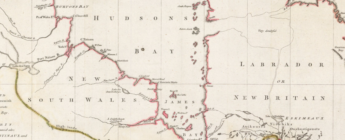
Finally, a few points that Neatline did not mention that are interesting to me, and possibly to most Canadians. For one, there was a New Britain and a New South Wales in Canada. These are not place names that are used today, and are now occupied by other provinces or territories in Canada. I had to do some searching on Wikipedia to learn a bit about their history. Especially interesting was that these place names were in use basically at the same time that Canada was being taken by force by the British from the French. It seems, therefore, that there was some, albeit sparse, English presence north of New France as well as to the south of it.

An image of New South Wales in Canada


I also love the annotation to the east of Hudson's Bay that a supposed lake, which connect to the north Atlantic through Labrador and Northern Quebec was "very doubtful". I wonder why they even thought to put that there. What prompted the map-maker to think this possibly existed?

As a final point, this map gives a great sense of a moment in time in western expansion by the European powers. The eastern portions of the map are detailed, show political boundaries, towns and geological features and looks accurate to the modern viewer. As you look west, however, detail fades, gradually, until the vast blank expanse of the prairies and west coast. It goes to show, once more, that maps like this are historic snapshots.

A detailed portion of the east coast of Canada on the 1762 map


Monday, March 12, 2018

Johnson's Upper and Lower Canada from 1863

There's a lot to love in these two maps of Upper and Lower Canada, parts of modern Ontario and Quebec, respectively as well as New Brunswick and bits of the United States. The maps come from Johnson's Atlas.


This map is an attractive one. It has a nice border, nice coloring (which I assume was done later and is probably not original), and that wonderful quality of spilling outside its borders. The map I have was taken from an atlas, and you can see the different page numbers and how the maps appeared. It's curious to have shown them this way, since the maps present contiguous regions, and it's not obvious why they wouldn't have been oriented differently to show one map that folds in half. This question becomes even more interesting when you consider that the two maps have only one legend, suggesting that they are meant to be viewed together.


The detail on the map is wonderful too. The counties/townships are noted in great detail, even though these sorts of geographic divisions are rarely used in any significant way in Canada these days. The seller of the map noted in the margin that this map is from 1863, which is before Canadian confederation. It is also just before Ottawa became the capital of Canada (1866) and at a time when Quebec City was the capital. Quebec is noted with a red dot on the map.

   The map shows a number of important rail lines, many canals and has three great insets, one of Montreal, one of the important Welland Canal and another of Wolf Island on the border of the United States. Wolf Island is noted as the start of the St. Lawrence river, and the inset shows a charming collection of buildings on the site of the town of Kingston, Upper Canada, a very important town at the time.

The Welland Canal, which was an important shipping route at the time that helped bypass Niagara Falls also gets its own inset, as does Montreal. Montreal's inset does not show much detail about the city, but identifies important towns on the island, shows the, now scenic, Lachine Canal, the historic Grand Trunk Railway, and has good detail about the surrounding region. At the bottom of the image of the Montreal inset, two different meridians are shown, one from Greenwich, and another from Washington.

 It's also interesting that while today Toronto is not only the largest city in Canada, but one of the top 5 in North America, on this map, it does not merit its own inset, though features which are today much less significant do draw that kind of attention from the map-makers.


Monday, March 5, 2018

Pittsburgh in 1795 and 1876 and Forts!

My wife and I took a great road-trip from Washington D.C. to Pittsburgh where I stopped in at Shaw Galleries for some map shopping. I ended up buying what I think is the only reproduction in my collection, and yet, it's older than some of the originals I have.


This map shows a plan of Pittsburgh, and its fort from 1795. This, map, however, is almost 100 years more recent than the time it depicts. From what I can find, this map was published by Samuel W. Durant in the 1876 "History of Allegheny Co. Pennsylvania". It is a reproduction of the original map, which I'm pretty sure is this one, held in the University of Pittsburgh library's digital collection:


 The original is quite handsome, but the reproduction has a few interesting features. Forts are always fascinating, and this map provides considerable detail on the Fort at Pittsburgh. Today not much is left of the original fortification built by the British (on the site of an earlier French fort.)


In showing this fort the map almost reveals a kind of self-awareness, that is to say that the map-maker knew that his was a new vision of the city, but that there was a long history before him. The inset shows not only where the previous French fort had been, but also the site of a much smaller frontier fort (itself shown in another inset), but it also shows where roads have since been built passing through and over the site of an important historic feature that no longer exists.

The map also shows a number of Islands in the rivers around the city, including this one with the (in my opinion) charming notation "buckwheat grown in 1795". I note that this remark also seems to appear on the original 1795 map.


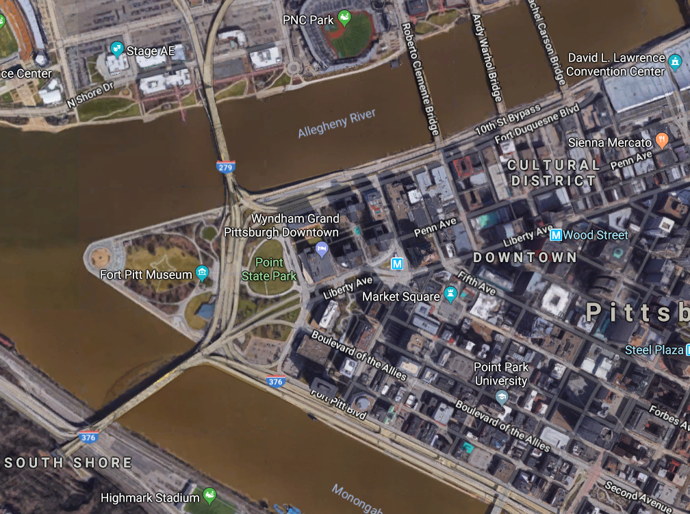
I notice, however, that this map shows a number of islands that seem to no longer exist. This well researched piece explains what happened to the islands, which was in most cases erosion. It makes the map even more wonderful as it shows not only man-made change and development over time but also natural changes to the geographic features of the area. Sure enough, a glance at a modern map of the same area shows no islands in the river at all; just bridges, lots and lots of bridges.


Thursday, March 1, 2018

Add it to the Wishlist: 1780 Harrison Antique Map of The St Lawrence River, Canada

I've never seen a map quite like this before.


This is a map of the St. Lawrence river, produced in 1780, and drawn from an earlier map, by a different cartographer, i.e. not Harrison, who published this one. It's featured, and on sale, here.

There's something starkly beautiful about this map. The whole length of the river, diagonally cutting across the map, the lack of any features other than those directly along the water, the blankness of the remainder of the map. It's quite stunning, really.

The map also appeals to me because it features some places I know well, but in a way I've never seen before. They are almost presented without context. Yes there is latitude and longitude, but if you had never heard of the river, or the cities on it, you would have no idea where in the world it was.

Below, I've posted images of some of my favorite features of the map. First though, I did some research on the Duke of Orleans, who commissioned the map off of which this map was based. In 1780, he was a man named Louis Philippe d'Orléans known as le Gros (the Fat). It seems he was a military man, but also, in his later years, a patron of the arts and sciences. Wikipedia lists a number of well known artists and scientists he was close with. Cartographers don't feature in this list, but it would seem reasonable that such a man would have an interest in such things. It would be interesting to hear from someone with more knowledge of this man, or of this map, why the St. Lawrence river, in particular was commissioned.

I also looked up the original map maker. D'anville. It seems that what distinguishes him so much from his contemporaries, is his willingness to leave blank spaces he knew little or less about. This seems to be the case here, but the result is fascinating and magnificent.

Scroll down for some more close-ups of this latest addition to my map wishlist.


The beautiful "Thousand Islands" region in Ontario, on the Canada-U.S. border.

A somewhat distorted view of Montreal. Note St. Anne, on the Island of Montreal. Today a beautiful suburb of the city.

Quebec City, and the mouth of the river. Interesting here is the great detail of smaller tributaries of the river.


Monday, January 29, 2018

Missing Pieces: Mitchell's 1867 Washington, D.C.

For the few years I lived in Washington, D.C., anytime I found myself in Georgetown, I would make a point of trying to stop in at the Old Print Gallery. This was a unique shop. It didn't have that dusty, feeling of some map shops that I love, but instead was clean, sleek and modern feeling. It had row upon row of cases of maps and prints arranged by location, alphabetically, and it had some true


gems, like Bunting's Cloverleaf of the world with Jerusalem at the center.

They also had a beautiful original of the first plans for the city of Washington, D.C. in 1792 by Andrew Ellicott. It was being sold for over US$40,000. Living in Washington, I knew I wanted a map of the city, and the Ellicott was truly the pinnacle of all such maps, but for me, at that price, it may as well have been one million dollars. It was unobtainable.


This image is in far worse condition than the one at the Old Print Gallery


I no longer live in Washington, but I'm disappointed to learn that the shop has closed, and merged with it's sister shop in New York City. It's a shame, because it was such a wonderful place, and I don't know of any other shops in D.C. that were as specialized.

The price of the Ellicott map being what it was, I turned to the internet to find myself a nice map of D.C. to add to my collection and came across a shop in Vancouver, British Columbia called Joyce Williams Gallery who had a great selection and very fair prices.

After speaking and corresponding with their friendly owner, I settled on this beautiful, very fine 1867 Augustus Mitchell Jr. map of Washington, D.C.


There's a lot to love about this map. Its wonderful to look at. It has an attractive floral border that somehow just pops out, without taking away from the map itself.

It also shows a number of details which may have been common for the time, but that today we would recognize as archaic, or simply unusual. For example, the White House is referred to on the map as the "President's House", This is a use that may be considered even more unusual because, as wikipedia notes, the place was called the White House as early as 1811, some 56 years before this map was published.

Another wonderful thing about this map is what it doesn't show. Some of the things tourists flock to D.C. for are absent altogether. For example, the Smithsonian is shown on the map, but only one building, not the many large facilities that make up its network. The Library of Congress is not on the map, as it would not be built for another 30 or so years. There's no reflecting pool either, and one may notice that the National Mall is not at its full length.


Most stark, perhaps, was something that actually did not jump at me right away: There's no tidal basin! The famous cherry blossom ringed body of water, the site of the Jefferson Memorial, just did not exist at the time this map was made. I looked at this map for quite some time before I even noticed that! Indeed, apparently, the idea for the basin didn't even originate until the 1880's, almost 15 years after this map.


The Mitchell map certainly lacks the historic value of the Ellicott, but it's a gorgeous piece, and one that I'm very pleased to have in my collection.


Wednesday, January 3, 2018

Add it to the Wishlist: 1714 Map of North America

I enjoy looking at websites that showcase antiquarian maps and follow accounts of that type, as well as map vendors on Twitter. As a result, I often come across maps that I think would be so wonderful to have in my collection if only I could find or afford them.

Since maps like that make me mappy, I thought my mappy place would be a great place to keep a running wish-list and explain what it is about certain maps that I love.

Today's wishlist map is this beauty of North America from 1714 that I found on mapmania:


There's so much great stuff going on in this map, but first, here's the little I could learn about it, thanks to this always great source, there's a good deal of information available. This map comes from an atlas meant to show recent and new long voyages of European discovery in different parts of the world. The language on the map is French, but the publisher, Pierre Van der Aa, is Dutch and was working in Leiden. Apparently, many of the other maps in the Atlas are similarly beautiful, featuring elaborate cartouches with titles.

I want to point out a few things about this map that I love and that piques my interest in it.

First, I love that it's incomplete. The map is virtually blank to the west of the Mississippi and north of what would today probably be Texas. The Arctic is unexplored, it appears that Greenland is attached to the North American mainland and California may or may not be an island.

Greenland 

Is California connected to anything?

I also love how political boundaries are drawn on this map. European spheres of influence dominate. There is Canada/New France, which extends to the Southern United States and as far west as the Mississippi. Pre-Seven Years War, New England is hemmed in by the Appalachians, with the French on the other side, and there appear to be a number of polities that I had originally thought were all Spanish. This map identifies them separate: Florida, New Mexico, New Spain and California are all distinct from one another. I admit to being surprised by this and not knowing the history of these regions well enough to understand the distinctions.

Under each of these European polities, however, are the identification of First Nations groups that lived in these areas. For example, there are regions listed as being dominated by the Illinois, the Outaouais and that 'the Apaches are powerful to the west of here'.

Powerful Apaches to the west

 There are a few other things I love about this map. Other than the beauty of the cartouche, and the identification of certain routes of exploration by great navigators, the map has a couple of elements I find somehow whimsical. My favorites are the annotations that in some places there is floating vegetation, though, not as bad as in other places on the same map. This was probably important for navigators to know,
and interesting for Europeans to learn about, but to me, today, it seems somehow comical.

This map definitely makes the wishlist!