Monday, February 26, 2018

The Land of Moriah, or Jerusalem

What place in the world has more meaning to people, or more historical significance than Jerusalem?

I bought this map of Jerusalem at M. Pollak's map store in Tel Aviv. I really like this one and was very excited to buy it.


The map is titled "Land of Moriah or Environs of Jerusalem". The map maker is Thomas Starling, and printed at the bottom is "London, Published for the proprietors. by Mr. Bull, Holles Street Cavendish Square". An inscription on the back from the seller indicates that the original date of publication was 1836. This date, however, does not appear on the map itself.


That's about all I know about the map. Research shows that Starling published a few atlases, including some in the U.S., but I can't figure out which one this would be from.

What I can point out are some of the really unique features of this map, starting with the name, Land of Moriah. The name alone is controversial as it's a biblical name about which scholars disagree. Some say that it refers only to the site in Jerusalem where the Temple of Solomon stood, while others say it may refer to a region, as shown on this map. There are differences based on religious belief as well.

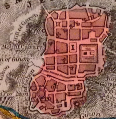
The map is interesting as it shows how the land would have been divided between at least two of the 12 tribes of Israel, here, Judah is in the south and Benjamin in the north. It also has a great little plan of old Jerusalem with certain important sites pointed out.

To really get an appreciation for some of the more interesting details on this small map, one needs to look much more closely.

For example, there's a tiny cross on the Mount Calvary. A structure is simply identified as "the temple" and "the City of David" all appear in the small plan of Jerusalem.


The map also notes the site of at least two biblical battles between the Israelites and the Ammonites and the Philistines.


Bethlehem, and the road between it and Jerusalem are shown on the map, alongside "David's Cistern" and "Solomon's Fountains". All of these, are, of course, biblical sites.

There is also reference to sites of "idol worship" and a number of other specific places found in biblical reference.

This is a small, but attractive map that is meant to show not only a biblical history, but may also reflect an interest in such matters at the time. The effort that went into making such a map, must have some positive correlation to the contemporary demand for such a product.

I only wish I knew a bit more about this map and its origins, and I welcome insights from those who know more about this publisher and this cartographer than I do.

Thursday, February 22, 2018

Add it to the Wishlist: Four Gorgeous 1757 Bellin Antique Maps of Canada - Hudsons Bay, St Lawrence River, Quebec City

I'm not a person with much money, so it's easy for me to decide that I can't afford a map I love. If I had the disposable income though, boy would I love this set of four, 18th century maps of Canada on sale by Classical Images, of Melbourne, Australia.

Here there are, four beautiful Bellin maps. I'll present them and what I love about them one at a time.


There's a lot to love about this map of Hudson's Bay. It's an attractive example, the map itself is nice to look at, it has a beautiful cartouche and nice geographic features, like mountains. It's also wonderful in that it seems to have totally made up islands, like "Isle de Bonne Fortune, which does not correspond with anything modern I can find. It also gets the shape of the Bay quite wrong (though James Bay looks pretty good), and Quebec seems to have no Ungava bay in its far north. I also love the note on the far left, in French, about the lands being 'entirely unknown' and a similar annotation at 65 north and 65 west of the 'strait without a name'.


At the time this map of the upper St. Lawrence River and Lake Ontario was made, there was considerable settlement in the colony of New France between the downstream city of Quebec and Montreal. For some reason, from this map, you'd hardly know it. Montreal is on the map, but as an island. There's not much there to speak of a settlement, or the importance of the settlement. The names of rivers appear to be quite detailed--perhaps because rivers were truly the highways of the time--and a number of forts and small settlements are indicated. The drawings of the mountains add to the attractiveness of the map, but points which probably should have been emphasized, are omitted.

Here's the downstream portion of the St. Lawrence. Another attractive map with surprising accurate naming of places like rivers, islands and mountains, but little in the way of cities and towns. A detail of this one, that appears in the others as well, is the identification of the longitude being from Paris, not Greenwich.


This last one may be my favorite, a view of Quebec City, from 1757 during the Seven Years War and while under French rule, before the "Conquest" by the British. In two years time, a battle at the Plains of Abraham (approximate location indicated on the map below), would dramatically alter the course of North American and Canadian history. This map gives wonderful details about the city and seems to make special note of its fortifications. Indeed, the city was very well defended, and it was a series of gambles and good luck that allowed for British success in their assault on the town. One of the most interesting details shown on the map are the walls of the city. Today, Quebec City is the oldest walled city north of Mexico City whose walls still exist.

Approximate location of the British landings at the Plains of Abraham
At the time that these maps of Canada were published, the Seven Years War was already ongoing. It's an amazing thought to imagine the possibility of British, or French officers studying any of these maps to plot strategies, attacks or routes. These maps may not have been practical for military purposes, but at a time when perhaps little was known about these places by rival powers, maps like this may have been the key to successful campaigns.

Monday, February 19, 2018

Montreal: A Not-So-Old Map of My Hometown and Best City Around!

This 1906 map of Montreal from the Department of the Interior Atlas of Canada is not the most interesting or beautiful to look at, and yet there are so many wonderful things about it. A clearer image may be found here (incidentally, from the same vendor who I think sold it to me).


The source of this map is unique. It's from 1906 and appeared in the first edition of the Atlas of Canada. According to the Canadian government department that still publishes it, that atlas was notable for its emphasis on means of communication and transportation in Canada. 


This is clear from the map. First, the map focuses on the port of Montreal. It's true the city was not as big then as it is now, but the port is impossible to miss. Second, the map notes "street railways" an early form of public transit in the city which is now long gone. Third, larger rail lines are also prominent, including, the famous Grand Trunk Railway, which had its headquarter's in Montreal and was an important rail-line for the country. The Lachine Canal is hard to miss too. Finally, there's the well known Victoria Bridge, shown on the map with a different name.


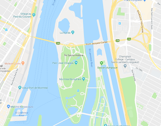
The bridge shown on this map also alludes to the many changes the city has undergone. For example, today, this view of Montreal would show at least two more bridges from the island, including the now heavily traveled and practically indispensable Jacques Cartier Bridge.

Something else pops up from looking at a current map of Montreal: there are more islands in the St. Lawrence River! "St. Helen Island" and "Ile Ronde" are merged into a single island and there's another landmass just to the east of that. These were all build in preparation for the World's Fair held in Montreal in 1967: Expo '67. The earth dug up in the construction of the Montreal Metro (subway) system was used to expand these islands where the pavilions were based. The U.S. exhibit, Buckminster Fuller's geodesic dome is still on this island. So is La Ronde, an amusement park that takes its name from the once small island that sat alone in the river.

Montrealers will recognize many familiar landmarks on this map, even if they are not named. For example, McGill university is where you would expect to see it, as is the unnamed Royal Victoria Hospital. The train station is also right where you'd expect it.

I had this map framed by an excellent framer, and we discussed where to put the matting. Someone present suggested that the matting should go right to the border of the map, showing only the view of the city and not the plain black line forming the border at the edge. The framer made a comment that has since stuck with me: the cartographer decided that they wanted to only show this part of the city, and nothing else. They chose that location for the border, and to hide it, would be detracting from the historic significance of the document. It reminded me that these maps are bits of history, and to have them, and show them comes with the obligation of being faithful to their purpose and message.


Thursday, February 8, 2018

"Canada" Makes its Debut: A Map that Exemplifies Sea Monsters in Cartography is the 1st Use of Canada

Following some of the Twitter feeds that focus on antique maps, and reading about the program from the Miami Map Fair earlier in February, the name Chet Van Duzer keeps popping up. Mr. Van Duzer is a cartographic historian, and in many cases, when his name has appeared online recently, it's been in connection with lectures about sea monsters on maps.

Sea monsters!? Cool!

In a publication he produced on the subject, one of the maps Mr. Van Duzer uses to illustrate (no pun intended) his point about drawings of monsters and other mythical creatures on maps is this one by Paulo Forlani in 1560, and held in the National Archives of Canada. Take a look:


This article features a discussion with Mr. Van Duzer about the reason map makers included animals on their maps. The reasons are varied. In some cases, they wanted to show people that the oceans were vast, scary and unknown. In other cases, they drew what they thought were faithful representations of what they had heard, or they simply hated the idea of blank spaces on their map.

Some examples of some really wild creatures that appear on maps can be found here. Particularly interesting is someone's idea of a walrus, described as a "a strange animal with “large, quadrangular teeth.”" Naturally, it lives somewhere way up north, but looks like something you'd expect to see on the Serengeti.


Another great thing about this map, and likley the reason it's in Canada's National Archives, is that it's the first map to say "Canada." All Canadians know that Canada is from the Huron word for village, and it was misunderstood that the Hurons were not giving the name of their country, but of their settlement. Some have also speculated it comes from the Spanish: 'ca nada' or 'this is nothing'. 


In any event, Forlani sure makes it something. His map shows a huge landmass which incorporates Greenland and seems to connect with China.

One thing about it that's so interesting though, is that the mountains and islands shown are largely fictional. They are placed wherever the map maker thought they should go.

This point is made by Van Duzer in the article, but it's an amazing thought to imagine a person, in a world before modern communication, compiling all this information, some of it being very new, inaccurate and vague and trying to make sense of it. It must be akin to having to draw a map of the moon based only on accounts from those who have been there, and those who have spoken to astronauts, nothing more. In such a context, it's no wonder that walruses have four legs and beasts ply the seas.

Tuesday, February 6, 2018

The Wild West: Johnson's Washington and Oregon of 1861

On a trip through the U.S. Pacific northwest, I bought this example of Johnson's Washington and Oregon from 1861.


I wasn't able to get a great image of it because it's framed, but there's a great 'zoomable' photo of the same map here.

I originally bought this map because it was the best one I could find of the region while in the region. I found it quite attractive and interesting, but perhaps a bit plain. The more I study it though, the more I've come to like it.

 The map does have some nice aesthetic features, for example the decorative border, the map spilling out of its border and the textured way in which the mountains are drawn. It also has that somehow strange feature of showing not only the longitude from Greenwich, but also from Washington, D.C.

The map has quite a bit of space with little on it other than lakes, rivers, mountains and the occasional fort. It gives a sense that this is a frontier region. It makes the area on the map feel more vast, more difficult to access and it makes the west coast, which does have more towns indicated, seem like more of a goal to reach. As though it's a slice of civilization across a land-sea of tough wilderness. This is somehow also enhanced by showing a proposed route for a railway line.


More interesting than some of the aesthetic features of the map, I find, are the political elements, and the elements of the map that did not exist in 1861 but that today would not only be present, but would be prominent.

The most obvious is the shape and existence of states and territories. Washington sort of wraps around and embraces Oregon. Idaho is just not there, and instead, Washington borders the Nebraska Territory. Montana is a figment of someone's imagination and is not on this map.

To the south of Oregon, the map does depict California, which borders the Utah Territory and all throughout over areas of otherwise blank map, we see the names of first nations tribes that lived in that territory. Prominent are "Shoshones or Snakes", "Punashly" and "Nez Perces".

Of particular interest to me are the areas that are now Canada, marked only as "British Possessions". This is not meant to be a map of Canada or the British possessions to the north, but there are still some great details there. The blanket label "British Possessions" is alone an interesting historical element. These regions would not even become part of Canada 6 years later during Confederation. They joined the country much later. Another detail I like is that, though there is a Seattle, and a Victoria (now British Columbia) on the map, there is no Vancouver. This is because what is now one of Canada's largest and most prominent cities was not settled until 1862, the year after this map was published.


One more detail about this map that I personally like is the absence of the town of Great Falls, Montana. I've never been to Great Falls, but my late grandmother spent some of her childhood there, and spoke about it fondly. This map shows only that there are falls at the site (just below the "e" in territory of the "Nebraska Territory"), but there's no settlement. The city where my grandmother watched the celebrations for the end of World War One, was not founded until the early 1880's.

Monday, February 5, 2018

Caveat Emptor: The Lesson of the Fake Waldseemüller Gores

There have been stories recently, in major news publications, about an extremely rare, early 16th century map that was set to go to auction with an expected selling price of at least USD800,000, but that has turned out to be a fake. It's a cool story, and a cautionary tale worth recording.

The map in question is the Martin Waldseemüller "gores". Gores are meant to be cut out and pasted onto a sphere to create a globe. That's one reason why this map is so rare. Most of these maps would have been cut up after being produced and lost over time. In fact, only four originals were known to exist of a map believed to be the first printed globe and the first to use the word "America".

The map was described as "a huge deal". It was the first to show the world in 360 degrees. Showed an important new landmass, and introduced an important new word into our lexicon. It also gave arguably inflated importance to the explorer Amerigo Vespucci.

It's an amazing thought, that just 15 years after Columbus's voyage, a map-maker scrambled to compile all this new information he's learning about the new world and to try and express it in a new way.  

Apparently, the story goes that someone walked off the street into Christie's auction house and claimed to be a descendant of a well known British paper restorer who had found the map among his late-relative's papers. The experts at the Auction house were overjoyed. The felt they had chanced upon an amazing treasure. Too bad they were wrong.


A map expert named Alex Clausen, employed by the well known (in the map world) Barry Ruderman of Barry Lawrence Ruderman Antique Maps, spotted a few things amiss.

A drop of glue on the paper, that would have affixed it to something, had print on top of the adhesive, rather than under it, as might be expected. In other places, detail seems to have been added to the map, where it would have been expected to be missing as the printing process wore it down. Another concern, caught by another paper expert, was that there was a line on the map that matched a spot where a verified original map had been repaired. It was too coincidental for this new map to have an identical repair. Moreover, another copy of the map, previously presumed to be original also had this same line. That latter map's status as an original is now also being re-considered by its owner.

Such a map would likely never be in the hands of an amateur or casual map collector, but it raises a question: if most experts were nearly fooled, how could an amateur ever avoid being duped? If the nuances between the real thing and a fake are so hard to detect, it's discouraging to someone who may want to take a step into buying some of the rarer, older, and more expensive maps that are on the market. The best advice, is probably to ask lots of questions of the seller, including about the provenance--the historical chain of ownership--of the map. It also helps to have a high level of trust in the seller.

Above all, it reinforces the much older maxim: caveat emptor! Let the buyer beware.

Thursday, February 1, 2018

5 Ways to Start Building a Map Collection or, a Beginner's Thoughts on "a Beginner's Guide" to Map Collecting

I came across this post on the Map Room Blog. In it, the author of the Map Room makes a few short comments about this article, in which the author talks about his new-found passion for collecting maps, specific British Ordinance Survey maps.

It made me realize a few things: 1) People collect maps that aren't necessarily old 2) there are dozens of ways to structure a map collection.

Honestly, the thought of collecting new maps, and things like road maps, has little appeal to me. I do love looking at maps of all kinds, but collecting, for me, means old, antique or otherwise unique maps.

I thought--especially in light of the upcoming Miami International Map Fair--I'd provide a list of things a new map-collector may want to consider when structuring or curating their collection. Of course, take your advice from who it comes: I'm an amateur and have my own reasons for collecting!

1)  Location Depicted: some people may want to collect only maps of a specific location. This allows you to build a collection that is deep, but potentially narrow. If you choose some place in Europe, your collection could potentially be quite large and cover a very long period of time, showing evolution over time.

2)  Location Made: Different countries have different traditions of map making. It's sometimes fascinating to see how, at different periods of time, some maps from different countries will show the same place quite differently. It's also sometimes fascinating to see maps of familiar places labeled in different languages. Some maps even show longitude differently, based on a place like Washington D.C. or Paris, instead of Greenwich.

3)  Age: Some people only want old maps. Some people, like the author of the article the Map Room commented on, only want relatively recent maps. I can see how--especially those with money--could be attracted to medieval maps, or original maps of early exploration, while others may prefer maps of the Victorian era, or from the colonial period of one country or another.

4)  Cartographer: Some map makers, like Blaeu, Mitchell, Johnston and Colton are well known and prolific, though some are rarer than others. I can see how someone may fall in love with a certain style (Blaeu's maps are particularly beautiful) and just want to amass as many maps by the same map maker as possible.

Blaeu's maps are undeniably gorgeous
5)  Specific Attributes: I realize this is a broad category, but there are so many ways to curate a collection that choosing a common element for all the maps in your collection is a good way to go. I prefer to collect maps only of places I've actually visited or been to (with rare exceptions). One may also consider a collection of maps linked to their family's genealogy. I've seen auctions for important military maps from various wars, or you can choose only to collect maps with blank spaces on them, or with sea monsters!


Some people may just enjoy maps and collect whatever they come across that tickles their fancy. That's great. For starting out though, I think it's probably worthwhile to have a sense of where you're going with your collection and what you're collecting for. I tend to have a good idea of the kinds of maps I want. That said, I can't pass up a dusty old book or map shop without going in to browse, even if I don't think they'll have what I want. The hunt is so much of the fun!