Showing posts with label First Nations. Show all posts

Monday, May 7, 2018

Herisson's 1806 Map of South America

I recently blogged about my 1806 map by Herisson titled L'Amerique Septentrionale from the "Atlas du dictionnaire de géographie universelle" purchaced from V & J Duncan (as always, no affiliation). That map came with Herisson's 1806 L'Amerique Meridionale or South America. It had so many fascinating historical elements I felt it deserved it's own post. Here it is:

Map of South America titled Herisson's 1806 Map L'Amerique Meridionale featured in the Atlas du dictionnaire de géographie universelle on page 44

For the purposes of understanding just how historic this map is, here's a map of South America today:


 The differences are easy to see. Argentina is instead a mix of the Kingdom of La Plata and The lands of Magellan, Paraguay is part of that region. Chile is wider and shorter than it is today. Brazil is but a shadow of its current size, and there is a vast "Land of the Amazons". Peru is just a sliver, and the lands that today include Venezuela and Colombia are a region known as the Kingdom of New Granada.

I do not know very much about the history of South America, and I hope that a reader can provide more information for me, but I did learn quite a bit when researching this blog post.

Among the things that I find interesting is that this map refers to the "Kingdom of New Granada". This is an entity that, according to wikepedia, existed from 1550-1717 before being replaced by the Viceroyalty of New Granada which existed until 1810, four years after this map was published. I'm not certain what accounts for the difference in the names on this map.

Brazil, at the time this map was published, was on the cusp of important historical developments. One year after this map was published, the Portuguese Court would flee Portugal to escape Napoleon and set up in Rio de Janerio. This would effectively make Rio the capital of the Portuguese Empire for the next 15 years.

Another aspect of South American history that has me coming up empty handed is the history of the lands marked as "the lands of Magellan" in what is today Argentina. My cursory searching has not found anything on such a place, and I wonder if I'm translating incorrectly from the French.

I was also only able to find some basic history of the area listed as "pays des Amazones" or the country of the Amazons. Most of this region eventually became part of Brazil, and at the time this map was published, was on the cusp of an influx of non-native people who were after rubber and other natural resources of the area. In the meantime, however, the map suggests a region left largely to the indigenous peoples of the region. The limited resources I've been able to find suggest that the few Europeans in this region were missionaries and perhaps explorers, but not permanent settlers.

Map of South America titled Herisson's 1806 Map L'Amerique Meridionale featured in the Atlas du dictionnaire de géographie universelle on page 44

It should be clear by now that my knowledge of South American history is sparse, but the map is so interesting because it shows a region that is politically unrecognizable. It would be fascinating to hear more details about these divisions that, though they may persist in some form today, are quite different than what they were in 1806.

Monday, April 23, 2018

Inuit Maps of Greenland

The Inuit in Greenland and Canada's north inhabit a hostile environment. The cold is appalling, the weather is unpredictable, the distances are vast, the terrain unforgiving and the necessities of life may be hard to come by. And yet, these people thrive in this harshest of environments. Indeed, if you want to see one way they've adapted, check out this fascinating, dated, video.


This is a blog about maps though, so I wondered how these people found their way around their regions. There was reliance on innukshuks, man-made landmarks to help with navigation, but what about out on the water, in a kayak?


The needs of a traveler would have been unique. The north is dark 6 months of the year, so it would have to somehow be read easily in the dark. It would need to be able to be handled without taking off mittens if it was too cold and would need to float, if it were dropped in the water. The solution was an ingenious one that I read about here, a tactile map.


When I first saw these I thought: "are they even maps?", but indeed they are. Known as Ammassalik wooden maps, and the images above are of maps which date to around 1885. The maps were tactile. Small enough to fit in your mitten, made of buoyant wood and carved to represent the contours of the coastline of Greenland. My guess, however, is that they would take some practice to learn how to read. Looking at the comparison between them and a more traditional map leaves me somewhat baffled. Map-reading can be a skill. No doubt those who used these maps learned how they worked.


Not many examples of these types of maps exist. The ones shown above were originally taken to Copenhagen, but are now in a museum in Greenland. Over at this blog, I found an image of a politically incorrect newspaper clipping showing some other similar carved maps. If anyone is aware of any other examples of this type of map, I'd be interested in learning more.


Thursday, March 29, 2018

First Nation's Mapping of Canada: Ochagach's 1730 Map

I wrote about an amazing 1762 map of Canada I found online. One of the things that fascinated me about that map, was a reference it had to Ochagach. Ochagach was a Cree "Indian" or First Nations person who drew a map to the west coast for La Vérendrye, the French explorer and fur trader.

There's a short bio of Ochagach here. As the bio explains, the route he proposed became essentially a crucial highway to the western parts of Canada used by fur traders. In the French context, it was the fur trade and desire for pelts that drive not only exploration, but settlement and expansion and shaped North America.

Ochagach's map is fascinating to look at and is available in "zoomable" form.


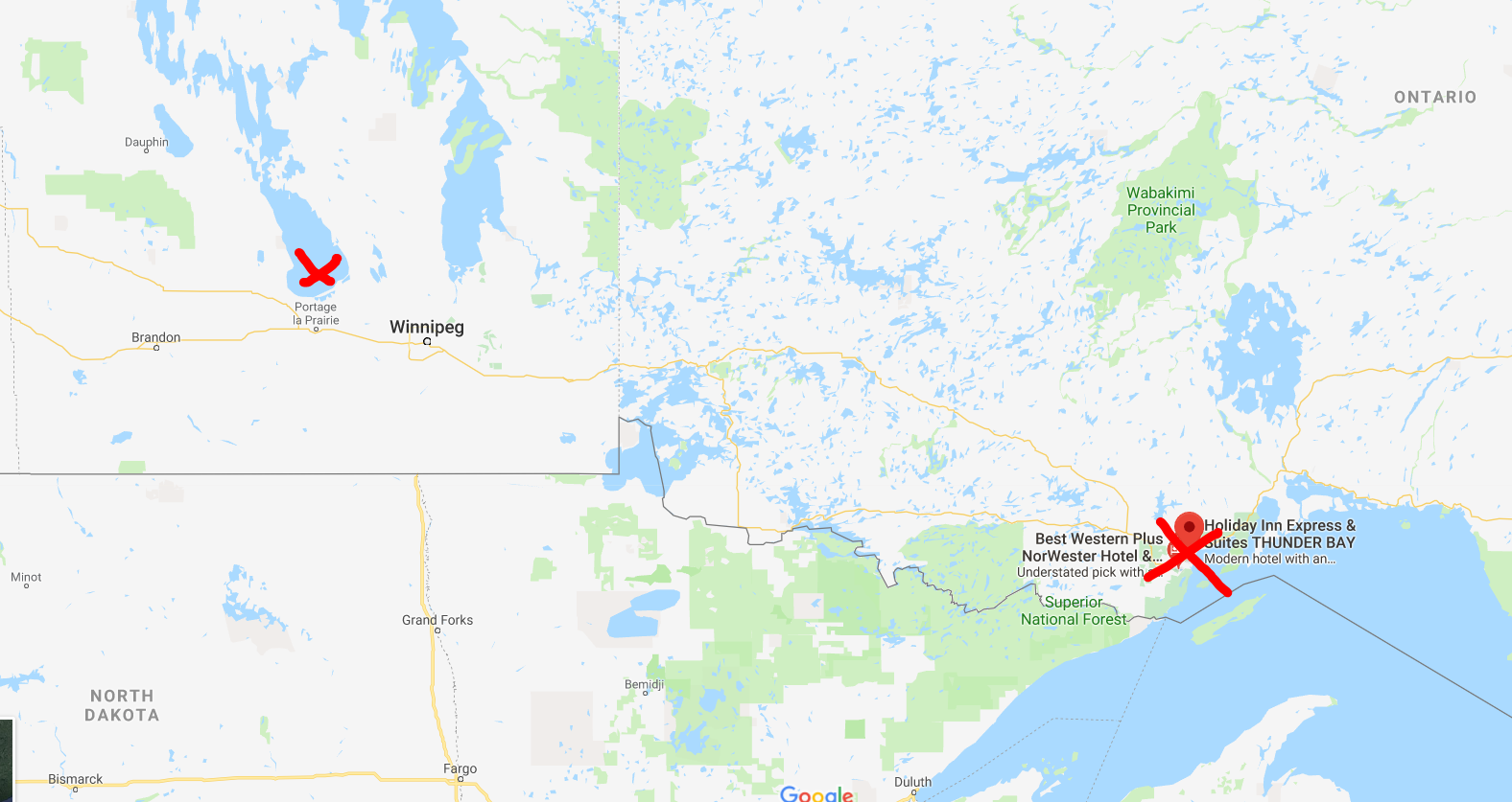
Remember, the first nations of Canada, as far as I know, had no written language or tradition of map-making. This was a person, who from his own mind, was able to prepare a map of Canada beginning at modern day Thunder Bay, Ontario and ending up somewhere beyond Lake Winnipeg, Manitoba. Today, that would be a car ride of over 1,000 KM.


Approximate start and finish points of the original route
This is quite a vast distance that Ochagach had good knowledge of, at a time when choices for transportation were a canoe or walking. 

The map shows what appear to be a series of lakes, connected by either short rivers or portages leading ultimately to lake "Ouinipigon" which could be either modern lake Winnipeg or lake Winnipegosis. The various lakes along the route are numbered. I don't know enough about the map to know if these are numbered to help a traveller count how far along they are, or whether it refers to the number of days it takes to reach a certain point.


I've seen the map  compared to the map for a subway system in that distances are somewhat reduced and the point of the map is to show a destination and tells you not very much about what goes on between the destinations. In this case, the subway "stops" seem to be the various lakes that you have to count off and traverse to get to where you're going.

There are some fascinating annotations on the map in French that are worth a closer look at. 

First, there are details like the ones in this image. Where there is a rare name given to a lake, as opposed to just a number, with an interesting annotation in French: "Lake of Tecacamcouey, of three days of walking". Basically, this map is explaining how long a portage needs to be made to get to this lake.


The image with the name of the destination lake, "Ouinipigon" is also shown with a similar annotation about three days of walking. This image also notes where the Assinibois people live, and says that the map was sketched by the "Cris" or Cree people.


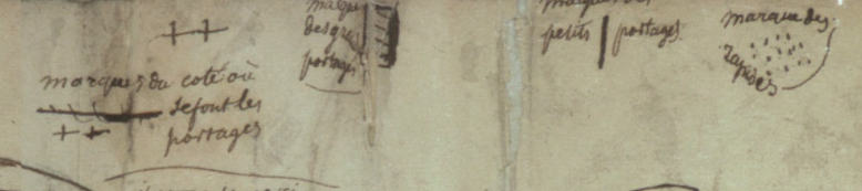
Finally, this image shows the legend of the map. Crosses represent portages. A number of horizontal lines represent large portages, a single vertical line is a short portage and dots are rapids.


There is an interesting, and short article here, in French, about First Nation's cartography. One of the more interesting points it makes, is just how influential First Nations, in general, and Ochagach in particular, was to European map makers. The article cites Ochagach's map as being the necessary information needed by both Philippe Buache and Bellin to complete their maps (images below from Barry Lawrence Ruderman). The influence is clear from just a glance.


Bellin. The annotation in the top left reads, in French "We do not know if in these parts there is land or water"

Buache

Thursday, March 15, 2018

Add it to the Wishlist: A Snapshot of North American History from 1762

I notice, as I build up my virtual wish-list, that many of the maps I'm choosing aren't from places I've been, but where I'm from, specifically Montreal, Quebec or Canada. That's why this 1762 map by Thomas Jefferys titled: "A Map of Canada and the North Part of Louisiana with the Adjacent Countrys [sic]" easily makes the list. The map is being offered for sale by Neatline Rare Maps of San Francisco for more money than I could ever hope to be able to afford to spend on a map!

Here's a picture of it:

This 1762 map by Thomas Jefferys titled: "A Map of Canada and the North Part of Louisiana with the Adjacent Countrys [sic] shows eastern Canada including Ontario, Quebec, New Brunswick, Nova Scotia and PEI as well as the great lakes. It has blanks across most of the prairies to the west coast, but does show lake Winnipeg.


I highly recommend visiting the Neatline site to get a much closer zoomable look at this map. Neatline has also provided a well researched background of the map and what it shows.

There are a couple of interesting points Neatline makes that are worth highlighting:

An image of the west coast showing a mythological Chinese voyage to North AmericaThe reference to First Nations groups is interesting, not only in their identification on the map, but also in that part of this map seems to have been made possible by reports from a first nations explorer named Ochagach who himself produced a map useful for western exploration by the French. It's a significant detail that tends to be lost in more general pictures of first nations that we learn about in school.

The other is the map's "mythological" elements. To me, the coolest is the legend of Fou-Sang, shown on the west coast of the map. It's a place supposedly visited by the Chinese as far back as 219 BC. Wikipedia writes a bit more about it. It's a remarkable story, but may have been a popular myth at the time this map was made.

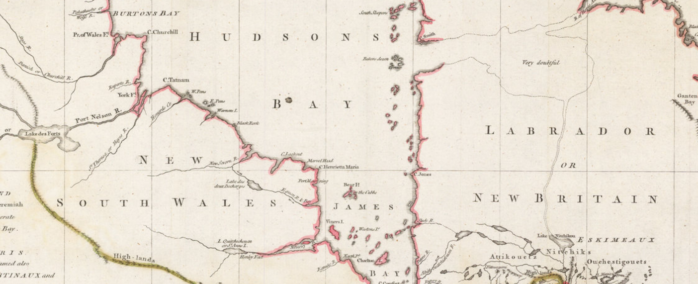
Finally, a few points that Neatline did not mention that are interesting to me, and possibly to most Canadians. For one, there was a New Britain and a New South Wales in Canada. These are not place names that are used today, and are now occupied by other provinces or territories in Canada. I had to do some searching on Wikipedia to learn a bit about their history. Especially interesting was that these place names were in use basically at the same time that Canada was being taken by force by the British from the French. It seems, therefore, that there was some, albeit sparse, English presence north of New France as well as to the south of it.

An image of New South Wales in Canada


I also love the annotation to the east of Hudson's Bay that a supposed lake, which connect to the north Atlantic through Labrador and Northern Quebec was "very doubtful". I wonder why they even thought to put that there. What prompted the map-maker to think this possibly existed?

As a final point, this map gives a great sense of a moment in time in western expansion by the European powers. The eastern portions of the map are detailed, show political boundaries, towns and geological features and looks accurate to the modern viewer. As you look west, however, detail fades, gradually, until the vast blank expanse of the prairies and west coast. It goes to show, once more, that maps like this are historic snapshots.

A detailed portion of the east coast of Canada on the 1762 map


Thursday, February 8, 2018

"Canada" Makes its Debut: A Map that Exemplifies Sea Monsters in Cartography is the 1st Use of Canada

Following some of the Twitter feeds that focus on antique maps, and reading about the program from the Miami Map Fair earlier in February, the name Chet Van Duzer keeps popping up. Mr. Van Duzer is a cartographic historian, and in many cases, when his name has appeared online recently, it's been in connection with lectures about sea monsters on maps.

Sea monsters!? Cool!

In a publication he produced on the subject, one of the maps Mr. Van Duzer uses to illustrate (no pun intended) his point about drawings of monsters and other mythical creatures on maps is this one by Paulo Forlani in 1560, and held in the National Archives of Canada. Take a look:


This article features a discussion with Mr. Van Duzer about the reason map makers included animals on their maps. The reasons are varied. In some cases, they wanted to show people that the oceans were vast, scary and unknown. In other cases, they drew what they thought were faithful representations of what they had heard, or they simply hated the idea of blank spaces on their map.

Some examples of some really wild creatures that appear on maps can be found here. Particularly interesting is someone's idea of a walrus, described as a "a strange animal with “large, quadrangular teeth.”" Naturally, it lives somewhere way up north, but looks like something you'd expect to see on the Serengeti.


Another great thing about this map, and likley the reason it's in Canada's National Archives, is that it's the first map to say "Canada." All Canadians know that Canada is from the Huron word for village, and it was misunderstood that the Hurons were not giving the name of their country, but of their settlement. Some have also speculated it comes from the Spanish: 'ca nada' or 'this is nothing'. 


In any event, Forlani sure makes it something. His map shows a huge landmass which incorporates Greenland and seems to connect with China.

One thing about it that's so interesting though, is that the mountains and islands shown are largely fictional. They are placed wherever the map maker thought they should go.

This point is made by Van Duzer in the article, but it's an amazing thought to imagine a person, in a world before modern communication, compiling all this information, some of it being very new, inaccurate and vague and trying to make sense of it. It must be akin to having to draw a map of the moon based only on accounts from those who have been there, and those who have spoken to astronauts, nothing more. In such a context, it's no wonder that walruses have four legs and beasts ply the seas.

Tuesday, February 6, 2018

The Wild West: Johnson's Washington and Oregon of 1861

On a trip through the U.S. Pacific northwest, I bought this example of Johnson's Washington and Oregon from 1861.


I wasn't able to get a great image of it because it's framed, but there's a great 'zoomable' photo of the same map here.

I originally bought this map because it was the best one I could find of the region while in the region. I found it quite attractive and interesting, but perhaps a bit plain. The more I study it though, the more I've come to like it.

 The map does have some nice aesthetic features, for example the decorative border, the map spilling out of its border and the textured way in which the mountains are drawn. It also has that somehow strange feature of showing not only the longitude from Greenwich, but also from Washington, D.C.

The map has quite a bit of space with little on it other than lakes, rivers, mountains and the occasional fort. It gives a sense that this is a frontier region. It makes the area on the map feel more vast, more difficult to access and it makes the west coast, which does have more towns indicated, seem like more of a goal to reach. As though it's a slice of civilization across a land-sea of tough wilderness. This is somehow also enhanced by showing a proposed route for a railway line.


More interesting than some of the aesthetic features of the map, I find, are the political elements, and the elements of the map that did not exist in 1861 but that today would not only be present, but would be prominent.

The most obvious is the shape and existence of states and territories. Washington sort of wraps around and embraces Oregon. Idaho is just not there, and instead, Washington borders the Nebraska Territory. Montana is a figment of someone's imagination and is not on this map.

To the south of Oregon, the map does depict California, which borders the Utah Territory and all throughout over areas of otherwise blank map, we see the names of first nations tribes that lived in that territory. Prominent are "Shoshones or Snakes", "Punashly" and "Nez Perces".

Of particular interest to me are the areas that are now Canada, marked only as "British Possessions". This is not meant to be a map of Canada or the British possessions to the north, but there are still some great details there. The blanket label "British Possessions" is alone an interesting historical element. These regions would not even become part of Canada 6 years later during Confederation. They joined the country much later. Another detail I like is that, though there is a Seattle, and a Victoria (now British Columbia) on the map, there is no Vancouver. This is because what is now one of Canada's largest and most prominent cities was not settled until 1862, the year after this map was published.


One more detail about this map that I personally like is the absence of the town of Great Falls, Montana. I've never been to Great Falls, but my late grandmother spent some of her childhood there, and spoke about it fondly. This map shows only that there are falls at the site (just below the "e" in territory of the "Nebraska Territory"), but there's no settlement. The city where my grandmother watched the celebrations for the end of World War One, was not founded until the early 1880's.

Thursday, January 11, 2018

Exceedingly Rare Aztec Map

Thanks to National Geographic, I came across this story about a map that is as much archaeology as it is geography.

The map is called thCodex Quetzalecatzin, was recently acquired by the U.S. Library of congress and is one of fewer than 100 Mezoamerican maps that predate the year 1600. In other words, it's an extremely rare, Aztec map from sometime between 1570 and 1595. 


Image of the Codex Quetzalecatzin frm the U.S. Library of Congress
The map shows the family tree and land holdings of an Aztec family and "...covers an area that runs from just north of Mexico City to just below Puebla, roughly 100 miles away to the southeast"

It contains both Aztec imagery as well as clear Spanish influences, not least the Spanish writing on the map. It appears to represent some of the earliest contact between the indigenous people of Mexico and Europeans. 

From looking at it, what strikes me is that it barely looks like a map at all. It looks more like a drawing of a landscape, or what we may call a "view", than a map. To the layperson like me, it also seems to have a strange scale and it is not immediately clear that it represents such a vast area. 

It is beautiful though, with vibrant colours and images such as this snippet: 


The U.S. Library of Congress has at least one other map like the Codex Quetzalecatzin. It's called the The Oztoticpac lands map, and though it has no doubt been the subject of extensive study, I cannot find very much about it online.


This one is even older than the Codex Quetzalecatzin and dates to around 1540. It's described as a "litigation map", relating to a property dispute. Some detail on it from The Library of Congress reads:

 The Oztoticpac Lands Map is an Aztec pictorial document with Nahuatl writing drawn for a court case surrounding the Oztoticpac estate within the city of Texcoco around 1540. The document, written on amatl paper, involves the land ownership of the Aztec ruler Chichimecatecotl, who was executed by Spanish officials in 1539. It is not clear from surviving information who won the case. Most of the document consists of black-and-red line drawings showing fields, houses, palaces, trees, and measured plots of land. In the lower left, twenty trees that have been grafted with European fruit stock in a local orchard are shown. These include apples, quinces, pears, grapes, and pomegranates.

Here's an image with a better look:

There are some fascinating details on this map, some of which probably require a better historical and cultural knowledge to understand, but which to the layperson, are interesting and fun to look at.

For example, the map contains images of various plants. The quote above explains what they are, but some of the images are so curious. For example, in the image of the plant below, whose disembodied hands are those, and why are they there at all? Whose disembodied heads are these and, what's this man doing all alone on this plot of land? These seem to be more than just decorative, and when considering that this map was used in a court case, one has to imagine that they are meant to reflect a certain ownership of a particular area shown on the map.


One reason I love antique maps is because they represent a snapshot of what a place was like at a specific moment in time. These maps do that, and then some. There are not just about what places looked like, but they tell us about who lived there and how they lived. This is more than you would get from your average antique map. It's why, as I wrote above, that maps like this fall into the category of archaeology. They help us understand how people who are long gone structured their lives and societies. They're windows into history and a pleasure to look at.

Wednesday, January 3, 2018

Add it to the Wishlist: 1714 Map of North America

I enjoy looking at websites that showcase antiquarian maps and follow accounts of that type, as well as map vendors on Twitter. As a result, I often come across maps that I think would be so wonderful to have in my collection if only I could find or afford them.

Since maps like that make me mappy, I thought my mappy place would be a great place to keep a running wish-list and explain what it is about certain maps that I love.

Today's wishlist map is this beauty of North America from 1714 that I found on mapmania:


There's so much great stuff going on in this map, but first, here's the little I could learn about it, thanks to this always great source, there's a good deal of information available. This map comes from an atlas meant to show recent and new long voyages of European discovery in different parts of the world. The language on the map is French, but the publisher, Pierre Van der Aa, is Dutch and was working in Leiden. Apparently, many of the other maps in the Atlas are similarly beautiful, featuring elaborate cartouches with titles.

I want to point out a few things about this map that I love and that piques my interest in it.

First, I love that it's incomplete. The map is virtually blank to the west of the Mississippi and north of what would today probably be Texas. The Arctic is unexplored, it appears that Greenland is attached to the North American mainland and California may or may not be an island.

Greenland 

Is California connected to anything?

I also love how political boundaries are drawn on this map. European spheres of influence dominate. There is Canada/New France, which extends to the Southern United States and as far west as the Mississippi. Pre-Seven Years War, New England is hemmed in by the Appalachians, with the French on the other side, and there appear to be a number of polities that I had originally thought were all Spanish. This map identifies them separate: Florida, New Mexico, New Spain and California are all distinct from one another. I admit to being surprised by this and not knowing the history of these regions well enough to understand the distinctions.

Under each of these European polities, however, are the identification of First Nations groups that lived in these areas. For example, there are regions listed as being dominated by the Illinois, the Outaouais and that 'the Apaches are powerful to the west of here'.

Powerful Apaches to the west

 There are a few other things I love about this map. Other than the beauty of the cartouche, and the identification of certain routes of exploration by great navigators, the map has a couple of elements I find somehow whimsical. My favorites are the annotations that in some places there is floating vegetation, though, not as bad as in other places on the same map. This was probably important for navigators to know,
and interesting for Europeans to learn about, but to me, today, it seems somehow comical.

This map definitely makes the wishlist!