Showing posts with label history. Show all posts

Monday, August 13, 2018

Hand-Drawn Maps of the Battle of Quebec

The Canadian Broadcasting Corporation (CBC) has a great story about one of the treasures of the Canadian War Museum in Ottawa.

The story explains that the Museum holds in its archives hand-drawn battle-maps, made by the British Army after their victory on the Plains of Abraham in 1759. A great video, explaining the map and some of its details can be found in the article linked to above.

In short, the maps were probably drawn as a report from the British Army back to London about the events of the battle. Such post-action maps were, apparently, typical. This one, shows the site of Quebec City including some features which are still present, such as the walls of the city. The map also shows the location of the various French and British armies at the battle and how they were arrayed to fight.

I had a hard time finding quality images of these maps anywhere, so the ones below are screen-caps taken from the CBC video and website.


This image, which for some reason is somewhat dark, shows a partially zoomed in image of the map. You can see the British formations in red and the French in blue. You can also make out geographic features like hills, and the formidable cliffs the British had to climb for their attack. The walls of the Citadel of Quebec can be seen in the east and a number of roads, some of which remain in use today. 


Here is a more zoomed out image of the same map shown above. It shows a legend, but the image is too low quality to read it. 


This image above is a close-up of the image of the armies lined up for battle.

One of the details that seems most interesting about this map is that it was donated to the Museum anonymously. Who had such a fascinating historic document in their possession for all those years without anybody knowing--such that the donor could be anonymous?

From what I can tell, the maps--which are hugely significant in Canadian history--are gorgeous, but they are not on display for the public. Apparently, they are too fragile and so remain a hidden treasure of the Museum. Alas...


Monday, May 7, 2018

Herisson's 1806 Map of South America

I recently blogged about my 1806 map by Herisson titled L'Amerique Septentrionale from the "Atlas du dictionnaire de géographie universelle" purchaced from V & J Duncan (as always, no affiliation). That map came with Herisson's 1806 L'Amerique Meridionale or South America. It had so many fascinating historical elements I felt it deserved it's own post. Here it is:

Map of South America titled Herisson's 1806 Map L'Amerique Meridionale featured in the Atlas du dictionnaire de géographie universelle on page 44

For the purposes of understanding just how historic this map is, here's a map of South America today:


 The differences are easy to see. Argentina is instead a mix of the Kingdom of La Plata and The lands of Magellan, Paraguay is part of that region. Chile is wider and shorter than it is today. Brazil is but a shadow of its current size, and there is a vast "Land of the Amazons". Peru is just a sliver, and the lands that today include Venezuela and Colombia are a region known as the Kingdom of New Granada.

I do not know very much about the history of South America, and I hope that a reader can provide more information for me, but I did learn quite a bit when researching this blog post.

Among the things that I find interesting is that this map refers to the "Kingdom of New Granada". This is an entity that, according to wikepedia, existed from 1550-1717 before being replaced by the Viceroyalty of New Granada which existed until 1810, four years after this map was published. I'm not certain what accounts for the difference in the names on this map.

Brazil, at the time this map was published, was on the cusp of important historical developments. One year after this map was published, the Portuguese Court would flee Portugal to escape Napoleon and set up in Rio de Janerio. This would effectively make Rio the capital of the Portuguese Empire for the next 15 years.

Another aspect of South American history that has me coming up empty handed is the history of the lands marked as "the lands of Magellan" in what is today Argentina. My cursory searching has not found anything on such a place, and I wonder if I'm translating incorrectly from the French.

I was also only able to find some basic history of the area listed as "pays des Amazones" or the country of the Amazons. Most of this region eventually became part of Brazil, and at the time this map was published, was on the cusp of an influx of non-native people who were after rubber and other natural resources of the area. In the meantime, however, the map suggests a region left largely to the indigenous peoples of the region. The limited resources I've been able to find suggest that the few Europeans in this region were missionaries and perhaps explorers, but not permanent settlers.

Map of South America titled Herisson's 1806 Map L'Amerique Meridionale featured in the Atlas du dictionnaire de géographie universelle on page 44

It should be clear by now that my knowledge of South American history is sparse, but the map is so interesting because it shows a region that is politically unrecognizable. It would be fascinating to hear more details about these divisions that, though they may persist in some form today, are quite different than what they were in 1806.

Monday, April 23, 2018

Inuit Maps of Greenland

The Inuit in Greenland and Canada's north inhabit a hostile environment. The cold is appalling, the weather is unpredictable, the distances are vast, the terrain unforgiving and the necessities of life may be hard to come by. And yet, these people thrive in this harshest of environments. Indeed, if you want to see one way they've adapted, check out this fascinating, dated, video.


This is a blog about maps though, so I wondered how these people found their way around their regions. There was reliance on innukshuks, man-made landmarks to help with navigation, but what about out on the water, in a kayak?


The needs of a traveler would have been unique. The north is dark 6 months of the year, so it would have to somehow be read easily in the dark. It would need to be able to be handled without taking off mittens if it was too cold and would need to float, if it were dropped in the water. The solution was an ingenious one that I read about here, a tactile map.


When I first saw these I thought: "are they even maps?", but indeed they are. Known as Ammassalik wooden maps, and the images above are of maps which date to around 1885. The maps were tactile. Small enough to fit in your mitten, made of buoyant wood and carved to represent the contours of the coastline of Greenland. My guess, however, is that they would take some practice to learn how to read. Looking at the comparison between them and a more traditional map leaves me somewhat baffled. Map-reading can be a skill. No doubt those who used these maps learned how they worked.


Not many examples of these types of maps exist. The ones shown above were originally taken to Copenhagen, but are now in a museum in Greenland. Over at this blog, I found an image of a politically incorrect newspaper clipping showing some other similar carved maps. If anyone is aware of any other examples of this type of map, I'd be interested in learning more.


Wednesday, April 11, 2018

Add it to the Wishlist: Tobias Conrad Lotter Map of Galicia and Lodomeria ca. 1775

My maps tend to be of places I've visited. I would make an exception for this one, because though I've never been to this place, my ancestors knew it well.

This is a map of Galicia, parts of what today are in Poland and Ukraine, but at the time of this map, were parts of a kingdom under Austrian, Hapsburg rule.

Here's the map, it's held by the New York Public Library, and I'm not sure that any copies of it exist on the market for a collector to aquire.

Tobias Conrad Lotter Map of Galicia and Lodomeria ca. 1775 covering current parts of Poland and Ukraine

I found the map on this website, which allows you to zoom in and really explore it, and also provides some good detail on it. The map is undated, and it's estimated that it was made between 1772 and 1810. It's assumed, however, that it was published during the lifetime of the map-maker, Lotter, which would place it around 1775.

I've always kept an eye out for a map that showed the town I've heard stories about from my only grandparent not to be born in Canada. The town she was born in was alternately called Javorov, Jawrow, or today Yavoriv, where there is a NATO training facility and which is in Ukraine, near the Polish border. The nearest big city, which is the one where it sounds like members of my family traveled frequently for business is Lemberg, known today as L'viv, also in Ukraine.

Tobias Conrad Lotter Map of Galicia and Lodomeria ca. 1775 covering current parts of Poland and Ukraine

Based on this map, and its legend, Jaworow was an ordinary town along a postal route and seems to have had a post office.

Tobias Conrad Lotter Map of Galicia and Lodomeria ca. 1775 covering current parts of Poland and Ukraine

The map is a true historical snapshot. The kingdom of Galicia no longer exists. Instead of being within Poland, the town of Yavoriv now lies within Ukraine. If you have the stomach, you can also read this nearly contemporary account of what befell the Jews of the town during the Holocaust (incidentally, also from the New York Public Library). Relatives of my grandmother are listed among the murdered from that town.


Wednesday, April 4, 2018

15th Century Viking Map of Vinland Being Studied by Yale

I recently came across this article about Yale doing an examination of the Vinland Viking map. I had heard about Vinland, but don't recall having heard about this map before. In short, Vinland is an as yet undiscovered location supposedly settled, at least briefly, by the Vikings in the 15th Century, before Columbus reached the New World. This map, which would have been almost as old as the Viking discovery, showed Vinland.

Here is an image of it from Wikipedia.

The probably forged Map of the Viking discovery of Vinland in the possession of Yale University

It's a pretty cool map, and very exciting to have so old a map of the new world. The problem is, it's almost universally considered to be a fake. There is some disagreement on this, but the majority of scholars have dismissed this map as being inauthentic for a number of reasons including the chemical composition of the ink used (it contains substances unused until the 1900s) and the way it was bound into a larger manuscript which would have rendered much of it illegible.

Nonetheless, Yale is putting some serious work into researching this map. They are looking at the topography of the map itself, studying the DNA of the animal skin it was printed on, and examining the maps's chemical composition. It's all very impressive, and still, they don't expect to prove its authenticity. Instead, they're trying to study a document which has become so culturally important, that many atlases feature it even with the notation that it's probably fake.

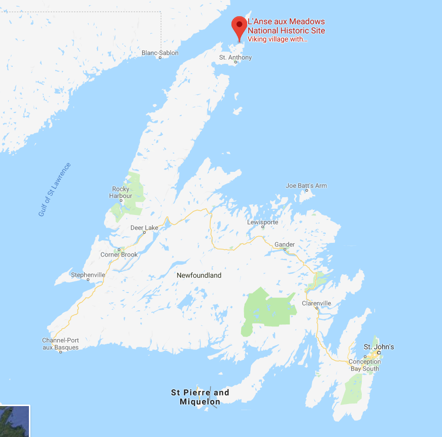
So then, what is Vinland? The answer is that nobody's quite sure. There are disagreements among experts as to what the word Vinland meant to the Vikings and whether it was a single place, or multiple places. If Vinland does refer to vines, or wine, as some suggest, it means that it must be at least as far south as the south shore of the St. Laurence River, where Jacques Cartier found wild vines. One thing that does seem more certain is that the only actual archaeological evidence of Viking settlement in North America, the site at L'Anse aux Meadows, Newfoundland, is not Vinland.

Map of L'Anse aux Meadows, NewfoundlandL'Anse aux Meadows is a remote site at the northernmost point of Newfoundland. Viking artifacts have been found there, as well as building materials from Iceland and Greenland that date to around 1000 C.E. This is conclusive evidence that there were Vikings living in Newfoundland, for at least a short time,  around 500 years before Columbus and any other European reached the area. The site, however, is considered by historians to be a base, or a waypoint for onward exploration. It was probably just a place to stop, maybe repair boats, take on more supplies, and then keep exploring onward. As such, the location of Vinland remains a mystery, and this map will likely not be helpful in finding it.

As an aside, I had the good luck of visiting L'Anse aux Meadows, which is not an easy place to get to, but which is stunningly beautiful and worth the trip. It also has a reconstruction of what the Viking settlement on the spot may have looked like. It's a long trip, but in my view, absolutely worth it. Check out some pictures I took while there.

UNESCO heritage plaque indicating Vikings were at this site.

L'Anse aux Meadows, Newfoundland

Site of a Viking building. The indentations on the ground show the footprint of the long since decayed building.
This depression was the actual site of a Viking structure.

A recreated Viking settlement on the site of the only known one in North America.

A recreated Viking settlement


Fog rolling into L'Anse aux Meadows, Newfoundland

Fog rolling in to L'Anse aux Meadows, Newfoundland


Thursday, March 29, 2018

First Nation's Mapping of Canada: Ochagach's 1730 Map

I wrote about an amazing 1762 map of Canada I found online. One of the things that fascinated me about that map, was a reference it had to Ochagach. Ochagach was a Cree "Indian" or First Nations person who drew a map to the west coast for La Vérendrye, the French explorer and fur trader.

There's a short bio of Ochagach here. As the bio explains, the route he proposed became essentially a crucial highway to the western parts of Canada used by fur traders. In the French context, it was the fur trade and desire for pelts that drive not only exploration, but settlement and expansion and shaped North America.

Ochagach's map is fascinating to look at and is available in "zoomable" form.


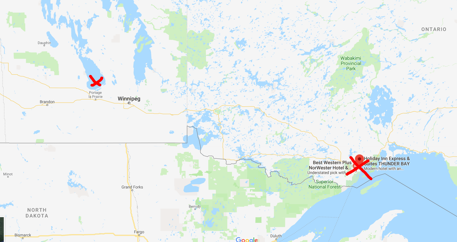
Remember, the first nations of Canada, as far as I know, had no written language or tradition of map-making. This was a person, who from his own mind, was able to prepare a map of Canada beginning at modern day Thunder Bay, Ontario and ending up somewhere beyond Lake Winnipeg, Manitoba. Today, that would be a car ride of over 1,000 KM.


Approximate start and finish points of the original route
This is quite a vast distance that Ochagach had good knowledge of, at a time when choices for transportation were a canoe or walking. 

The map shows what appear to be a series of lakes, connected by either short rivers or portages leading ultimately to lake "Ouinipigon" which could be either modern lake Winnipeg or lake Winnipegosis. The various lakes along the route are numbered. I don't know enough about the map to know if these are numbered to help a traveller count how far along they are, or whether it refers to the number of days it takes to reach a certain point.


I've seen the map  compared to the map for a subway system in that distances are somewhat reduced and the point of the map is to show a destination and tells you not very much about what goes on between the destinations. In this case, the subway "stops" seem to be the various lakes that you have to count off and traverse to get to where you're going.

There are some fascinating annotations on the map in French that are worth a closer look at. 

First, there are details like the ones in this image. Where there is a rare name given to a lake, as opposed to just a number, with an interesting annotation in French: "Lake of Tecacamcouey, of three days of walking". Basically, this map is explaining how long a portage needs to be made to get to this lake.


The image with the name of the destination lake, "Ouinipigon" is also shown with a similar annotation about three days of walking. This image also notes where the Assinibois people live, and says that the map was sketched by the "Cris" or Cree people.


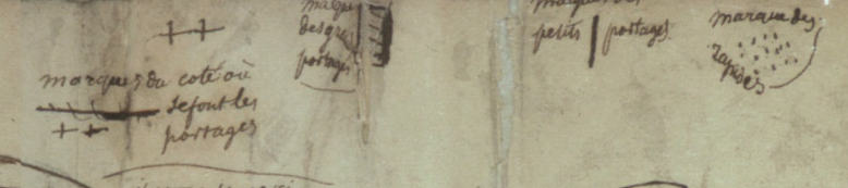
Finally, this image shows the legend of the map. Crosses represent portages. A number of horizontal lines represent large portages, a single vertical line is a short portage and dots are rapids.


There is an interesting, and short article here, in French, about First Nation's cartography. One of the more interesting points it makes, is just how influential First Nations, in general, and Ochagach in particular, was to European map makers. The article cites Ochagach's map as being the necessary information needed by both Philippe Buache and Bellin to complete their maps (images below from Barry Lawrence Ruderman). The influence is clear from just a glance.


Bellin. The annotation in the top left reads, in French "We do not know if in these parts there is land or water"

Buache

Monday, March 26, 2018

Warsaw, 1845 from the Society for the Diffusion of Useful Knowledge

I visited Warsaw, Poland, only once and only briefly, but that still qualified it for a map for my collection. I purchased this one somewhere in the United States (I can't remember where, exactly, but I want to say it was in Virginia or the Carolinas), it's an 1845 map of the city.


One of the things I love about this map, is the name of the publisher: the Society for the Diffusion of Useful Knowledge.

The group was essentially a politically linked organization in the U.K. who made it their aim to provide high-quality educational materials for people with no or limited access to learning materials. It started in the 1820s, and does not seem to have lasted very long, but apparently produced a number of high-quality maps.

The image of the map I posted here is not the best, but as always, David Rumsey has me covered. See here for his high-quality image of the same map.

Warsaw has gone through much destruction since 1845 when this map was published. I find it difficult to compare this antique map with the city today. Not least because of the choice of orientation of the map. For some reason, it shows north as being towards the right. I can't think of a good reason to have done this, other than to have it appear in "landscape" orientation on the page of an atlas more neatly. I don't know enough about its history to comment, so I'll limit myself to the things I find interesting about this map.

One change I will point out is something noticed by another blogger, who does not normally write about maps. This blog notes that one difference in the city was the reclaiming of land from the river Vistula in the early 20th century. It provides a bit more information on Warsaw than I have.

When looking at the image I posted above, the outskirts of the city look a bit blurry. This is not a result of bad photography. This seems to be an intentional visual effect on the map. I find that it has the result of focusing ones attention on the city itself, which is interesting. I don't know if that's what the map-maker was hoping to do with his choice of design, but it has a nice effect.

I also like how the map, though it is itself an antique, notes important historic elements of the city. For example, there is a border of the city from 1762 shown on the map. This older border is well within what appear to be the borders of the city at the time it was published. Perhaps someone out there with a better knowledge of Warsaw's history can explain to me why this was an important date.


The town of Praga, on the east bank of the Vistula, notes that it was burned in 1794 and 1831, just a few years before this map was produced. The 1794 burning was as a result of a Polish uprising against Russian rule over Poland. I'm less clear on the causes of the 1831 burning, but I suspect it may be linked to the battle of Olszynka Grochowska as part of the 1831 "November Uprising" or Polish-Russian war. Again, I hope there are people better versed in Polish history than I am out there who can explain this better to me.


The comparison of important buildings in the city along the bottom of the map is also quite charming. Only a small sample are shown in close-up here, but it's clear that these were well drawn, with attention to detail. They also seem to be presented in a formal sort of way, not as a decorative addition. It's a nice feature to add to a city map.

It's a shame that I don't know more about Poland to be able to write more about this map, but I hope someone out there will be able to read this, comment and provide more information. I look forward to learning more.

As a final point, I notice that the back of the map has a stamp on it that reads Devon & Exeter Institution. This is a library that still operates, and their website is here. It's unusual to know the provenance of an antique map, and so this is sort of interesting to know that at some point in its life, the map belonged to this institution. How it got to a store in the United States I cannot say, but this find has done some travelling to get to my home in Ottawa!


Monday, February 26, 2018

The Land of Moriah, or Jerusalem

What place in the world has more meaning to people, or more historical significance than Jerusalem?

I bought this map of Jerusalem at M. Pollak's map store in Tel Aviv. I really like this one and was very excited to buy it.


The map is titled "Land of Moriah or Environs of Jerusalem". The map maker is Thomas Starling, and printed at the bottom is "London, Published for the proprietors. by Mr. Bull, Holles Street Cavendish Square". An inscription on the back from the seller indicates that the original date of publication was 1836. This date, however, does not appear on the map itself.


That's about all I know about the map. Research shows that Starling published a few atlases, including some in the U.S., but I can't figure out which one this would be from.

What I can point out are some of the really unique features of this map, starting with the name, Land of Moriah. The name alone is controversial as it's a biblical name about which scholars disagree. Some say that it refers only to the site in Jerusalem where the Temple of Solomon stood, while others say it may refer to a region, as shown on this map. There are differences based on religious belief as well.

The map is interesting as it shows how the land would have been divided between at least two of the 12 tribes of Israel, here, Judah is in the south and Benjamin in the north. It also has a great little plan of old Jerusalem with certain important sites pointed out.

To really get an appreciation for some of the more interesting details on this small map, one needs to look much more closely.

For example, there's a tiny cross on the Mount Calvary. A structure is simply identified as "the temple" and "the City of David" all appear in the small plan of Jerusalem.


The map also notes the site of at least two biblical battles between the Israelites and the Ammonites and the Philistines.


Bethlehem, and the road between it and Jerusalem are shown on the map, alongside "David's Cistern" and "Solomon's Fountains". All of these, are, of course, biblical sites.

There is also reference to sites of "idol worship" and a number of other specific places found in biblical reference.

This is a small, but attractive map that is meant to show not only a biblical history, but may also reflect an interest in such matters at the time. The effort that went into making such a map, must have some positive correlation to the contemporary demand for such a product.

I only wish I knew a bit more about this map and its origins, and I welcome insights from those who know more about this publisher and this cartographer than I do.

Thursday, January 25, 2018

Come From Away: Colton's New Brunswick, Nova Scotia, Newfoundland and Prince Edward Island

In the Canadian Maritime and Atlantic provinces, someone who's from any place other than one of those four provinces is known as a CFA, a come from away: because that's where you're from, away.

A few years back, my wife and I went on a fabulous road trip through the Maritime and Atlantic provinces (Newfoundland and Labrador is an Atlantic province, not a Maritime one), had an amazing time, met some wonderful people, saw some great sights, ate some great food, got engaged and I bought a couple of maps!

The map I'll feature in this post is a gorgeous Colton, first published in 1855 of New Brunswick, Nova Scotia, Newfoundland and Prince Edward Island. I bought this map at an art gallery in Halifax that also sold some maps called Zwicker's Gallery (a place that is itself an institution). They had some other beautiful maps of the region (Including a great one with images of some dogs this part of the world are famous for, notably the Labrador and the Newfoundland Dog), but this was the only one I could afford at the time.


 I love this map! There's so much about it that's appealing.

First, just look at it! The border is gorgeous. It has that wonderful element of spilling outside the border, showing every element of the land. It breaks up the provinces (colonies at the time) into counties, which I don't believe are particularly significant these days, and it's in excellent condition. Even the name plate of the map is appealing.

The way "Colton" is written, the various fonts of the names of the different places...I just find this map very pleasing to look at.

Second, the history represented on this map is wonderful. Nova Scotia and New Brunswick were among the first four provinces of Canada which came together for confederation in 1867. Prince Edward Island would only join Canada in 1873 (largely because of heavy debt from having built a railroad on the small island), and Newfoundland joined still later, in 1949, after a much debated referendum.

Third, the detail on this map is impressive. So many of the tiny bays, capes and coves on Newfoundland are named. Some of these places may have been, or were being settled for the first time around when this map was published. Other places, including some of Newfoundland's largest communities today are completely absent from the map, in some cases, like Gander, Newfoundland, because they didn't even exist until around 100 years later.


 A final thing I enjoy about this map, is that it presents another mystery to me. The map clearly says it's a Colton. It also says it was first published in 1855. That doesn't mean that the actual paper map I have is from 1855, it could be more recent. There's an annotation from the seller next to the page number (19) that shows the year 1864. The problem is, when I search, I can't find any Colton atlases published that year. Even when I go through the ever-useful Rumsey website, I can find very similar Colton maps, but none that are on page 19. Perhaps even more strange, there is an almost identical Johnson map that is printed on page 19 from 1865, but it is clearly not the same map I have. All I've been able to find is someone selling the identical map (in rough condition) on ebay. This person claims their map is from 1855, but they may simply be looking at the date of first publication, which could be quite different from the date of actual printing. I'm including a screen capture of the item for sale below.

Once more, another mystery to solve. Anyone with thoughts or insights is encouraged to let me know!


Monday, January 22, 2018

Add it to the Wishlist: Map of Cartagena, Colombia

My map collecting began as a way to bring home interesting, historical souvenirs from places I travel to. I don't have or seek out maps of countries I have never visited, even if sometimes I have a map of a city I have not been to in that country. That's why this gorgeous map of Cartagena, Colombia makes the wishlist. My wife and I honeymooned in Cartagena, and while there, the only antique map I was able to find was from a nearby Colombian town, but not Cartagena itself.
This is an uncolored version of the map in question

This beauty, however, goes right onto the wishlist.

I noticed the map on twitter, here, as one of the new acquisitions of a New York City based map-dealer Geographicus, rare antique maps. There's plenty of information about the map itself and the cartographer on the Geographicus website, so I don't need to repeat any of that, but I want to point out a few things I love about this circa 1766 map by Dutch cartographer Isaak Tirion.

First, one of my favourite things about any old map is seeing the obvious changes to the place over time. Today, Cartagena feels sprawling, and the undeveloped area on the map labeled Terra Bomba is now a modern, developed area with narrow high rises and hotels, reminiscent in many ways of Miami Beach.
The fortress on the 1766 map named "Kasteel van St. Lazarus" is no longer referred to by that name anymore. It's now the impressive
Castillo de San Felipe de Barajas that my wife and I reached the top of in a sweaty, somewhat miserable hike (it was worth it).

Second, I love the artistic detail of the map. The hills outside the walls being drawn as hills, the beach is clearly a beach, the shores are clearly marshy and vegetated and areas on "Eil Manga" are under cultivation.

I love the detail of the walls surrounding the city, with even the smallest turn or curve appearing on the map, nothing is glossed over.

I also love the identification of the hospital outside the city walls, which I'm guessing was done historically to keep the sick away from the rest of the population. A detail which if true, is a fascinating bit of history enshrined in the map.

Also, item number one on the legend is called, in Dutch "de dom of hoofdkerk" which seems to translate to "the main Church or Cathedral". What's interesting here is that it appears to also show the Palace of the Inquisition, which is across the street, but not named.

I also get a kick out of what seems like a quirky element of the map. The ocean beyond Cartagena is the Atlantic, but this map simply says "the sea". It simply assumes that the viewer knows where in the world the city is, and has no need to name the Atlantic, probably the most important Ocean in the world for the Dutch at the time.

The map is truly gorgeous, and is on the market, only far beyond my means. I have no relationship whatsoever with the seller, but I do hope it finds a good home. 

Wednesday, January 17, 2018

Caribbean Vacation Map

The third map I'll feature here (though I don't think it's the third I ever bought) is of the Lesser Antilles and it's one of C.S. Hammond's.


I know the image quality here isn't the best. Perhaps I can try again later and update this post.

The map is not the most beautiful I own. I bought it mostly as a souvenir of a cruise I was on that stopped in Puerto Rico, or as this map says "Porto Rico".

The map is a fun one to me. It offers that snapshot of history I love, showing places which are currently sovereign states as colonies, unusual spellings and a case where the map spills outside it's own borders, as does Trinidad and Tobago.

Originally, I thought that the map was cut out of an older magazine, based on the paper and because it's not a full page, just an imperfectly cut out map. After researching the information in the map legend though, I believe it almost certainly came from an atlas.


The problem with this legend, and the mystery of this map is that it doesn't give me a year. I know Hammond began publishing maps in 1900. This map, came in a folder upon which the seller had jotted down circa 1910. So-far, so good. Only, just because a vendor says a thing, does not make it true. Especially this person, who was a general antiques dealers and had no maps other than this one. (By the way, I paid nowhere near the price listed under the date).

My first search ended up at David Rumsey (as do all searches for antique maps). He has a map that's nearly identical to mine, but published in 1948.


If you take a look at his site, you'll see that the map is very similar to mine, but zoom in on Porto Rico. The map on Rumsey's site lists the island as Puerto Rico. So these maps are not the same, and given that Puerto Rico replaced Porto Rico, I think I'm safe to assume that my map predates 1948. See, for example, this website (which I have nothing to do with) selling a different Hammond map of Porto Rico from 1910 with the same spelling as mine.

Then I came across a fabulous site for maps of the Caribbean called Caribmap. They have a map, produced by Hammond, very similar to mine from "the New World Loose Leaf Atlas" published in 1931. Take a look at it here. It's hard to spot any differences. The only one that jumped at me is not part of the map itself, but is the note "rb-29" in the bottom left corner. I know my map is poorly cut out, but I think it has enough of a margin that if my map was the same as the Caribmap one, I'd see that annotation.

So again, a map leads me on a little mystery, and I've learned a lot in the search. I know Hammond did publish world atlases circa 1910, but I don't have images of any of them to readily look through. I don't have an answer to this one though, and hopefully, once more, some friendly expert out there can point me in the right direction.