Monday, June 18, 2018

Map of the states of North & South Carolina. (with) Plan of Charleston. London, published June 1 by I.T. Hinton & Simpkin & Marshall. Engraved & printed by Fenner Sears & Co. (1832)

On a trip to Asheville, North Carolina I was keen to come back with a map as a souvenier, but couldn't find anywhere in town that sold them. My wife and I therefore embarked on a bit of a goose (map) chase to out of the way antique shops on back roads 'till we came across a barn full of antiques. None of it was really interesting to me, and some of it fell into the category of "who would buy that"? Somehow, however, tucked in a corner, on a wall on the barn I found this fascinating specimen which I have since learned is properly titled: "Map of the states of North & South Carolina. (with) Plan of Charleston. London, published June 1 by I.T. Hinton & Simpkin & Marshall. Engraved & printed by Fenner Sears & Co. (1832)"


As always, a much higher quality, zoomable image of the map is available through Rumsey, but the one on that site is coloured, while mine is not.

The map comes from an atlas, as is clear from looking at it on Rumsey. The copy I have shows some interesting signs of that. There are a few small tears in it, where the binding must have been. It was framed when I bought it, so I have not been able to examine what's on its reverse, but close inspection shows that it must have been in a closed atlas for a long time before anyone ever opened it up. Each side of the page is slightly stained with an image of the opposite side. Look at these examples:


You may need to look quite closely, but there is definitely some staining to the paper from having likely been closed in a book, and possibly under pressure, for an extended period.

There are a few other elements of this map I find interesting. The Outer Banks, today a highly popular tourist destination, is very low on detail in this map. With an important exception, Roanoke Island. 


There's not much on or around Roanoke Island at this time to merit a mention, especially when other smaller islands nearby have nothing on them. Roanoke, however, is the site of the lost colony, and would likely have been of interest to Americans and British (the map was published in London) alike. The Island still presents mysteries to historians and holds an important place in American, British and North American history, so its inclusion is logical.

Another place that is in the Outer Banks and which also plays an important historical role but which is absent from this map, is Kitty Hawk, site of the first powered flight in 1903. Even today it's not a big town, and at the time, may simply not have existed at all, but it's impossible to imagine any map showing the Outer Banks after 1903 not at least indicating it's location.

I also find the inset plan of Charleston to be quite curious.


Obviously, Charleston of today is much larger, but this inset is interesting because it lacks so much detail. Two rivers are named, but there are no street names, so sites of interest, no names for the inlets or canals, the harbour, nothing. It's not even clear if the city ends at the northernmost east-west street, or if it just fades out of sight because of the size of the inset. The inset gives the view a sense of the size of the city, but otherwise, tells very little about it. I'm not sure why that is. Similarly missing is Fort Sumter, whose role in the history of the U.S. Civil War would likely guarantee its inclusion on any maps after 1860. In doing some research on this map I have found that this plan of Charleston predates any to appear in any American published atlas, which makes it somewhat unique.

Another point: I tend to research my maps as much as I can to get a sense of whether there are others out there and how much they sell for. I have only found one vendor of this map. It gives me the sense that what I have is quite scarce and perhaps a real treasure. It makes it that much more interesting to own, and I'm honored to be able to have it and care for it.

Monday, June 11, 2018

Wearable Maps: Newfoundland

I'm not the type to normally walk around in clothes adorned with maps, but after falling in love with Newfoundland on my first visit there, I could not resist this cool T-shirt map.


One of the things that makes this map so interesting is that it shows the names of some very small towns in Newfoundland. Also, it shows just how sparse the interior is, and how busy the coasts are. The size of the name on the map corresponds to the size of the town itself.

Really though, the best thing about this map, are the fun place names in Newfoundland. Some of which I've actually been to!

For example, on the image below, note Nickey's Nose Cove, Coffee Cove, and Leading Tickles.


Here we have Placentia, Dildo, Little Heart's Ease, and Bonavista, first sited by Cabot.


 Yes, these are all real places, and yes, they're beautiful. Get to Newfoundland, it's wonderful!


Thursday, June 7, 2018

The Erdapfel Globe

Through the wonders of twitter I came across a fabulous bit of map history: the Erdapfel (German for Earth Apple), sometimes called the Globe of Martin Behaim. This is possibly the oldest surviving globe in the world and it was made in Nuremberg in 1492, the year Columbus sailed.

Here's a picture of it taken from this site:


There's a lot that's amazing about this map. For one, the creator of the map was quite well traveled for a person living in the late 15th Century. He personally visited Portugal and western Africa. He therefore received some of his knowledge for this globe first hand.

The globe also shows an empty expanse between the western part of Europe and the far east. That said, the map maker used some of the same sources as Columbus, or at the very least, he agreed with the Italian explorer that the world was round. 

The map contains some beautiful illustrations, like this huge whale and boats:


It also contains a great many inaccuracies, as can be imagined. Most notably, perhaps, Japan is further north than shown on this map. Malaysia is shown as a large peninsula and the shape of Africa is incorrect including the shape of Madagascar which is shown as north of Zanzibar.

Anyone who really wants to get into the fine details of this map can take a look at this very comprehensive history here, or this shorter summary, here.

Anyone who wants to see the globe, would have to go to the Germanic Museum in Nuremberg. It seems that in 2011 there was an effort to have the globe digitized, but I can't find any place online where it's viewable.

In all cases, this is an amazing piece of world history and map history and a real, visual time capsule of European understanding of the world at a time contemporary to Columbus.

Monday, June 4, 2018

The Map That Got Away: A 1632 French Map of Madeira, Portugal

Recently, I was in Funchal, on the Island of Madeira, Portugal, for work. I had limited free time, but hoped to buy a map of the place if I could find one. The bit of research I did was unable to give me any clues on where I may be able to find an antique map of the place, so on a whim, I stopped in at a shop catering to coin and stamp collectors to see if they may be able to help point me in the right direction.

The owner of the shop didn't have any encouraging news for me, but I noticed, on the wall in a corner of his shop, he did have a couple of maps, one appeared to be a Bellin. When I told him I wanted a local map, he went round to the back and after a few minutes, produced this.


I was pretty excited. It was listed as selling for 170 Euro, but the man in the shop told me he'd accept less if I paid cash (which I didn't have on me in any case).

I asked him if I could take a closer look at the map, which was in matting, and that's when the red flags started popping up. The map did look authentic and original. It was very clean, but the grain of the paper seemed authentic, there was no colour and it seemed right.

When I wanted to see the reverse, however, I realized that it was glued to the backing. That worried me. The owner, to my horror, started trying to pull the map loose from the glue. I was terrified it would tear. It didn't, but he was able to peel enough of it away that I could see a date on it, 1632.

Knowing that I couldn't buy it at that moment anyway, I went back to work and resolved to research it a bit. I came up empty handed. I couldn't find an image of this map, or even one similar to it anywhere. I knew it was probably French, had an approximate year but knew nothing more. So, I turned to twitter.


It took some time, but I got a few helping hands from the twitterverse, and one, particularly helpful reply from the very helpful New York Public Library Map Division. I have no idea how they did this, but they found the origin of this map.


Incredible! They were right! There it was, on page 215 of the microfilm was the map from the store. It even confirmed another concern I had, that there was nothing printed on the reverse of this map. That's because it was on the last page of a chapter in an atlas, and page 216 was blank with a new section beginning on page 217.

My next concern, however, was the glue. My concerns were confirmed by NYPL Maps and also James Roy, who wrote:


I was aware of all these concerns, but I thought, I like the map enough, that even if there are some concerns with it, if I can get it for a good price, it will be worth it.

It's a great looking piece, the ships, the perspective, the way the towns are drawn and the age of the map itself were all so appealing I couldn't believe my luck to have found it.

The problem was, the store had limited hours and I was extremely busy with work. I sent the owner an e-mail to see if I could convince him to stay open a bit longer, or to meet me on a day when he was closed, but the e-mail bounced back. Alas, I had to leave the island without a map.

So, I may have been saved by circumstances from buying a forgery or a map whose quality was greatly compromised by glue. I also learned there are some people out there on twitter who really know their maps and are very generous with their time and information. Still though, I can't help but feel that this one got away from me. I guess I will need to add a map of Madeira to my virtual wish-list!

Wednesday, May 16, 2018

18th Century Bellin showing the St. Lawrence River

With a hat-tip to the Map Room Blog I wanted to just write a short bit about a gorgeous map that they wrote about. It's an 18th Century Bellin showing the St. Lawrence River on three sheets. Here they are:


These are gorgeous maps, and can all be viewed in greater detail here.

I don't have much information beyond what the Map Room has provided as to information on the provenance of these maps. I'll content myself with pointing out a few little details that I enjoy.

I always love depictions of Montreal. Here, the island is named with just the settlement of Ville Marie shown. The city of Laval does not appear on the map, with only the name of Isle Jesus. Many of Montreal's suburbs are named here, including Longueil and Boucherville.


Quebec, the modern province through which the river flows, and the city it flows past is inconsistently named. In some places it's spelled the modern way: Quebec, in others, including the map title, it's Quebek. I'm not sure what accounts for this difference.


There are some great place names on this map. Two that stand out to me: Pot à l'Eau-de-Vie (Brandy Pot) and Mille Vaches (a Thousand Cows).


This is a gorgeous map with historic significance and it's clear why it belongs in Quebec's archives. Looking at it though, I am reminded of this other great map of the St. Lawrence, probably made just a few years later. It's hard to say which I like more. It's also interesting to compare these Bellin maps to this collection of other maps of his of the same region. the comparison in level of detail and focus is interesting.

Monday, May 14, 2018

Mitchell's 1867 Plan of Boston

On a trip to Boston I stopped in at Ward Maps (as always, no affiliation) which is a nice, neat, well organized map shop selling antiques, and I think also reproductions. I couldn't decide between two maps: one of, or perhaps the, first Boston public transit map ever produced or the one I actually bought. In the end, I think my choice was made purely based on aesthetics. The map I bought was simply more attractive. It's an 1867 Mitchell titled "Plan of Boston" with a beautifully coloured inset of the Boston region.


There are elements of this map that seem, to me at least, to scream that it's a Mitchell. For one, the border of the map, and something about the style, that I can't quite put my finger on, all seem to say that it's a Mitchell.

It's also a map that shows a Boston that's profoundly changed since the map was made. According to the general history of the city on Wikipedia, the mid 19th century, when this map was made, was an important time for the city. Boston was receiving many new immigrants and was growing. Neighborhoods were becoming little ethnic enclaves and the city needed more space. 

Compare the map above, to the boston of today:


 A number of differences stand out, including the absence of a "South Boston Bay", and some more subtle changes that are hard to see without more of a close-up. Many of these land reclamation projects were due to the growth of the city.

One, in particular is the addition of streets north of beacon street, which had been right up against the Charles River. After a major fire in the 1870s, so after this map was made, the debris from burned buildings was pushed into the marshy areas of the river to create new land for the city and creating what is today, Storrow Drive.


I also find the image above charming because of its depiction of the lovley Boston Common. In particular, I find that there's something somehow funny about the drawing of the pond with the note that it is indeed a pond on the common.


Another great aspect of this map is the inset, which also shows changes in the region over time.


This inset of the region around Boston shows how some areas had recently been incorporated into the town, such as South Boston and East Boston. Other areas, which are now part of the city, such as Dorchester, are shown as seperate areas from the city.

All told, this is an attractive map, with some interesting historic details of a great city. I'm pleased with my choice in this case!


Thursday, May 10, 2018

Add it to the Wishlist: 1766 Map Showing Russian Discoveries of the West Coast of North America

At the time of my writing this post, I am planning a work-trip to Portland, Oregon. Naturally this got me thinking about maps of the region and I decided to see if I could find another west-coast of North America map to add to my virtual wishlist. I got some great ideas from a tweet from Vetus Carta (@rare_maps), an online, Ottawa-based, antique map dealer (as always, no affiliation).

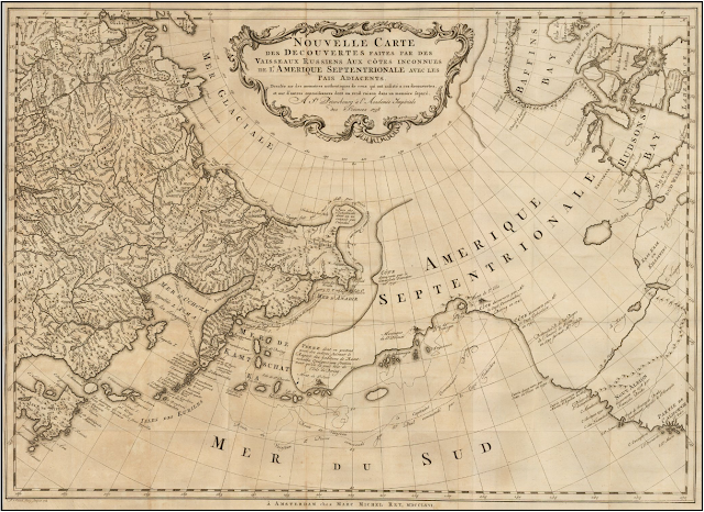
Anyway, the tweet led me to the Vetus Carta site where this gorgeous 1766 of eastern Russia and western North America is on sale.

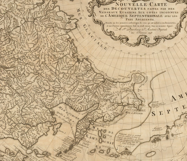
Nouvelle Carte Des Decouvertes Faites par Des Vaisseaux Russiens Aux Cotes Inconnues De L'Amerique Septentrionale Avec Les Pais Adiacents ('New Map of Discoveries Made by Russian Vessels on the Unknown Coasts of North America with Adjacent Countries') published in Amsterdam in 1758 by Gerhard Friedrich Müller.

The image above is from Barry Lawrence Ruderman, where the image is available to zoom into in high-quality (and where it's on sale as well). Vetus Carta, though, provides an impressively detailed overview of the map, which, by the way, is properly titled Nouvelle Carte Des Decouvertes Faites par Des Vaisseaux Russiens Aux Cotes Inconnues De L'Amerique Septentrionale Avec Les Pais Adiacents ('New Map of Discoveries Made by Russian Vessels on the Unknown Coasts of North America with Adjacent Countries') published in Amsterdam in 1758 by Gerhard Friedrich Müller.

Anyone interested in the finer details of the map's history should visit the Vetus Carta site. From my perspective, one of the most important points of this history is that this map not only went on to inspire many other, contemporary map-makers, but that it helped to debunk some of the popular, though incorrect thinking about the region at the time. It was a groundbreaking map in that it was more scientific than other maps of the region that were already available.

Vetus Carta goes on to note some of the inaccuracies in this map, which, again, was more accurate than most of what was already out there: first, it shows a “River of the West” at the “entrance discovered by Martin d’Aguilar in 1609.” This river, which supposedly ran from Hudson's Bay to the Pacific, is a figment of someones imagination. There is also a supposed entrance into the continent that the map-maker says was discovered by Juan de Fuca in 1576, this is incorrect as well. There's also the incorrect shape of Alaska.

From my perspective, as a layperson who really enjoys these antique maps, there are some different things that have caused me to add it to my wishlist other than its historic significance.

Nouvelle Carte Des Decouvertes Faites par Des Vaisseaux Russiens Aux Cotes Inconnues De L'Amerique Septentrionale Avec Les Pais Adiacents ('New Map of Discoveries Made by Russian Vessels on the Unknown Coasts of North America with Adjacent Countries') published in Amsterdam in 1758 by Gerhard Friedrich Müller.

I love the blanks on this map. Its amazing to think of a time when people looked at vast spaces of the world and said "we have no idea what's there". Of course, someone knew what was there, but the Russians who provided the information for this map, did not, and so we're left with an enormously large void whose contents could have been anything. For similar reasons, I love the inaccuracies in northern Quebec and around Hudson's Bay.

Nouvelle Carte Des Decouvertes Faites par Des Vaisseaux Russiens Aux Cotes Inconnues De L'Amerique Septentrionale Avec Les Pais Adiacents ('New Map of Discoveries Made by Russian Vessels on the Unknown Coasts of North America with Adjacent Countries') published in Amsterdam in 1758 by Gerhard Friedrich Müller.

I also love the contrast in this map between the detailed Russian territory which appears to be a place that was known to European map makers on the one hand, and the supposed emptiness of North America on the other. The places seem so tantalizingly close to one another, and yet, the people living in the east, who knew their own lands, knew nothing of the west or the people in it.

Nouvelle Carte Des Decouvertes Faites par Des Vaisseaux Russiens Aux Cotes Inconnues De L'Amerique Septentrionale Avec Les Pais Adiacents ('New Map of Discoveries Made by Russian Vessels on the Unknown Coasts of North America with Adjacent Countries') published in Amsterdam in 1758 by Gerhard Friedrich Müller.

Some of the annotations on this map are also wonderful. The indications of the voyages of Russian explorers are fascinating historic details, but comments like the one above are just great. It reads: 'Land about which we have claims from residents of Kamchatka, some of whom say that it can be seen from Bering Island'. This is just more reinforcement of how close the land of the map-maker is to the land about which he knows nothing, and how tempting such a place may be for an explorer.

This is really a great map, and one that I'd love to have if I could ever afford such wonderful things. Until then, I can enjoy it as part of my virtual wish-list collection.