Monday, January 29, 2018

Missing Pieces: Mitchell's 1867 Washington, D.C.

For the few years I lived in Washington, D.C., anytime I found myself in Georgetown, I would make a point of trying to stop in at the Old Print Gallery. This was a unique shop. It didn't have that dusty, feeling of some map shops that I love, but instead was clean, sleek and modern feeling. It had row upon row of cases of maps and prints arranged by location, alphabetically, and it had some true


gems, like Bunting's Cloverleaf of the world with Jerusalem at the center.

They also had a beautiful original of the first plans for the city of Washington, D.C. in 1792 by Andrew Ellicott. It was being sold for over US$40,000. Living in Washington, I knew I wanted a map of the city, and the Ellicott was truly the pinnacle of all such maps, but for me, at that price, it may as well have been one million dollars. It was unobtainable.


This image is in far worse condition than the one at the Old Print Gallery


I no longer live in Washington, but I'm disappointed to learn that the shop has closed, and merged with it's sister shop in New York City. It's a shame, because it was such a wonderful place, and I don't know of any other shops in D.C. that were as specialized.

The price of the Ellicott map being what it was, I turned to the internet to find myself a nice map of D.C. to add to my collection and came across a shop in Vancouver, British Columbia called Joyce Williams Gallery who had a great selection and very fair prices.

After speaking and corresponding with their friendly owner, I settled on this beautiful, very fine 1867 Augustus Mitchell Jr. map of Washington, D.C.


There's a lot to love about this map. Its wonderful to look at. It has an attractive floral border that somehow just pops out, without taking away from the map itself.

It also shows a number of details which may have been common for the time, but that today we would recognize as archaic, or simply unusual. For example, the White House is referred to on the map as the "President's House", This is a use that may be considered even more unusual because, as wikipedia notes, the place was called the White House as early as 1811, some 56 years before this map was published.

Another wonderful thing about this map is what it doesn't show. Some of the things tourists flock to D.C. for are absent altogether. For example, the Smithsonian is shown on the map, but only one building, not the many large facilities that make up its network. The Library of Congress is not on the map, as it would not be built for another 30 or so years. There's no reflecting pool either, and one may notice that the National Mall is not at its full length.


Most stark, perhaps, was something that actually did not jump at me right away: There's no tidal basin! The famous cherry blossom ringed body of water, the site of the Jefferson Memorial, just did not exist at the time this map was made. I looked at this map for quite some time before I even noticed that! Indeed, apparently, the idea for the basin didn't even originate until the 1880's, almost 15 years after this map.


The Mitchell map certainly lacks the historic value of the Ellicott, but it's a gorgeous piece, and one that I'm very pleased to have in my collection.


Thursday, January 25, 2018

Come From Away: Colton's New Brunswick, Nova Scotia, Newfoundland and Prince Edward Island

In the Canadian Maritime and Atlantic provinces, someone who's from any place other than one of those four provinces is known as a CFA, a come from away: because that's where you're from, away.

A few years back, my wife and I went on a fabulous road trip through the Maritime and Atlantic provinces (Newfoundland and Labrador is an Atlantic province, not a Maritime one), had an amazing time, met some wonderful people, saw some great sights, ate some great food, got engaged and I bought a couple of maps!

The map I'll feature in this post is a gorgeous Colton, first published in 1855 of New Brunswick, Nova Scotia, Newfoundland and Prince Edward Island. I bought this map at an art gallery in Halifax that also sold some maps called Zwicker's Gallery (a place that is itself an institution). They had some other beautiful maps of the region (Including a great one with images of some dogs this part of the world are famous for, notably the Labrador and the Newfoundland Dog), but this was the only one I could afford at the time.


 I love this map! There's so much about it that's appealing.

First, just look at it! The border is gorgeous. It has that wonderful element of spilling outside the border, showing every element of the land. It breaks up the provinces (colonies at the time) into counties, which I don't believe are particularly significant these days, and it's in excellent condition. Even the name plate of the map is appealing.

The way "Colton" is written, the various fonts of the names of the different places...I just find this map very pleasing to look at.

Second, the history represented on this map is wonderful. Nova Scotia and New Brunswick were among the first four provinces of Canada which came together for confederation in 1867. Prince Edward Island would only join Canada in 1873 (largely because of heavy debt from having built a railroad on the small island), and Newfoundland joined still later, in 1949, after a much debated referendum.

Third, the detail on this map is impressive. So many of the tiny bays, capes and coves on Newfoundland are named. Some of these places may have been, or were being settled for the first time around when this map was published. Other places, including some of Newfoundland's largest communities today are completely absent from the map, in some cases, like Gander, Newfoundland, because they didn't even exist until around 100 years later.


 A final thing I enjoy about this map, is that it presents another mystery to me. The map clearly says it's a Colton. It also says it was first published in 1855. That doesn't mean that the actual paper map I have is from 1855, it could be more recent. There's an annotation from the seller next to the page number (19) that shows the year 1864. The problem is, when I search, I can't find any Colton atlases published that year. Even when I go through the ever-useful Rumsey website, I can find very similar Colton maps, but none that are on page 19. Perhaps even more strange, there is an almost identical Johnson map that is printed on page 19 from 1865, but it is clearly not the same map I have. All I've been able to find is someone selling the identical map (in rough condition) on ebay. This person claims their map is from 1855, but they may simply be looking at the date of first publication, which could be quite different from the date of actual printing. I'm including a screen capture of the item for sale below.

Once more, another mystery to solve. Anyone with thoughts or insights is encouraged to let me know!


Monday, January 22, 2018

Add it to the Wishlist: Map of Cartagena, Colombia

My map collecting began as a way to bring home interesting, historical souvenirs from places I travel to. I don't have or seek out maps of countries I have never visited, even if sometimes I have a map of a city I have not been to in that country. That's why this gorgeous map of Cartagena, Colombia makes the wishlist. My wife and I honeymooned in Cartagena, and while there, the only antique map I was able to find was from a nearby Colombian town, but not Cartagena itself.
This is an uncolored version of the map in question

This beauty, however, goes right onto the wishlist.

I noticed the map on twitter, here, as one of the new acquisitions of a New York City based map-dealer Geographicus, rare antique maps. There's plenty of information about the map itself and the cartographer on the Geographicus website, so I don't need to repeat any of that, but I want to point out a few things I love about this circa 1766 map by Dutch cartographer Isaak Tirion.

First, one of my favourite things about any old map is seeing the obvious changes to the place over time. Today, Cartagena feels sprawling, and the undeveloped area on the map labeled Terra Bomba is now a modern, developed area with narrow high rises and hotels, reminiscent in many ways of Miami Beach.
The fortress on the 1766 map named "Kasteel van St. Lazarus" is no longer referred to by that name anymore. It's now the impressive
Castillo de San Felipe de Barajas that my wife and I reached the top of in a sweaty, somewhat miserable hike (it was worth it).

Second, I love the artistic detail of the map. The hills outside the walls being drawn as hills, the beach is clearly a beach, the shores are clearly marshy and vegetated and areas on "Eil Manga" are under cultivation.

I love the detail of the walls surrounding the city, with even the smallest turn or curve appearing on the map, nothing is glossed over.

I also love the identification of the hospital outside the city walls, which I'm guessing was done historically to keep the sick away from the rest of the population. A detail which if true, is a fascinating bit of history enshrined in the map.

Also, item number one on the legend is called, in Dutch "de dom of hoofdkerk" which seems to translate to "the main Church or Cathedral". What's interesting here is that it appears to also show the Palace of the Inquisition, which is across the street, but not named.

I also get a kick out of what seems like a quirky element of the map. The ocean beyond Cartagena is the Atlantic, but this map simply says "the sea". It simply assumes that the viewer knows where in the world the city is, and has no need to name the Atlantic, probably the most important Ocean in the world for the Dutch at the time.

The map is truly gorgeous, and is on the market, only far beyond my means. I have no relationship whatsoever with the seller, but I do hope it finds a good home. 

Wednesday, January 17, 2018

Caribbean Vacation Map

The third map I'll feature here (though I don't think it's the third I ever bought) is of the Lesser Antilles and it's one of C.S. Hammond's.


I know the image quality here isn't the best. Perhaps I can try again later and update this post.

The map is not the most beautiful I own. I bought it mostly as a souvenir of a cruise I was on that stopped in Puerto Rico, or as this map says "Porto Rico".

The map is a fun one to me. It offers that snapshot of history I love, showing places which are currently sovereign states as colonies, unusual spellings and a case where the map spills outside it's own borders, as does Trinidad and Tobago.

Originally, I thought that the map was cut out of an older magazine, based on the paper and because it's not a full page, just an imperfectly cut out map. After researching the information in the map legend though, I believe it almost certainly came from an atlas.


The problem with this legend, and the mystery of this map is that it doesn't give me a year. I know Hammond began publishing maps in 1900. This map, came in a folder upon which the seller had jotted down circa 1910. So-far, so good. Only, just because a vendor says a thing, does not make it true. Especially this person, who was a general antiques dealers and had no maps other than this one. (By the way, I paid nowhere near the price listed under the date).

My first search ended up at David Rumsey (as do all searches for antique maps). He has a map that's nearly identical to mine, but published in 1948.


If you take a look at his site, you'll see that the map is very similar to mine, but zoom in on Porto Rico. The map on Rumsey's site lists the island as Puerto Rico. So these maps are not the same, and given that Puerto Rico replaced Porto Rico, I think I'm safe to assume that my map predates 1948. See, for example, this website (which I have nothing to do with) selling a different Hammond map of Porto Rico from 1910 with the same spelling as mine.

Then I came across a fabulous site for maps of the Caribbean called Caribmap. They have a map, produced by Hammond, very similar to mine from "the New World Loose Leaf Atlas" published in 1931. Take a look at it here. It's hard to spot any differences. The only one that jumped at me is not part of the map itself, but is the note "rb-29" in the bottom left corner. I know my map is poorly cut out, but I think it has enough of a margin that if my map was the same as the Caribmap one, I'd see that annotation.

So again, a map leads me on a little mystery, and I've learned a lot in the search. I know Hammond did publish world atlases circa 1910, but I don't have images of any of them to readily look through. I don't have an answer to this one though, and hopefully, once more, some friendly expert out there can point me in the right direction.

Sunday, January 14, 2018

The Mystery of the Turkish Map: Solved


As an amateur map collector, I find that sometimes my acquisitions can be hit or miss. Sometimes I buy something and it turns out I make a great purchase from someone who may not realize exactly how good an item they're selling, and sometimes I pay too much for something I think is beautiful, but is not really an item of any value other than the aesthetic.

I wrote here about my second ever map purchase. It was this beauty:


I explained a bit about how I came to doubt its authenticity as an antique, and how I could not find anything else like it anywhere. It turns out, not only was I right to doubt it's age, but I should have questioned whether or not it was truly a map, or meant as one.

When I originally posted about this map, I tweeted about it to my followers and hoped that someone could have some insight for me. I dug a bit deeper after a commentor on the blog suggested I try reaching out to Turkish diplomatic missions, which I did. This turned out to be an excellent suggestion.

In a triumph of digital diplomacy, the Turkish Embassy in Dublin responded relativley quickly. I'll reproduce their helpful reply.


So right away, I received more information on my map than I had ever had. I knew the name of the man in the image on the map and learned that not only might the map be new, but that the language may not be right. I reached out to the two twitter accounts the Embassy suggested and heard back, fairly quickly from the very friendly person behind @JourneyHistory.

He responded that the map, wasn't really a map, was a modern miniature painting, made to look like it was in the Ottoman style, and on paper that was probably distressed, to make it look old. He sent me a link to dozens of images, none of which are maps, but many of which have a strong stylistic resemblance to my piece. 

For example:

Image result for Eski Osmanlı minyatür

What's more, I was told that the writing on the artwork may actually be complete gibberish. Essentially, the equivalent of mashing the keys on your keyboard and putting whatever comes out into fancy calligraphy. His theory being that not many people read that language any longer, and that the artists making these images probably even less so.

Another helpful commentor on my blog, the helpful and friendly Halim, suggested that it's possible that the writing on the map is another language transliterated, maybe Italian or Ladino. Ladino, or Judaeo-Spanish would be especially interesting, given that it was a language spoken primarily by Jews in the Ottoman Empire. A group that would not ever have represented a majority, and also strange for a modern artist to use.

So, thanks to this blog, the powers of the internet and what I believe is a human inclination to bend towards kindness and helpfulness, I have an answer to my own, personal map mystery: My map is not a map, it's basically just a painting, and it is not old, nor is the paper it's on likely to be. That said, it remains on my wall because it's beautiful, and it now comes with an even better story.

Thursday, January 11, 2018

Exceedingly Rare Aztec Map

Thanks to National Geographic, I came across this story about a map that is as much archaeology as it is geography.

The map is called thCodex Quetzalecatzin, was recently acquired by the U.S. Library of congress and is one of fewer than 100 Mezoamerican maps that predate the year 1600. In other words, it's an extremely rare, Aztec map from sometime between 1570 and 1595. 


Image of the Codex Quetzalecatzin frm the U.S. Library of Congress
The map shows the family tree and land holdings of an Aztec family and "...covers an area that runs from just north of Mexico City to just below Puebla, roughly 100 miles away to the southeast"

It contains both Aztec imagery as well as clear Spanish influences, not least the Spanish writing on the map. It appears to represent some of the earliest contact between the indigenous people of Mexico and Europeans. 

From looking at it, what strikes me is that it barely looks like a map at all. It looks more like a drawing of a landscape, or what we may call a "view", than a map. To the layperson like me, it also seems to have a strange scale and it is not immediately clear that it represents such a vast area. 

It is beautiful though, with vibrant colours and images such as this snippet: 


The U.S. Library of Congress has at least one other map like the Codex Quetzalecatzin. It's called the The Oztoticpac lands map, and though it has no doubt been the subject of extensive study, I cannot find very much about it online.


This one is even older than the Codex Quetzalecatzin and dates to around 1540. It's described as a "litigation map", relating to a property dispute. Some detail on it from The Library of Congress reads:

 The Oztoticpac Lands Map is an Aztec pictorial document with Nahuatl writing drawn for a court case surrounding the Oztoticpac estate within the city of Texcoco around 1540. The document, written on amatl paper, involves the land ownership of the Aztec ruler Chichimecatecotl, who was executed by Spanish officials in 1539. It is not clear from surviving information who won the case. Most of the document consists of black-and-red line drawings showing fields, houses, palaces, trees, and measured plots of land. In the lower left, twenty trees that have been grafted with European fruit stock in a local orchard are shown. These include apples, quinces, pears, grapes, and pomegranates.

Here's an image with a better look:

There are some fascinating details on this map, some of which probably require a better historical and cultural knowledge to understand, but which to the layperson, are interesting and fun to look at.

For example, the map contains images of various plants. The quote above explains what they are, but some of the images are so curious. For example, in the image of the plant below, whose disembodied hands are those, and why are they there at all? Whose disembodied heads are these and, what's this man doing all alone on this plot of land? These seem to be more than just decorative, and when considering that this map was used in a court case, one has to imagine that they are meant to reflect a certain ownership of a particular area shown on the map.


One reason I love antique maps is because they represent a snapshot of what a place was like at a specific moment in time. These maps do that, and then some. There are not just about what places looked like, but they tell us about who lived there and how they lived. This is more than you would get from your average antique map. It's why, as I wrote above, that maps like this fall into the category of archaeology. They help us understand how people who are long gone structured their lives and societies. They're windows into history and a pleasure to look at.

Monday, January 8, 2018

My Mystery Map: Istanbul

The second map I ever bought was in Istanbul, but it's the map I know the least about, and the more I read and hear about it, the more I'm convinced that it's more of a pretty work of art than it is an actual antique map. In fact, after extensive searching, I can't find anything that even looks like it online.

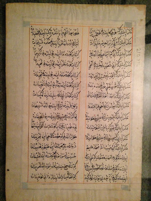
When buying the map, I faced a real language barrier, but it was from what appeared to be a reputable shop that had a small number of other, somewhat similar maps. What I understood from the strained conversation was that this was a page from an antique Ottoman atlas showing a map of Istanbul. I'm pretty sure now that this was not correct. Take a look and I'll try to break it down.


So above is the front of the map I bought and to the right is the reverse of the page. This map is framed and hanging on my wall, so I can't handle it, but my recollection was that the paper seemed authentic, or at the very least, not modern. Also, I cannot read the writing on this map, but it seems clear to me that it was not printed and was probably done by hand. I believe that it's the Ottoman Turkish Alphabet, which borrows from Arabic and Persian.

There are some clues about the map, but I have a hard time deciphering them. For example, I can't figure out who the hirsute chap in the photo is. I would guess he's supposed to be an Ottoman Sultan, but maybe he's a governor of the city, or some other important person.

There's also the banner at the top-center of the page. From what I can tell from searching here, it looks like an Ottoman banner that may have been used in the 18th century, but this is anything but certain.


Then there's the cityscape itself. I'm not sure what vantage this view was taken from. As best as I can tell from playing around with google streets view from Istanbul, this image is meant to be taken from the Bospherous, looking south from Galata. Somewhere around the area marked in blue.


This brings me up against a few problems. The mosque on the right hand side has three minarets and the one on the left has four. I'm pretty sure, just from the drawing, that the mosque with three minarets is meant to be the Hagia Sophia. That's simply what it looks like. The problem is, the actual Hagia Sophia has four minarets. The other mosque, which is blue in colour, could be meant to be the Blue Mosque, but that one has six minarets. Even playing around on google streets view, I can't figure out what possible vantage point would give the viewer a sight of two mosques, on on the right with three minarets and one nearby on the left with four.


I brought this map for an informal appraisal to a shop in Washington, D.C. where I used to live. The appraiser agreed that the paper it was on was old, and was less concerned than I was that the colours of the map were too vibrant to be old. Her view, however, was that the drawings themselves looked modern, that they do not reflect the way something may have been drawn long ago and that the painting of the map was probably quite new. She may be on to something. A close look at the map (not something I can show in a photo) reveals that there is text behind it, in the same script as the text on the reverse.

I'd love to know more about this map if there are any knowledgeable or sleuthy people out there who can help (or anyone who can read the Turkish).

In the meantime, despite it probably not actually being an antique map, it's still a beautiful bit of work and I'll happily keep it on my wall.

Wednesday, January 3, 2018

Add it to the Wishlist: 1714 Map of North America

I enjoy looking at websites that showcase antiquarian maps and follow accounts of that type, as well as map vendors on Twitter. As a result, I often come across maps that I think would be so wonderful to have in my collection if only I could find or afford them.

Since maps like that make me mappy, I thought my mappy place would be a great place to keep a running wish-list and explain what it is about certain maps that I love.

Today's wishlist map is this beauty of North America from 1714 that I found on mapmania:


There's so much great stuff going on in this map, but first, here's the little I could learn about it, thanks to this always great source, there's a good deal of information available. This map comes from an atlas meant to show recent and new long voyages of European discovery in different parts of the world. The language on the map is French, but the publisher, Pierre Van der Aa, is Dutch and was working in Leiden. Apparently, many of the other maps in the Atlas are similarly beautiful, featuring elaborate cartouches with titles.

I want to point out a few things about this map that I love and that piques my interest in it.

First, I love that it's incomplete. The map is virtually blank to the west of the Mississippi and north of what would today probably be Texas. The Arctic is unexplored, it appears that Greenland is attached to the North American mainland and California may or may not be an island.

Greenland 

Is California connected to anything?

I also love how political boundaries are drawn on this map. European spheres of influence dominate. There is Canada/New France, which extends to the Southern United States and as far west as the Mississippi. Pre-Seven Years War, New England is hemmed in by the Appalachians, with the French on the other side, and there appear to be a number of polities that I had originally thought were all Spanish. This map identifies them separate: Florida, New Mexico, New Spain and California are all distinct from one another. I admit to being surprised by this and not knowing the history of these regions well enough to understand the distinctions.

Under each of these European polities, however, are the identification of First Nations groups that lived in these areas. For example, there are regions listed as being dominated by the Illinois, the Outaouais and that 'the Apaches are powerful to the west of here'.

Powerful Apaches to the west

 There are a few other things I love about this map. Other than the beauty of the cartouche, and the identification of certain routes of exploration by great navigators, the map has a couple of elements I find somehow whimsical. My favorites are the annotations that in some places there is floating vegetation, though, not as bad as in other places on the same map. This was probably important for navigators to know,
and interesting for Europeans to learn about, but to me, today, it seems somehow comical.

This map definitely makes the wishlist!