I recently wrote about my 1830 map of southern Africa. One reason I found that map so interesting, was that it showed an Africa which had tribes in it, but very few European powers were setting up colonies in that part of the world.
This map of Southern Africa from 1635 is on sale by Inter-Antiquariaat Mefferdt & De Jonge in the Netherlands (as always, no affiliation). Take a look:
The sellers of this map have some good information about it on their website. They note a few interesting points. For starters, this map pre-dates Dutch colonies in this part of the world. It also notes that much of this map is based off of Portuguese maps, which are of mixed-degrees of accuracy.
The map does a pretty good job showing off various coastal place names, but these seem to be the names of geographic features (i.e. bays, coves, etc). There are also a few towns shown in the interior, but like the 1830 map of the same region, this map does not try to pretend to know what lies just beyond the coast.
Also notable is the lack of names of tribes found on the 1830 map. It may be that Europeans were not sufficiently familiar with the inhabitants of Africa to name them. Part of South Africa on this map is named "Caffaria", or Kaffraria, which is a word that has at its root a derogatory term for Africans. The name of this place appears on the 1830s map as well, and so it seems that Europeans were either indifferent to the disrespectful use of the word, or that it only fell out of accepted usage at a later date.
It's also interesting that even though there was little European presence in Africa at the time of this map, Africa is still divided into regions, for example, Mozambique--with its wonderful little elephants--clearly has a border. It's not clear what exactly prompted the inclusion of this border.
Finally, aside from the historic interest and value of this map, being a Blau, one of the reasons it ends up on the wish-list is its aesthetic beauty. The cartouche, and this lonely little turtle in the Gulf of Guinea, make it a stunning map for the collection of anyone interested in this part of the world.
Thursday, April 19, 2018
Monday, April 16, 2018
5 Incredible Historic Details from Herisson's 1806 Map of North America
My wife and I took a road trip through the Southern USA and on our travels, I had hoped to find a good antique map of the region, or even of the colonial United States. I didn't get exactly what I wanted. In Savannah, Georgia I spent some time in the lovely shop of V & J Duncan (as always, no affiliation) and picked up Herisson's 1806 Map titled L'Amerique Septentrionale and L'Amerique Meridionale. Both maps are from the "Atlas du dictionnaire de géographie universelle" and are each so chock-full of amazing features I have to separate them into two blog posts.
For anyone interested, a high quality zoomable image of the map is available on this site (where it is also for sale and where I have no affiliation) though I think the coloring on mine is more attractive.
Without further ado, the 5 most awesome things about this map:
1) The Arctic: It's clear nobody really knows what's going on up there. Greenland appears to be attached to the north American mainland, there is no Arctic Archipelago and the map-maker is pretty sure that there's no North-West Passage.
2) The fortress of the Appalacian Mountains: While there are settlements on the east coast of the continent and in central Canada along the St. lawrence, Settlement has not ventured west of the Appalacians at the time and the west is tantalizingly blank.
3) The Interior: As alluded to above, so little is happening in the interior of this map. There is some good detail of lakes and rivers, even in remote locations, like Great Slave lake, far in the Canadian north. We also get some detail of various forts or trading posts and an interesting village of first nations people. Other than that though, the west is basically unknown to the map maker.
4) The political boundaries of the map: The barely 30 year old United States is shown, as is Louisiana, whose border with New Mexico and British Canada is undefined, especially in the west, where it just sort of stops. Much of central America is identified as Mexico or New Spain, and Florida was a Spanish possession, though that is not clearly indicated on this map.
5) There are mistakes! Maybe this isn't a historic detail, per se, but the map has a number of mistakes. Three jump out at me. For one, Mount Hood seems to be referred to as Mount Sood. This probably isn't too big a deal, and the location seems accurate. The second is Cape Cod. It's way south. South of Annapolis even. It's not even close to Massachusetts. Finally, Haiti does not appear on this map. Haiti gained independence in 1804. This map, from 1806, two years later, makes no allusion to a Haiti existing at all.
This is a great map. I'd love to hear the thoughts of others on what you find interesting about it.
For anyone interested, a high quality zoomable image of the map is available on this site (where it is also for sale and where I have no affiliation) though I think the coloring on mine is more attractive.
Without further ado, the 5 most awesome things about this map:
1) The Arctic: It's clear nobody really knows what's going on up there. Greenland appears to be attached to the north American mainland, there is no Arctic Archipelago and the map-maker is pretty sure that there's no North-West Passage.
2) The fortress of the Appalacian Mountains: While there are settlements on the east coast of the continent and in central Canada along the St. lawrence, Settlement has not ventured west of the Appalacians at the time and the west is tantalizingly blank.
3) The Interior: As alluded to above, so little is happening in the interior of this map. There is some good detail of lakes and rivers, even in remote locations, like Great Slave lake, far in the Canadian north. We also get some detail of various forts or trading posts and an interesting village of first nations people. Other than that though, the west is basically unknown to the map maker.
4) The political boundaries of the map: The barely 30 year old United States is shown, as is Louisiana, whose border with New Mexico and British Canada is undefined, especially in the west, where it just sort of stops. Much of central America is identified as Mexico or New Spain, and Florida was a Spanish possession, though that is not clearly indicated on this map.
5) There are mistakes! Maybe this isn't a historic detail, per se, but the map has a number of mistakes. Three jump out at me. For one, Mount Hood seems to be referred to as Mount Sood. This probably isn't too big a deal, and the location seems accurate. The second is Cape Cod. It's way south. South of Annapolis even. It's not even close to Massachusetts. Finally, Haiti does not appear on this map. Haiti gained independence in 1804. This map, from 1806, two years later, makes no allusion to a Haiti existing at all.
This is a great map. I'd love to hear the thoughts of others on what you find interesting about it.
Wednesday, April 11, 2018
Add it to the Wishlist: Tobias Conrad Lotter Map of Galicia and Lodomeria ca. 1775
My maps tend to be of places I've visited. I would make an exception for this one, because though I've never been to this place, my ancestors knew it well.
This is a map of Galicia, parts of what today are in Poland and Ukraine, but at the time of this map, were parts of a kingdom under Austrian, Hapsburg rule.
Here's the map, it's held by the New York Public Library, and I'm not sure that any copies of it exist on the market for a collector to aquire.
I found the map on this website, which allows you to zoom in and really explore it, and also provides some good detail on it. The map is undated, and it's estimated that it was made between 1772 and 1810. It's assumed, however, that it was published during the lifetime of the map-maker, Lotter, which would place it around 1775.
I've always kept an eye out for a map that showed the town I've heard stories about from my only grandparent not to be born in Canada. The town she was born in was alternately called Javorov, Jawrow, or today Yavoriv, where there is a NATO training facility and which is in Ukraine, near the Polish border. The nearest big city, which is the one where it sounds like members of my family traveled frequently for business is Lemberg, known today as L'viv, also in Ukraine.
Based on this map, and its legend, Jaworow was an ordinary town along a postal route and seems to have had a post office.
The map is a true historical snapshot. The kingdom of Galicia no longer exists. Instead of being within Poland, the town of Yavoriv now lies within Ukraine. If you have the stomach, you can also read this nearly contemporary account of what befell the Jews of the town during the Holocaust (incidentally, also from the New York Public Library). Relatives of my grandmother are listed among the murdered from that town.
This is a map of Galicia, parts of what today are in Poland and Ukraine, but at the time of this map, were parts of a kingdom under Austrian, Hapsburg rule.
Here's the map, it's held by the New York Public Library, and I'm not sure that any copies of it exist on the market for a collector to aquire.
I found the map on this website, which allows you to zoom in and really explore it, and also provides some good detail on it. The map is undated, and it's estimated that it was made between 1772 and 1810. It's assumed, however, that it was published during the lifetime of the map-maker, Lotter, which would place it around 1775.
I've always kept an eye out for a map that showed the town I've heard stories about from my only grandparent not to be born in Canada. The town she was born in was alternately called Javorov, Jawrow, or today Yavoriv, where there is a NATO training facility and which is in Ukraine, near the Polish border. The nearest big city, which is the one where it sounds like members of my family traveled frequently for business is Lemberg, known today as L'viv, also in Ukraine.
Based on this map, and its legend, Jaworow was an ordinary town along a postal route and seems to have had a post office.
The map is a true historical snapshot. The kingdom of Galicia no longer exists. Instead of being within Poland, the town of Yavoriv now lies within Ukraine. If you have the stomach, you can also read this nearly contemporary account of what befell the Jews of the town during the Holocaust (incidentally, also from the New York Public Library). Relatives of my grandmother are listed among the murdered from that town.
Monday, April 9, 2018
1764 Bellin map of Santa Marta, Colombia
My wife and I took our honeymoon in Cartagena, Colombia. I really wanted to try to find an antique map of the city before I left, but had a hard time locating anyone who had any selection to sell.
We found one antique dealer who had literally one antique map. It was not of Cartagena, so that one is still on the wishlist, but I did get my hands on something great. Behold my 1764 Bellin map of Santa Marta, Colombia.
As always, David Rumsey has a better zoomable version, and I note as well that the map is held in the collection of the National Library of Colombia.
I don't know too much about Colombia's history, and almost didn't buy the map because I had never heard of Santa Marta--Sainte Marthe on the map--had not visited it, and didn't want a map of a place that meant nothing to me. The seller told me a bit about the town and then, I had to have the map.
Santa Marta was the first Spanish colonial city in Colombia. It's also the oldest surviving city in that country and the second oldest in all of South America. It was founded in 1525, contrast that with the first attempt at founding Quebec City in 1535.
The map is also a Bellin. Many map collectors and historians, recognize Bellin as an important cartographer, producing a wide range of high quality maps in France in the mid to late 18th Century. That was another hook for me, as well as the map's age. This one was produced in 1764.
There are a few elements of the map that make it visually quite interesting. For one, at a glance, I find it looks as though the ocean is to the right of the town, when clearly, it's to the left, in the west. One reason I think my mind plays this trick is the contours around the hill make it seem to be an island.
I also really like the depictions of the small forts and "castles" along the coast. They are not given too much detail by Bellin, but are an attractive feature of the map.
Though it's not from a place I've been, this map is still of historic significance, and makes a souvenir of the adventures we went through, off the tourist path, to find and buy it. I'm proud that it's in my collection!
We found one antique dealer who had literally one antique map. It was not of Cartagena, so that one is still on the wishlist, but I did get my hands on something great. Behold my 1764 Bellin map of Santa Marta, Colombia.
As always, David Rumsey has a better zoomable version, and I note as well that the map is held in the collection of the National Library of Colombia.
I don't know too much about Colombia's history, and almost didn't buy the map because I had never heard of Santa Marta--Sainte Marthe on the map--had not visited it, and didn't want a map of a place that meant nothing to me. The seller told me a bit about the town and then, I had to have the map.
Santa Marta was the first Spanish colonial city in Colombia. It's also the oldest surviving city in that country and the second oldest in all of South America. It was founded in 1525, contrast that with the first attempt at founding Quebec City in 1535.
The map is also a Bellin. Many map collectors and historians, recognize Bellin as an important cartographer, producing a wide range of high quality maps in France in the mid to late 18th Century. That was another hook for me, as well as the map's age. This one was produced in 1764.
Though it's not from a place I've been, this map is still of historic significance, and makes a souvenir of the adventures we went through, off the tourist path, to find and buy it. I'm proud that it's in my collection!
Wednesday, April 4, 2018
15th Century Viking Map of Vinland Being Studied by Yale
I recently came across this article about Yale doing an examination of the Vinland Viking map. I had heard about Vinland, but don't recall having heard about this map before. In short, Vinland is an as yet undiscovered location supposedly settled, at least briefly, by the Vikings in the 15th Century, before Columbus reached the New World. This map, which would have been almost as old as the Viking discovery, showed Vinland.
Here is an image of it from Wikipedia.
It's a pretty cool map, and very exciting to have so old a map of the new world. The problem is, it's almost universally considered to be a fake. There is some disagreement on this, but the majority of scholars have dismissed this map as being inauthentic for a number of reasons including the chemical composition of the ink used (it contains substances unused until the 1900s) and the way it was bound into a larger manuscript which would have rendered much of it illegible.
Nonetheless, Yale is putting some serious work into researching this map. They are looking at the topography of the map itself, studying the DNA of the animal skin it was printed on, and examining the maps's chemical composition. It's all very impressive, and still, they don't expect to prove its authenticity. Instead, they're trying to study a document which has become so culturally important, that many atlases feature it even with the notation that it's probably fake.
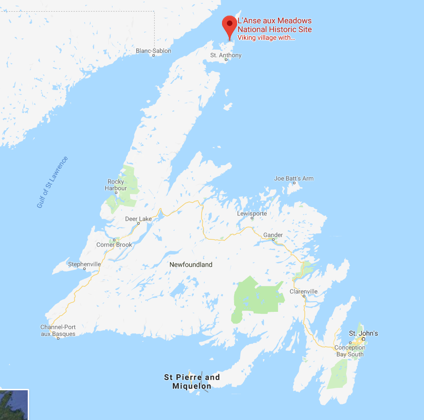
So then, what is Vinland? The answer is that nobody's quite sure. There are disagreements among experts as to what the word Vinland meant to the Vikings and whether it was a single place, or multiple places. If Vinland does refer to vines, or wine, as some suggest, it means that it must be at least as far south as the south shore of the St. Laurence River, where Jacques Cartier found wild vines. One thing that does seem more certain is that the only actual archaeological evidence of Viking settlement in North America, the site at L'Anse aux Meadows, Newfoundland, is not Vinland.
L'Anse aux Meadows is a remote site at the northernmost point of Newfoundland. Viking artifacts have been found there, as well as building materials from Iceland and Greenland that date to around 1000 C.E. This is conclusive evidence that there were Vikings living in Newfoundland, for at least a short time, around 500 years before Columbus and any other European reached the area. The site, however, is considered by historians to be a base, or a waypoint for onward exploration. It was probably just a place to stop, maybe repair boats, take on more supplies, and then keep exploring onward. As such, the location of Vinland remains a mystery, and this map will likely not be helpful in finding it.
As an aside, I had the good luck of visiting L'Anse aux Meadows, which is not an easy place to get to, but which is stunningly beautiful and worth the trip. It also has a reconstruction of what the Viking settlement on the spot may have looked like. It's a long trip, but in my view, absolutely worth it. Check out some pictures I took while there.
Here is an image of it from Wikipedia.
It's a pretty cool map, and very exciting to have so old a map of the new world. The problem is, it's almost universally considered to be a fake. There is some disagreement on this, but the majority of scholars have dismissed this map as being inauthentic for a number of reasons including the chemical composition of the ink used (it contains substances unused until the 1900s) and the way it was bound into a larger manuscript which would have rendered much of it illegible.
Nonetheless, Yale is putting some serious work into researching this map. They are looking at the topography of the map itself, studying the DNA of the animal skin it was printed on, and examining the maps's chemical composition. It's all very impressive, and still, they don't expect to prove its authenticity. Instead, they're trying to study a document which has become so culturally important, that many atlases feature it even with the notation that it's probably fake.
So then, what is Vinland? The answer is that nobody's quite sure. There are disagreements among experts as to what the word Vinland meant to the Vikings and whether it was a single place, or multiple places. If Vinland does refer to vines, or wine, as some suggest, it means that it must be at least as far south as the south shore of the St. Laurence River, where Jacques Cartier found wild vines. One thing that does seem more certain is that the only actual archaeological evidence of Viking settlement in North America, the site at L'Anse aux Meadows, Newfoundland, is not Vinland.
As an aside, I had the good luck of visiting L'Anse aux Meadows, which is not an easy place to get to, but which is stunningly beautiful and worth the trip. It also has a reconstruction of what the Viking settlement on the spot may have looked like. It's a long trip, but in my view, absolutely worth it. Check out some pictures I took while there.
| This depression was the actual site of a Viking structure. |
Thursday, March 29, 2018
First Nation's Mapping of Canada: Ochagach's 1730 Map
I wrote about an amazing 1762 map of Canada I found online. One of the things that fascinated me about that map, was a reference it had to Ochagach. Ochagach was a Cree "Indian" or First Nations person who drew a map to the west coast for La Vérendrye, the French explorer and fur trader.
There's a short bio of Ochagach here. As the bio explains, the route he proposed became essentially a crucial highway to the western parts of Canada used by fur traders. In the French context, it was the fur trade and desire for pelts that drive not only exploration, but settlement and expansion and shaped North America.
Ochagach's map is fascinating to look at and is available in "zoomable" form.
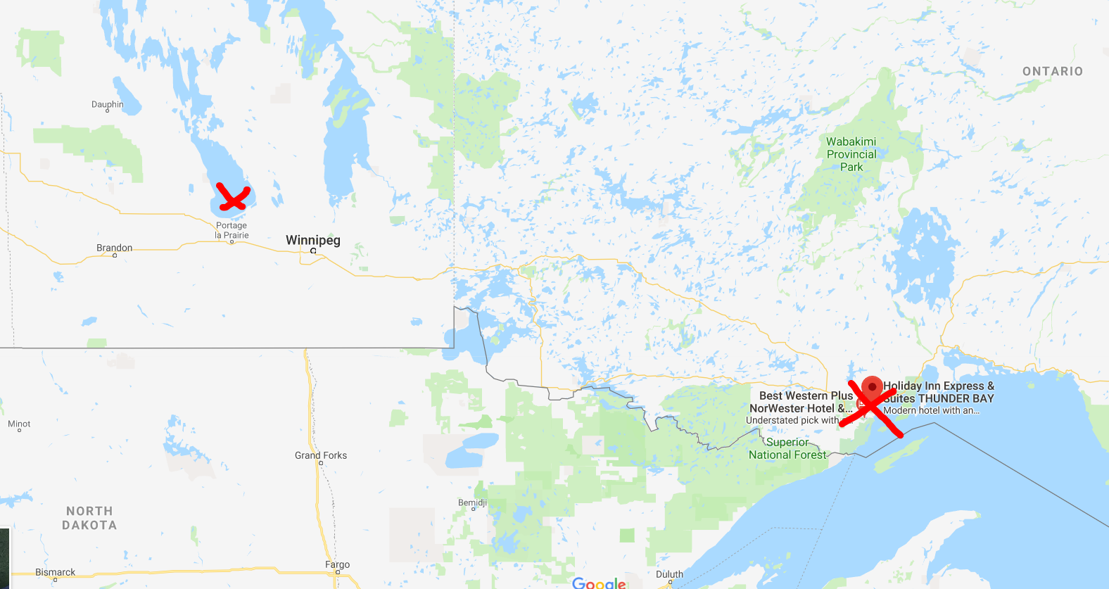
Remember, the first nations of Canada, as far as I know, had no written language or tradition of map-making. This was a person, who from his own mind, was able to prepare a map of Canada beginning at modern day Thunder Bay, Ontario and ending up somewhere beyond Lake Winnipeg, Manitoba. Today, that would be a car ride of over 1,000 KM.
This is quite a vast distance that Ochagach had good knowledge of, at a time when choices for transportation were a canoe or walking.
The map shows what appear to be a series of lakes, connected by either short rivers or portages leading ultimately to lake "Ouinipigon" which could be either modern lake Winnipeg or lake Winnipegosis. The various lakes along the route are numbered. I don't know enough about the map to know if these are numbered to help a traveller count how far along they are, or whether it refers to the number of days it takes to reach a certain point.
I've seen the map compared to the map for a subway system in that distances are somewhat reduced and the point of the map is to show a destination and tells you not very much about what goes on between the destinations. In this case, the subway "stops" seem to be the various lakes that you have to count off and traverse to get to where you're going.
There are some fascinating annotations on the map in French that are worth a closer look at.
First, there are details like the ones in this image. Where there is a rare name given to a lake, as opposed to just a number, with an interesting annotation in French: "Lake of Tecacamcouey, of three days of walking". Basically, this map is explaining how long a portage needs to be made to get to this lake.
The image with the name of the destination lake, "Ouinipigon" is also shown with a similar annotation about three days of walking. This image also notes where the Assinibois people live, and says that the map was sketched by the "Cris" or Cree people.
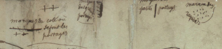
Finally, this image shows the legend of the map. Crosses represent portages. A number of horizontal lines represent large portages, a single vertical line is a short portage and dots are rapids.
There is an interesting, and short article here, in French, about First Nation's cartography. One of the more interesting points it makes, is just how influential First Nations, in general, and Ochagach in particular, was to European map makers. The article cites Ochagach's map as being the necessary information needed by both Philippe Buache and Bellin to complete their maps (images below from Barry Lawrence Ruderman). The influence is clear from just a glance.
There's a short bio of Ochagach here. As the bio explains, the route he proposed became essentially a crucial highway to the western parts of Canada used by fur traders. In the French context, it was the fur trade and desire for pelts that drive not only exploration, but settlement and expansion and shaped North America.
Ochagach's map is fascinating to look at and is available in "zoomable" form.
Remember, the first nations of Canada, as far as I know, had no written language or tradition of map-making. This was a person, who from his own mind, was able to prepare a map of Canada beginning at modern day Thunder Bay, Ontario and ending up somewhere beyond Lake Winnipeg, Manitoba. Today, that would be a car ride of over 1,000 KM.
| Approximate start and finish points of the original route |
The map shows what appear to be a series of lakes, connected by either short rivers or portages leading ultimately to lake "Ouinipigon" which could be either modern lake Winnipeg or lake Winnipegosis. The various lakes along the route are numbered. I don't know enough about the map to know if these are numbered to help a traveller count how far along they are, or whether it refers to the number of days it takes to reach a certain point.
I've seen the map compared to the map for a subway system in that distances are somewhat reduced and the point of the map is to show a destination and tells you not very much about what goes on between the destinations. In this case, the subway "stops" seem to be the various lakes that you have to count off and traverse to get to where you're going.
There are some fascinating annotations on the map in French that are worth a closer look at.
First, there are details like the ones in this image. Where there is a rare name given to a lake, as opposed to just a number, with an interesting annotation in French: "Lake of Tecacamcouey, of three days of walking". Basically, this map is explaining how long a portage needs to be made to get to this lake.
The image with the name of the destination lake, "Ouinipigon" is also shown with a similar annotation about three days of walking. This image also notes where the Assinibois people live, and says that the map was sketched by the "Cris" or Cree people.
Finally, this image shows the legend of the map. Crosses represent portages. A number of horizontal lines represent large portages, a single vertical line is a short portage and dots are rapids.
There is an interesting, and short article here, in French, about First Nation's cartography. One of the more interesting points it makes, is just how influential First Nations, in general, and Ochagach in particular, was to European map makers. The article cites Ochagach's map as being the necessary information needed by both Philippe Buache and Bellin to complete their maps (images below from Barry Lawrence Ruderman). The influence is clear from just a glance.
| Bellin. The annotation in the top left reads, in French "We do not know if in these parts there is land or water" |
| Buache |
Monday, March 26, 2018
Warsaw, 1845 from the Society for the Diffusion of Useful Knowledge
I visited Warsaw, Poland, only once and only briefly, but that still qualified it for a map for my collection. I purchased this one somewhere in the United States (I can't remember where, exactly, but I want to say it was in Virginia or the Carolinas), it's an 1845 map of the city.
One of the things I love about this map, is the name of the publisher: the Society for the Diffusion of Useful Knowledge.
The group was essentially a politically linked organization in the U.K. who made it their aim to provide high-quality educational materials for people with no or limited access to learning materials. It started in the 1820s, and does not seem to have lasted very long, but apparently produced a number of high-quality maps.
The image of the map I posted here is not the best, but as always, David Rumsey has me covered. See here for his high-quality image of the same map.
Warsaw has gone through much destruction since 1845 when this map was published. I find it difficult to compare this antique map with the city today. Not least because of the choice of orientation of the map. For some reason, it shows north as being towards the right. I can't think of a good reason to have done this, other than to have it appear in "landscape" orientation on the page of an atlas more neatly. I don't know enough about its history to comment, so I'll limit myself to the things I find interesting about this map.
One change I will point out is something noticed by another blogger, who does not normally write about maps. This blog notes that one difference in the city was the reclaiming of land from the river Vistula in the early 20th century. It provides a bit more information on Warsaw than I have.
When looking at the image I posted above, the outskirts of the city look a bit blurry. This is not a result of bad photography. This seems to be an intentional visual effect on the map. I find that it has the result of focusing ones attention on the city itself, which is interesting. I don't know if that's what the map-maker was hoping to do with his choice of design, but it has a nice effect.
I also like how the map, though it is itself an antique, notes important historic elements of the city. For example, there is a border of the city from 1762 shown on the map. This older border is well within what appear to be the borders of the city at the time it was published. Perhaps someone out there with a better knowledge of Warsaw's history can explain to me why this was an important date.
The town of Praga, on the east bank of the Vistula, notes that it was burned in 1794 and 1831, just a few years before this map was produced. The 1794 burning was as a result of a Polish uprising against Russian rule over Poland. I'm less clear on the causes of the 1831 burning, but I suspect it may be linked to the battle of Olszynka Grochowska as part of the 1831 "November Uprising" or Polish-Russian war. Again, I hope there are people better versed in Polish history than I am out there who can explain this better to me.
The comparison of important buildings in the city along the bottom of the map is also quite charming. Only a small sample are shown in close-up here, but it's clear that these were well drawn, with attention to detail. They also seem to be presented in a formal sort of way, not as a decorative addition. It's a nice feature to add to a city map.
It's a shame that I don't know more about Poland to be able to write more about this map, but I hope someone out there will be able to read this, comment and provide more information. I look forward to learning more.
As a final point, I notice that the back of the map has a stamp on it that reads Devon & Exeter Institution. This is a library that still operates, and their website is here. It's unusual to know the provenance of an antique map, and so this is sort of interesting to know that at some point in its life, the map belonged to this institution. How it got to a store in the United States I cannot say, but this find has done some travelling to get to my home in Ottawa!
One of the things I love about this map, is the name of the publisher: the Society for the Diffusion of Useful Knowledge.
The group was essentially a politically linked organization in the U.K. who made it their aim to provide high-quality educational materials for people with no or limited access to learning materials. It started in the 1820s, and does not seem to have lasted very long, but apparently produced a number of high-quality maps.
The image of the map I posted here is not the best, but as always, David Rumsey has me covered. See here for his high-quality image of the same map.
Warsaw has gone through much destruction since 1845 when this map was published. I find it difficult to compare this antique map with the city today. Not least because of the choice of orientation of the map. For some reason, it shows north as being towards the right. I can't think of a good reason to have done this, other than to have it appear in "landscape" orientation on the page of an atlas more neatly. I don't know enough about its history to comment, so I'll limit myself to the things I find interesting about this map.
One change I will point out is something noticed by another blogger, who does not normally write about maps. This blog notes that one difference in the city was the reclaiming of land from the river Vistula in the early 20th century. It provides a bit more information on Warsaw than I have.
When looking at the image I posted above, the outskirts of the city look a bit blurry. This is not a result of bad photography. This seems to be an intentional visual effect on the map. I find that it has the result of focusing ones attention on the city itself, which is interesting. I don't know if that's what the map-maker was hoping to do with his choice of design, but it has a nice effect.
I also like how the map, though it is itself an antique, notes important historic elements of the city. For example, there is a border of the city from 1762 shown on the map. This older border is well within what appear to be the borders of the city at the time it was published. Perhaps someone out there with a better knowledge of Warsaw's history can explain to me why this was an important date.
The town of Praga, on the east bank of the Vistula, notes that it was burned in 1794 and 1831, just a few years before this map was produced. The 1794 burning was as a result of a Polish uprising against Russian rule over Poland. I'm less clear on the causes of the 1831 burning, but I suspect it may be linked to the battle of Olszynka Grochowska as part of the 1831 "November Uprising" or Polish-Russian war. Again, I hope there are people better versed in Polish history than I am out there who can explain this better to me.
The comparison of important buildings in the city along the bottom of the map is also quite charming. Only a small sample are shown in close-up here, but it's clear that these were well drawn, with attention to detail. They also seem to be presented in a formal sort of way, not as a decorative addition. It's a nice feature to add to a city map.
It's a shame that I don't know more about Poland to be able to write more about this map, but I hope someone out there will be able to read this, comment and provide more information. I look forward to learning more.
As a final point, I notice that the back of the map has a stamp on it that reads Devon & Exeter Institution. This is a library that still operates, and their website is here. It's unusual to know the provenance of an antique map, and so this is sort of interesting to know that at some point in its life, the map belonged to this institution. How it got to a store in the United States I cannot say, but this find has done some travelling to get to my home in Ottawa!
Subscribe to:
Posts (Atom)