Showing posts with label Antique Map. Show all posts

Monday, May 7, 2018

Herisson's 1806 Map of South America

I recently blogged about my 1806 map by Herisson titled L'Amerique Septentrionale from the "Atlas du dictionnaire de géographie universelle" purchaced from V & J Duncan (as always, no affiliation). That map came with Herisson's 1806 L'Amerique Meridionale or South America. It had so many fascinating historical elements I felt it deserved it's own post. Here it is:

Map of South America titled Herisson's 1806 Map L'Amerique Meridionale featured in the Atlas du dictionnaire de géographie universelle on page 44

For the purposes of understanding just how historic this map is, here's a map of South America today:


 The differences are easy to see. Argentina is instead a mix of the Kingdom of La Plata and The lands of Magellan, Paraguay is part of that region. Chile is wider and shorter than it is today. Brazil is but a shadow of its current size, and there is a vast "Land of the Amazons". Peru is just a sliver, and the lands that today include Venezuela and Colombia are a region known as the Kingdom of New Granada.

I do not know very much about the history of South America, and I hope that a reader can provide more information for me, but I did learn quite a bit when researching this blog post.

Among the things that I find interesting is that this map refers to the "Kingdom of New Granada". This is an entity that, according to wikepedia, existed from 1550-1717 before being replaced by the Viceroyalty of New Granada which existed until 1810, four years after this map was published. I'm not certain what accounts for the difference in the names on this map.

Brazil, at the time this map was published, was on the cusp of important historical developments. One year after this map was published, the Portuguese Court would flee Portugal to escape Napoleon and set up in Rio de Janerio. This would effectively make Rio the capital of the Portuguese Empire for the next 15 years.

Another aspect of South American history that has me coming up empty handed is the history of the lands marked as "the lands of Magellan" in what is today Argentina. My cursory searching has not found anything on such a place, and I wonder if I'm translating incorrectly from the French.

I was also only able to find some basic history of the area listed as "pays des Amazones" or the country of the Amazons. Most of this region eventually became part of Brazil, and at the time this map was published, was on the cusp of an influx of non-native people who were after rubber and other natural resources of the area. In the meantime, however, the map suggests a region left largely to the indigenous peoples of the region. The limited resources I've been able to find suggest that the few Europeans in this region were missionaries and perhaps explorers, but not permanent settlers.

Map of South America titled Herisson's 1806 Map L'Amerique Meridionale featured in the Atlas du dictionnaire de géographie universelle on page 44

It should be clear by now that my knowledge of South American history is sparse, but the map is so interesting because it shows a region that is politically unrecognizable. It would be fascinating to hear more details about these divisions that, though they may persist in some form today, are quite different than what they were in 1806.

Wednesday, April 11, 2018

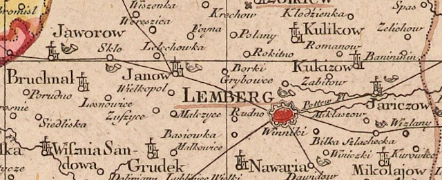
Add it to the Wishlist: Tobias Conrad Lotter Map of Galicia and Lodomeria ca. 1775

My maps tend to be of places I've visited. I would make an exception for this one, because though I've never been to this place, my ancestors knew it well.

This is a map of Galicia, parts of what today are in Poland and Ukraine, but at the time of this map, were parts of a kingdom under Austrian, Hapsburg rule.

Here's the map, it's held by the New York Public Library, and I'm not sure that any copies of it exist on the market for a collector to aquire.

Tobias Conrad Lotter Map of Galicia and Lodomeria ca. 1775 covering current parts of Poland and Ukraine

I found the map on this website, which allows you to zoom in and really explore it, and also provides some good detail on it. The map is undated, and it's estimated that it was made between 1772 and 1810. It's assumed, however, that it was published during the lifetime of the map-maker, Lotter, which would place it around 1775.

I've always kept an eye out for a map that showed the town I've heard stories about from my only grandparent not to be born in Canada. The town she was born in was alternately called Javorov, Jawrow, or today Yavoriv, where there is a NATO training facility and which is in Ukraine, near the Polish border. The nearest big city, which is the one where it sounds like members of my family traveled frequently for business is Lemberg, known today as L'viv, also in Ukraine.

Tobias Conrad Lotter Map of Galicia and Lodomeria ca. 1775 covering current parts of Poland and Ukraine

Based on this map, and its legend, Jaworow was an ordinary town along a postal route and seems to have had a post office.

Tobias Conrad Lotter Map of Galicia and Lodomeria ca. 1775 covering current parts of Poland and Ukraine

The map is a true historical snapshot. The kingdom of Galicia no longer exists. Instead of being within Poland, the town of Yavoriv now lies within Ukraine. If you have the stomach, you can also read this nearly contemporary account of what befell the Jews of the town during the Holocaust (incidentally, also from the New York Public Library). Relatives of my grandmother are listed among the murdered from that town.


Monday, March 26, 2018

Warsaw, 1845 from the Society for the Diffusion of Useful Knowledge

I visited Warsaw, Poland, only once and only briefly, but that still qualified it for a map for my collection. I purchased this one somewhere in the United States (I can't remember where, exactly, but I want to say it was in Virginia or the Carolinas), it's an 1845 map of the city.


One of the things I love about this map, is the name of the publisher: the Society for the Diffusion of Useful Knowledge.

The group was essentially a politically linked organization in the U.K. who made it their aim to provide high-quality educational materials for people with no or limited access to learning materials. It started in the 1820s, and does not seem to have lasted very long, but apparently produced a number of high-quality maps.

The image of the map I posted here is not the best, but as always, David Rumsey has me covered. See here for his high-quality image of the same map.

Warsaw has gone through much destruction since 1845 when this map was published. I find it difficult to compare this antique map with the city today. Not least because of the choice of orientation of the map. For some reason, it shows north as being towards the right. I can't think of a good reason to have done this, other than to have it appear in "landscape" orientation on the page of an atlas more neatly. I don't know enough about its history to comment, so I'll limit myself to the things I find interesting about this map.

One change I will point out is something noticed by another blogger, who does not normally write about maps. This blog notes that one difference in the city was the reclaiming of land from the river Vistula in the early 20th century. It provides a bit more information on Warsaw than I have.

When looking at the image I posted above, the outskirts of the city look a bit blurry. This is not a result of bad photography. This seems to be an intentional visual effect on the map. I find that it has the result of focusing ones attention on the city itself, which is interesting. I don't know if that's what the map-maker was hoping to do with his choice of design, but it has a nice effect.

I also like how the map, though it is itself an antique, notes important historic elements of the city. For example, there is a border of the city from 1762 shown on the map. This older border is well within what appear to be the borders of the city at the time it was published. Perhaps someone out there with a better knowledge of Warsaw's history can explain to me why this was an important date.


The town of Praga, on the east bank of the Vistula, notes that it was burned in 1794 and 1831, just a few years before this map was produced. The 1794 burning was as a result of a Polish uprising against Russian rule over Poland. I'm less clear on the causes of the 1831 burning, but I suspect it may be linked to the battle of Olszynka Grochowska as part of the 1831 "November Uprising" or Polish-Russian war. Again, I hope there are people better versed in Polish history than I am out there who can explain this better to me.


The comparison of important buildings in the city along the bottom of the map is also quite charming. Only a small sample are shown in close-up here, but it's clear that these were well drawn, with attention to detail. They also seem to be presented in a formal sort of way, not as a decorative addition. It's a nice feature to add to a city map.

It's a shame that I don't know more about Poland to be able to write more about this map, but I hope someone out there will be able to read this, comment and provide more information. I look forward to learning more.

As a final point, I notice that the back of the map has a stamp on it that reads Devon & Exeter Institution. This is a library that still operates, and their website is here. It's unusual to know the provenance of an antique map, and so this is sort of interesting to know that at some point in its life, the map belonged to this institution. How it got to a store in the United States I cannot say, but this find has done some travelling to get to my home in Ottawa!


Thursday, March 8, 2018

Wishlist Map: 5 Things About Montreal You Probably Never Knew

Next up on my wishlist: Bellin's Carte de L'Isle De Montreal et de Ses Environs (Map of the Island of Montreal and its Surroundings) from 1744. This map is available for purchase here, from Arader Galleries (who I have no affiliation or relationship with).


It seems typical of Bellin to show geographic features on his map, but to minimize man made elements. According to wikipedia, at the time this map was made, some 22,000 people lived in Montreal, yet the map does not make this obvious.

Here are five awesome facts about Montreal that we can learn from this map that probably all but the most die-hard Montrealers never knew.

1) Lachine was an island: Today Montrealers are familiar with the neighborhood of Lachine and the Lachine canal that borders it. The canal was built to bypass the rapids shown on the map (the "sault"). The Canal, however, was not all a new waterway. Instead, it was an expansion of Lac St. Pierre that was already separating Lachine from the rest of Montreal.

2) Yes, they really called it "La Chine" (China): La Chine, which evolved into the modern Lachine, was originally a derisive nickname. The explorer La Salle believed that China lay just beyond the impassible rapids upstream of Montreal. Of course it didn't, and what he returned to his home in Lachine from his failed efforts to reach China, he and his companions were mockingly called "Chinese".

3) Forts, forts, forts! There were forts all over the island of Montreal. It would be interesting for a real Montreal historian (i.e. not me) to indicate if any of these still exist, but there were lots of them. I see a fort Roland, fort De La Chine, even a fort Pointe Claire: today an important suburb of the city.

4) The island was crisscrossed by streams. This is not obvious in present day Montreal, and some of these have even been filled in. A modern map of the city, especially in the downtown area, shows no sign of some of the waterways on the map in 1744.


Downtown Montreal today. No streams.

5) Windmills. The city was dotted with them, and they help emphasize the rural nature of the city at the time. Windmills would have been an important part of rural life in the 18th century. There are only a handful of these left today, including the one in Pointe Claire. 

Monday, February 26, 2018

The Land of Moriah, or Jerusalem

What place in the world has more meaning to people, or more historical significance than Jerusalem?

I bought this map of Jerusalem at M. Pollak's map store in Tel Aviv. I really like this one and was very excited to buy it.


The map is titled "Land of Moriah or Environs of Jerusalem". The map maker is Thomas Starling, and printed at the bottom is "London, Published for the proprietors. by Mr. Bull, Holles Street Cavendish Square". An inscription on the back from the seller indicates that the original date of publication was 1836. This date, however, does not appear on the map itself.


That's about all I know about the map. Research shows that Starling published a few atlases, including some in the U.S., but I can't figure out which one this would be from.

What I can point out are some of the really unique features of this map, starting with the name, Land of Moriah. The name alone is controversial as it's a biblical name about which scholars disagree. Some say that it refers only to the site in Jerusalem where the Temple of Solomon stood, while others say it may refer to a region, as shown on this map. There are differences based on religious belief as well.

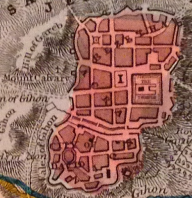
The map is interesting as it shows how the land would have been divided between at least two of the 12 tribes of Israel, here, Judah is in the south and Benjamin in the north. It also has a great little plan of old Jerusalem with certain important sites pointed out.

To really get an appreciation for some of the more interesting details on this small map, one needs to look much more closely.

For example, there's a tiny cross on the Mount Calvary. A structure is simply identified as "the temple" and "the City of David" all appear in the small plan of Jerusalem.


The map also notes the site of at least two biblical battles between the Israelites and the Ammonites and the Philistines.


Bethlehem, and the road between it and Jerusalem are shown on the map, alongside "David's Cistern" and "Solomon's Fountains". All of these, are, of course, biblical sites.

There is also reference to sites of "idol worship" and a number of other specific places found in biblical reference.

This is a small, but attractive map that is meant to show not only a biblical history, but may also reflect an interest in such matters at the time. The effort that went into making such a map, must have some positive correlation to the contemporary demand for such a product.

I only wish I knew a bit more about this map and its origins, and I welcome insights from those who know more about this publisher and this cartographer than I do.

Thursday, February 22, 2018

Add it to the Wishlist: Four Gorgeous 1757 Bellin Antique Maps of Canada - Hudsons Bay, St Lawrence River, Quebec City

I'm not a person with much money, so it's easy for me to decide that I can't afford a map I love. If I had the disposable income though, boy would I love this set of four, 18th century maps of Canada on sale by Classical Images, of Melbourne, Australia.

Here there are, four beautiful Bellin maps. I'll present them and what I love about them one at a time.


There's a lot to love about this map of Hudson's Bay. It's an attractive example, the map itself is nice to look at, it has a beautiful cartouche and nice geographic features, like mountains. It's also wonderful in that it seems to have totally made up islands, like "Isle de Bonne Fortune, which does not correspond with anything modern I can find. It also gets the shape of the Bay quite wrong (though James Bay looks pretty good), and Quebec seems to have no Ungava bay in its far north. I also love the note on the far left, in French, about the lands being 'entirely unknown' and a similar annotation at 65 north and 65 west of the 'strait without a name'.


At the time this map of the upper St. Lawrence River and Lake Ontario was made, there was considerable settlement in the colony of New France between the downstream city of Quebec and Montreal. For some reason, from this map, you'd hardly know it. Montreal is on the map, but as an island. There's not much there to speak of a settlement, or the importance of the settlement. The names of rivers appear to be quite detailed--perhaps because rivers were truly the highways of the time--and a number of forts and small settlements are indicated. The drawings of the mountains add to the attractiveness of the map, but points which probably should have been emphasized, are omitted.

Here's the downstream portion of the St. Lawrence. Another attractive map with surprising accurate naming of places like rivers, islands and mountains, but little in the way of cities and towns. A detail of this one, that appears in the others as well, is the identification of the longitude being from Paris, not Greenwich.


This last one may be my favorite, a view of Quebec City, from 1757 during the Seven Years War and while under French rule, before the "Conquest" by the British. In two years time, a battle at the Plains of Abraham (approximate location indicated on the map below), would dramatically alter the course of North American and Canadian history. This map gives wonderful details about the city and seems to make special note of its fortifications. Indeed, the city was very well defended, and it was a series of gambles and good luck that allowed for British success in their assault on the town. One of the most interesting details shown on the map are the walls of the city. Today, Quebec City is the oldest walled city north of Mexico City whose walls still exist.

Approximate location of the British landings at the Plains of Abraham
At the time that these maps of Canada were published, the Seven Years War was already ongoing. It's an amazing thought to imagine the possibility of British, or French officers studying any of these maps to plot strategies, attacks or routes. These maps may not have been practical for military purposes, but at a time when perhaps little was known about these places by rival powers, maps like this may have been the key to successful campaigns.

Monday, January 29, 2018

Missing Pieces: Mitchell's 1867 Washington, D.C.

For the few years I lived in Washington, D.C., anytime I found myself in Georgetown, I would make a point of trying to stop in at the Old Print Gallery. This was a unique shop. It didn't have that dusty, feeling of some map shops that I love, but instead was clean, sleek and modern feeling. It had row upon row of cases of maps and prints arranged by location, alphabetically, and it had some true


gems, like Bunting's Cloverleaf of the world with Jerusalem at the center.

They also had a beautiful original of the first plans for the city of Washington, D.C. in 1792 by Andrew Ellicott. It was being sold for over US$40,000. Living in Washington, I knew I wanted a map of the city, and the Ellicott was truly the pinnacle of all such maps, but for me, at that price, it may as well have been one million dollars. It was unobtainable.


This image is in far worse condition than the one at the Old Print Gallery


I no longer live in Washington, but I'm disappointed to learn that the shop has closed, and merged with it's sister shop in New York City. It's a shame, because it was such a wonderful place, and I don't know of any other shops in D.C. that were as specialized.

The price of the Ellicott map being what it was, I turned to the internet to find myself a nice map of D.C. to add to my collection and came across a shop in Vancouver, British Columbia called Joyce Williams Gallery who had a great selection and very fair prices.

After speaking and corresponding with their friendly owner, I settled on this beautiful, very fine 1867 Augustus Mitchell Jr. map of Washington, D.C.


There's a lot to love about this map. Its wonderful to look at. It has an attractive floral border that somehow just pops out, without taking away from the map itself.

It also shows a number of details which may have been common for the time, but that today we would recognize as archaic, or simply unusual. For example, the White House is referred to on the map as the "President's House", This is a use that may be considered even more unusual because, as wikipedia notes, the place was called the White House as early as 1811, some 56 years before this map was published.

Another wonderful thing about this map is what it doesn't show. Some of the things tourists flock to D.C. for are absent altogether. For example, the Smithsonian is shown on the map, but only one building, not the many large facilities that make up its network. The Library of Congress is not on the map, as it would not be built for another 30 or so years. There's no reflecting pool either, and one may notice that the National Mall is not at its full length.


Most stark, perhaps, was something that actually did not jump at me right away: There's no tidal basin! The famous cherry blossom ringed body of water, the site of the Jefferson Memorial, just did not exist at the time this map was made. I looked at this map for quite some time before I even noticed that! Indeed, apparently, the idea for the basin didn't even originate until the 1880's, almost 15 years after this map.


The Mitchell map certainly lacks the historic value of the Ellicott, but it's a gorgeous piece, and one that I'm very pleased to have in my collection.


Thursday, January 25, 2018

Come From Away: Colton's New Brunswick, Nova Scotia, Newfoundland and Prince Edward Island

In the Canadian Maritime and Atlantic provinces, someone who's from any place other than one of those four provinces is known as a CFA, a come from away: because that's where you're from, away.

A few years back, my wife and I went on a fabulous road trip through the Maritime and Atlantic provinces (Newfoundland and Labrador is an Atlantic province, not a Maritime one), had an amazing time, met some wonderful people, saw some great sights, ate some great food, got engaged and I bought a couple of maps!

The map I'll feature in this post is a gorgeous Colton, first published in 1855 of New Brunswick, Nova Scotia, Newfoundland and Prince Edward Island. I bought this map at an art gallery in Halifax that also sold some maps called Zwicker's Gallery (a place that is itself an institution). They had some other beautiful maps of the region (Including a great one with images of some dogs this part of the world are famous for, notably the Labrador and the Newfoundland Dog), but this was the only one I could afford at the time.


 I love this map! There's so much about it that's appealing.

First, just look at it! The border is gorgeous. It has that wonderful element of spilling outside the border, showing every element of the land. It breaks up the provinces (colonies at the time) into counties, which I don't believe are particularly significant these days, and it's in excellent condition. Even the name plate of the map is appealing.

The way "Colton" is written, the various fonts of the names of the different places...I just find this map very pleasing to look at.

Second, the history represented on this map is wonderful. Nova Scotia and New Brunswick were among the first four provinces of Canada which came together for confederation in 1867. Prince Edward Island would only join Canada in 1873 (largely because of heavy debt from having built a railroad on the small island), and Newfoundland joined still later, in 1949, after a much debated referendum.

Third, the detail on this map is impressive. So many of the tiny bays, capes and coves on Newfoundland are named. Some of these places may have been, or were being settled for the first time around when this map was published. Other places, including some of Newfoundland's largest communities today are completely absent from the map, in some cases, like Gander, Newfoundland, because they didn't even exist until around 100 years later.


 A final thing I enjoy about this map, is that it presents another mystery to me. The map clearly says it's a Colton. It also says it was first published in 1855. That doesn't mean that the actual paper map I have is from 1855, it could be more recent. There's an annotation from the seller next to the page number (19) that shows the year 1864. The problem is, when I search, I can't find any Colton atlases published that year. Even when I go through the ever-useful Rumsey website, I can find very similar Colton maps, but none that are on page 19. Perhaps even more strange, there is an almost identical Johnson map that is printed on page 19 from 1865, but it is clearly not the same map I have. All I've been able to find is someone selling the identical map (in rough condition) on ebay. This person claims their map is from 1855, but they may simply be looking at the date of first publication, which could be quite different from the date of actual printing. I'm including a screen capture of the item for sale below.

Once more, another mystery to solve. Anyone with thoughts or insights is encouraged to let me know!