Showing posts with label map. Show all posts

Monday, July 16, 2018

Wooden 3D Map of the Chesapeake Bay

Most maps in my collection are original antiques, but not all of them. On a trip to Annapolis, Maryland I stopped in at Woodcraft Artisans (no affiliation) and bought a beautiful, interesting 3D nautical chart of Chesapeake Bay.


The image above is taken from the manufacturer's site Carved Lake Art. The image below is a less good picture of the map hanging on my wall. If you visit Carved Lake Art's site, you can see the map in great detail.


There are a few things I like about this map aside from the awesome effect of the 3D effect. The detail of the waterways on this map is impressive as are the images of the land.

Of the various different maps of this style available, I chose this one because at the time, I was living in Washington D.C., which is depicted on this map, also, it's a map of a place I was visiting at the time.

This is a unique map that is not the rarest, oldest or most expensive that I own, but it may be the most unique, so I'm happy to share it with my loyal readers (reader?) to hopefully enjoy what I enjoy about it.

Monday, June 11, 2018

Wearable Maps: Newfoundland

I'm not the type to normally walk around in clothes adorned with maps, but after falling in love with Newfoundland on my first visit there, I could not resist this cool T-shirt map.


One of the things that makes this map so interesting is that it shows the names of some very small towns in Newfoundland. Also, it shows just how sparse the interior is, and how busy the coasts are. The size of the name on the map corresponds to the size of the town itself.

Really though, the best thing about this map, are the fun place names in Newfoundland. Some of which I've actually been to!

For example, on the image below, note Nickey's Nose Cove, Coffee Cove, and Leading Tickles.


Here we have Placentia, Dildo, Little Heart's Ease, and Bonavista, first sited by Cabot.


 Yes, these are all real places, and yes, they're beautiful. Get to Newfoundland, it's wonderful!


Thursday, June 7, 2018

The Erdapfel Globe

Through the wonders of twitter I came across a fabulous bit of map history: the Erdapfel (German for Earth Apple), sometimes called the Globe of Martin Behaim. This is possibly the oldest surviving globe in the world and it was made in Nuremberg in 1492, the year Columbus sailed.

Here's a picture of it taken from this site:


There's a lot that's amazing about this map. For one, the creator of the map was quite well traveled for a person living in the late 15th Century. He personally visited Portugal and western Africa. He therefore received some of his knowledge for this globe first hand.

The globe also shows an empty expanse between the western part of Europe and the far east. That said, the map maker used some of the same sources as Columbus, or at the very least, he agreed with the Italian explorer that the world was round. 

The map contains some beautiful illustrations, like this huge whale and boats:


It also contains a great many inaccuracies, as can be imagined. Most notably, perhaps, Japan is further north than shown on this map. Malaysia is shown as a large peninsula and the shape of Africa is incorrect including the shape of Madagascar which is shown as north of Zanzibar.

Anyone who really wants to get into the fine details of this map can take a look at this very comprehensive history here, or this shorter summary, here.

Anyone who wants to see the globe, would have to go to the Germanic Museum in Nuremberg. It seems that in 2011 there was an effort to have the globe digitized, but I can't find any place online where it's viewable.

In all cases, this is an amazing piece of world history and map history and a real, visual time capsule of European understanding of the world at a time contemporary to Columbus.

Monday, May 14, 2018

Mitchell's 1867 Plan of Boston

On a trip to Boston I stopped in at Ward Maps (as always, no affiliation) which is a nice, neat, well organized map shop selling antiques, and I think also reproductions. I couldn't decide between two maps: one of, or perhaps the, first Boston public transit map ever produced or the one I actually bought. In the end, I think my choice was made purely based on aesthetics. The map I bought was simply more attractive. It's an 1867 Mitchell titled "Plan of Boston" with a beautifully coloured inset of the Boston region.


There are elements of this map that seem, to me at least, to scream that it's a Mitchell. For one, the border of the map, and something about the style, that I can't quite put my finger on, all seem to say that it's a Mitchell.

It's also a map that shows a Boston that's profoundly changed since the map was made. According to the general history of the city on Wikipedia, the mid 19th century, when this map was made, was an important time for the city. Boston was receiving many new immigrants and was growing. Neighborhoods were becoming little ethnic enclaves and the city needed more space. 

Compare the map above, to the boston of today:


 A number of differences stand out, including the absence of a "South Boston Bay", and some more subtle changes that are hard to see without more of a close-up. Many of these land reclamation projects were due to the growth of the city.

One, in particular is the addition of streets north of beacon street, which had been right up against the Charles River. After a major fire in the 1870s, so after this map was made, the debris from burned buildings was pushed into the marshy areas of the river to create new land for the city and creating what is today, Storrow Drive.


I also find the image above charming because of its depiction of the lovley Boston Common. In particular, I find that there's something somehow funny about the drawing of the pond with the note that it is indeed a pond on the common.


Another great aspect of this map is the inset, which also shows changes in the region over time.


This inset of the region around Boston shows how some areas had recently been incorporated into the town, such as South Boston and East Boston. Other areas, which are now part of the city, such as Dorchester, are shown as seperate areas from the city.

All told, this is an attractive map, with some interesting historic details of a great city. I'm pleased with my choice in this case!


Thursday, May 10, 2018

Add it to the Wishlist: 1766 Map Showing Russian Discoveries of the West Coast of North America

At the time of my writing this post, I am planning a work-trip to Portland, Oregon. Naturally this got me thinking about maps of the region and I decided to see if I could find another west-coast of North America map to add to my virtual wishlist. I got some great ideas from a tweet from Vetus Carta (@rare_maps), an online, Ottawa-based, antique map dealer (as always, no affiliation).

Anyway, the tweet led me to the Vetus Carta site where this gorgeous 1766 of eastern Russia and western North America is on sale.

Nouvelle Carte Des Decouvertes Faites par Des Vaisseaux Russiens Aux Cotes Inconnues De L'Amerique Septentrionale Avec Les Pais Adiacents ('New Map of Discoveries Made by Russian Vessels on the Unknown Coasts of North America with Adjacent Countries') published in Amsterdam in 1758 by Gerhard Friedrich Müller.

The image above is from Barry Lawrence Ruderman, where the image is available to zoom into in high-quality (and where it's on sale as well). Vetus Carta, though, provides an impressively detailed overview of the map, which, by the way, is properly titled Nouvelle Carte Des Decouvertes Faites par Des Vaisseaux Russiens Aux Cotes Inconnues De L'Amerique Septentrionale Avec Les Pais Adiacents ('New Map of Discoveries Made by Russian Vessels on the Unknown Coasts of North America with Adjacent Countries') published in Amsterdam in 1758 by Gerhard Friedrich Müller.

Anyone interested in the finer details of the map's history should visit the Vetus Carta site. From my perspective, one of the most important points of this history is that this map not only went on to inspire many other, contemporary map-makers, but that it helped to debunk some of the popular, though incorrect thinking about the region at the time. It was a groundbreaking map in that it was more scientific than other maps of the region that were already available.

Vetus Carta goes on to note some of the inaccuracies in this map, which, again, was more accurate than most of what was already out there: first, it shows a “River of the West” at the “entrance discovered by Martin d’Aguilar in 1609.” This river, which supposedly ran from Hudson's Bay to the Pacific, is a figment of someones imagination. There is also a supposed entrance into the continent that the map-maker says was discovered by Juan de Fuca in 1576, this is incorrect as well. There's also the incorrect shape of Alaska.

From my perspective, as a layperson who really enjoys these antique maps, there are some different things that have caused me to add it to my wishlist other than its historic significance.

Nouvelle Carte Des Decouvertes Faites par Des Vaisseaux Russiens Aux Cotes Inconnues De L'Amerique Septentrionale Avec Les Pais Adiacents ('New Map of Discoveries Made by Russian Vessels on the Unknown Coasts of North America with Adjacent Countries') published in Amsterdam in 1758 by Gerhard Friedrich Müller.

I love the blanks on this map. Its amazing to think of a time when people looked at vast spaces of the world and said "we have no idea what's there". Of course, someone knew what was there, but the Russians who provided the information for this map, did not, and so we're left with an enormously large void whose contents could have been anything. For similar reasons, I love the inaccuracies in northern Quebec and around Hudson's Bay.

Nouvelle Carte Des Decouvertes Faites par Des Vaisseaux Russiens Aux Cotes Inconnues De L'Amerique Septentrionale Avec Les Pais Adiacents ('New Map of Discoveries Made by Russian Vessels on the Unknown Coasts of North America with Adjacent Countries') published in Amsterdam in 1758 by Gerhard Friedrich Müller.

I also love the contrast in this map between the detailed Russian territory which appears to be a place that was known to European map makers on the one hand, and the supposed emptiness of North America on the other. The places seem so tantalizingly close to one another, and yet, the people living in the east, who knew their own lands, knew nothing of the west or the people in it.

Nouvelle Carte Des Decouvertes Faites par Des Vaisseaux Russiens Aux Cotes Inconnues De L'Amerique Septentrionale Avec Les Pais Adiacents ('New Map of Discoveries Made by Russian Vessels on the Unknown Coasts of North America with Adjacent Countries') published in Amsterdam in 1758 by Gerhard Friedrich Müller.

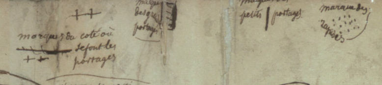
Some of the annotations on this map are also wonderful. The indications of the voyages of Russian explorers are fascinating historic details, but comments like the one above are just great. It reads: 'Land about which we have claims from residents of Kamchatka, some of whom say that it can be seen from Bering Island'. This is just more reinforcement of how close the land of the map-maker is to the land about which he knows nothing, and how tempting such a place may be for an explorer.

This is really a great map, and one that I'd love to have if I could ever afford such wonderful things. Until then, I can enjoy it as part of my virtual wish-list collection.

Monday, April 23, 2018

Inuit Maps of Greenland

The Inuit in Greenland and Canada's north inhabit a hostile environment. The cold is appalling, the weather is unpredictable, the distances are vast, the terrain unforgiving and the necessities of life may be hard to come by. And yet, these people thrive in this harshest of environments. Indeed, if you want to see one way they've adapted, check out this fascinating, dated, video.


This is a blog about maps though, so I wondered how these people found their way around their regions. There was reliance on innukshuks, man-made landmarks to help with navigation, but what about out on the water, in a kayak?


The needs of a traveler would have been unique. The north is dark 6 months of the year, so it would have to somehow be read easily in the dark. It would need to be able to be handled without taking off mittens if it was too cold and would need to float, if it were dropped in the water. The solution was an ingenious one that I read about here, a tactile map.


When I first saw these I thought: "are they even maps?", but indeed they are. Known as Ammassalik wooden maps, and the images above are of maps which date to around 1885. The maps were tactile. Small enough to fit in your mitten, made of buoyant wood and carved to represent the contours of the coastline of Greenland. My guess, however, is that they would take some practice to learn how to read. Looking at the comparison between them and a more traditional map leaves me somewhat baffled. Map-reading can be a skill. No doubt those who used these maps learned how they worked.


Not many examples of these types of maps exist. The ones shown above were originally taken to Copenhagen, but are now in a museum in Greenland. Over at this blog, I found an image of a politically incorrect newspaper clipping showing some other similar carved maps. If anyone is aware of any other examples of this type of map, I'd be interested in learning more.


Thursday, April 19, 2018

Add it to the Wishlist: Blau's 1635 Map of South Africa “Aethiopia Inferior, vel Exterior“

I recently wrote about my 1830 map of southern Africa. One reason I found that map so interesting, was that it showed an Africa which had tribes in it, but very few European powers were setting up colonies in that part of the world.

This map of Southern Africa from 1635 is on sale by Inter-Antiquariaat Mefferdt & De Jonge in the Netherlands (as always, no affiliation). Take a look:

1635 map of south africa by blau. Shows southern africa before the dutch colonized it.

The sellers of this map have some good information about it on their website. They note a few interesting points. For starters, this map pre-dates Dutch colonies in this part of the world. It also notes that much of this map is based off of Portuguese maps, which are of mixed-degrees of accuracy.

The map does a pretty good job showing off various coastal place names, but these seem to be the names of geographic features (i.e. bays, coves, etc). There are also a few towns shown in the interior, but like the 1830 map of the same region, this map does not try to pretend to know what lies just beyond the coast.

a close up view of the cape of good hope, caffaria, or kaffraria, and an illustrated sailing ship.

Also notable is the lack of names of tribes found on the 1830 map. It may be that Europeans were not sufficiently familiar with the inhabitants of Africa to name them. Part of South Africa on this map is named "Caffaria", or Kaffraria, which is a word that has at its root a derogatory term for Africans. The name of this place appears on the 1830s map as well, and so it seems that Europeans were either indifferent to the disrespectful use of the word, or that it only fell out of accepted usage at a later date.

It's also interesting that even though there was little European presence in Africa at the time of this map, Africa is still divided into regions, for example, Mozambique--with its wonderful little elephants--clearly has a border. It's not clear what exactly prompted the inclusion of this border.

close-up of Mozambique with illustrated elephants.

Finally, aside from the historic interest and value of this map, being a Blau, one of the reasons it ends up on the wish-list is its aesthetic beauty. The cartouche, and this lonely little turtle in the Gulf of Guinea, make it a stunning map for the collection of anyone interested in this part of the world.

Cartouche of the map showing Africans holding an ox hide with monkeys and turtles

Turtle illustration.

Wednesday, April 11, 2018

Add it to the Wishlist: Tobias Conrad Lotter Map of Galicia and Lodomeria ca. 1775

My maps tend to be of places I've visited. I would make an exception for this one, because though I've never been to this place, my ancestors knew it well.

This is a map of Galicia, parts of what today are in Poland and Ukraine, but at the time of this map, were parts of a kingdom under Austrian, Hapsburg rule.

Here's the map, it's held by the New York Public Library, and I'm not sure that any copies of it exist on the market for a collector to aquire.

Tobias Conrad Lotter Map of Galicia and Lodomeria ca. 1775 covering current parts of Poland and Ukraine

I found the map on this website, which allows you to zoom in and really explore it, and also provides some good detail on it. The map is undated, and it's estimated that it was made between 1772 and 1810. It's assumed, however, that it was published during the lifetime of the map-maker, Lotter, which would place it around 1775.

I've always kept an eye out for a map that showed the town I've heard stories about from my only grandparent not to be born in Canada. The town she was born in was alternately called Javorov, Jawrow, or today Yavoriv, where there is a NATO training facility and which is in Ukraine, near the Polish border. The nearest big city, which is the one where it sounds like members of my family traveled frequently for business is Lemberg, known today as L'viv, also in Ukraine.

Tobias Conrad Lotter Map of Galicia and Lodomeria ca. 1775 covering current parts of Poland and Ukraine

Based on this map, and its legend, Jaworow was an ordinary town along a postal route and seems to have had a post office.

Tobias Conrad Lotter Map of Galicia and Lodomeria ca. 1775 covering current parts of Poland and Ukraine

The map is a true historical snapshot. The kingdom of Galicia no longer exists. Instead of being within Poland, the town of Yavoriv now lies within Ukraine. If you have the stomach, you can also read this nearly contemporary account of what befell the Jews of the town during the Holocaust (incidentally, also from the New York Public Library). Relatives of my grandmother are listed among the murdered from that town.


Monday, April 9, 2018

1764 Bellin map of Santa Marta, Colombia

My wife and I took our honeymoon in Cartagena, Colombia. I really wanted to try to find an antique map of the city before I left, but had a hard time locating anyone who had any selection to sell.

We found one antique dealer who had literally one antique map. It was not of Cartagena, so that one is still on the wishlist, but I did get my hands on something great. Behold my 1764 Bellin map of Santa Marta, Colombia.

1764 Bellin Map of Santa Marta or Sainte Marthe Colombia

As always, David Rumsey has a better zoomable version, and I note as well that the map is held in the collection of the National Library of Colombia.

I don't know too much about Colombia's history, and almost didn't buy the map because I had never heard of Santa Marta--Sainte Marthe on the map--had not visited it, and didn't want a map of a place that meant nothing to me. The seller told me a bit about the town and then, I had to have the map.

Santa Marta was the first Spanish colonial city in Colombia. It's also the oldest surviving city in that country and the second oldest in all of South America. It was founded in 1525, contrast that with the first attempt at founding Quebec City in 1535.

The map is also a Bellin. Many map collectors and historians, recognize Bellin as an important cartographer, producing a wide range of high quality maps in France in the mid to late 18th Century. That was another hook for me, as well as the map's age. This one was produced in 1764.

There are a few elements of the map that make it visually quite interesting. For one, at a glance, I find it looks as though the ocean is to the right of the town, when clearly, it's to the left, in the west. One reason I think my mind plays this trick is the contours around the hill make it seem to be an island.

I also really like the depictions of the small forts and "castles" along the coast. They are not given too much detail by Bellin, but are an attractive feature of the map.


Though it's not from a place I've been, this map is still of historic significance, and makes a souvenir of the adventures we went through, off the tourist path, to find and buy it. I'm proud that it's in my collection!

Wednesday, April 4, 2018

15th Century Viking Map of Vinland Being Studied by Yale

I recently came across this article about Yale doing an examination of the Vinland Viking map. I had heard about Vinland, but don't recall having heard about this map before. In short, Vinland is an as yet undiscovered location supposedly settled, at least briefly, by the Vikings in the 15th Century, before Columbus reached the New World. This map, which would have been almost as old as the Viking discovery, showed Vinland.

Here is an image of it from Wikipedia.

The probably forged Map of the Viking discovery of Vinland in the possession of Yale University

It's a pretty cool map, and very exciting to have so old a map of the new world. The problem is, it's almost universally considered to be a fake. There is some disagreement on this, but the majority of scholars have dismissed this map as being inauthentic for a number of reasons including the chemical composition of the ink used (it contains substances unused until the 1900s) and the way it was bound into a larger manuscript which would have rendered much of it illegible.

Nonetheless, Yale is putting some serious work into researching this map. They are looking at the topography of the map itself, studying the DNA of the animal skin it was printed on, and examining the maps's chemical composition. It's all very impressive, and still, they don't expect to prove its authenticity. Instead, they're trying to study a document which has become so culturally important, that many atlases feature it even with the notation that it's probably fake.

So then, what is Vinland? The answer is that nobody's quite sure. There are disagreements among experts as to what the word Vinland meant to the Vikings and whether it was a single place, or multiple places. If Vinland does refer to vines, or wine, as some suggest, it means that it must be at least as far south as the south shore of the St. Laurence River, where Jacques Cartier found wild vines. One thing that does seem more certain is that the only actual archaeological evidence of Viking settlement in North America, the site at L'Anse aux Meadows, Newfoundland, is not Vinland.

Map of L'Anse aux Meadows, NewfoundlandL'Anse aux Meadows is a remote site at the northernmost point of Newfoundland. Viking artifacts have been found there, as well as building materials from Iceland and Greenland that date to around 1000 C.E. This is conclusive evidence that there were Vikings living in Newfoundland, for at least a short time,  around 500 years before Columbus and any other European reached the area. The site, however, is considered by historians to be a base, or a waypoint for onward exploration. It was probably just a place to stop, maybe repair boats, take on more supplies, and then keep exploring onward. As such, the location of Vinland remains a mystery, and this map will likely not be helpful in finding it.

As an aside, I had the good luck of visiting L'Anse aux Meadows, which is not an easy place to get to, but which is stunningly beautiful and worth the trip. It also has a reconstruction of what the Viking settlement on the spot may have looked like. It's a long trip, but in my view, absolutely worth it. Check out some pictures I took while there.

UNESCO heritage plaque indicating Vikings were at this site.

L'Anse aux Meadows, Newfoundland

Site of a Viking building. The indentations on the ground show the footprint of the long since decayed building.
This depression was the actual site of a Viking structure.

A recreated Viking settlement on the site of the only known one in North America.

A recreated Viking settlement


Fog rolling into L'Anse aux Meadows, Newfoundland

Fog rolling in to L'Anse aux Meadows, Newfoundland


Thursday, March 29, 2018

First Nation's Mapping of Canada: Ochagach's 1730 Map

I wrote about an amazing 1762 map of Canada I found online. One of the things that fascinated me about that map, was a reference it had to Ochagach. Ochagach was a Cree "Indian" or First Nations person who drew a map to the west coast for La Vérendrye, the French explorer and fur trader.

There's a short bio of Ochagach here. As the bio explains, the route he proposed became essentially a crucial highway to the western parts of Canada used by fur traders. In the French context, it was the fur trade and desire for pelts that drive not only exploration, but settlement and expansion and shaped North America.

Ochagach's map is fascinating to look at and is available in "zoomable" form.


Remember, the first nations of Canada, as far as I know, had no written language or tradition of map-making. This was a person, who from his own mind, was able to prepare a map of Canada beginning at modern day Thunder Bay, Ontario and ending up somewhere beyond Lake Winnipeg, Manitoba. Today, that would be a car ride of over 1,000 KM.


Approximate start and finish points of the original route
This is quite a vast distance that Ochagach had good knowledge of, at a time when choices for transportation were a canoe or walking. 

The map shows what appear to be a series of lakes, connected by either short rivers or portages leading ultimately to lake "Ouinipigon" which could be either modern lake Winnipeg or lake Winnipegosis. The various lakes along the route are numbered. I don't know enough about the map to know if these are numbered to help a traveller count how far along they are, or whether it refers to the number of days it takes to reach a certain point.


I've seen the map  compared to the map for a subway system in that distances are somewhat reduced and the point of the map is to show a destination and tells you not very much about what goes on between the destinations. In this case, the subway "stops" seem to be the various lakes that you have to count off and traverse to get to where you're going.

There are some fascinating annotations on the map in French that are worth a closer look at. 

First, there are details like the ones in this image. Where there is a rare name given to a lake, as opposed to just a number, with an interesting annotation in French: "Lake of Tecacamcouey, of three days of walking". Basically, this map is explaining how long a portage needs to be made to get to this lake.


The image with the name of the destination lake, "Ouinipigon" is also shown with a similar annotation about three days of walking. This image also notes where the Assinibois people live, and says that the map was sketched by the "Cris" or Cree people.


Finally, this image shows the legend of the map. Crosses represent portages. A number of horizontal lines represent large portages, a single vertical line is a short portage and dots are rapids.


There is an interesting, and short article here, in French, about First Nation's cartography. One of the more interesting points it makes, is just how influential First Nations, in general, and Ochagach in particular, was to European map makers. The article cites Ochagach's map as being the necessary information needed by both Philippe Buache and Bellin to complete their maps (images below from Barry Lawrence Ruderman). The influence is clear from just a glance.


Bellin. The annotation in the top left reads, in French "We do not know if in these parts there is land or water"

Buache

Thursday, March 22, 2018

The Puzzle of the Map: Seven Bridges of Königsberg (today Kaliningrad)

I'm bad at math. Like, really bad. This is hard on my father who is a mathematician with the degrees to prove it. He keeps trying to get me interested in math, and his latest attempt is to tell me about the problem of the seven bridges of Königsberg, today Kaliningrad, Russia.

Here's the issue, and a colourful 1732 map of the city available for purchase here (as always no affiliation between me and the seller of any kind, simply giving credit where it's due), to help illustrate it.


As you can see, the city in 1732 had seven bridges, which I've highlighted in yellow. Residents used to like to play a game. They would try to take a stroll around the town attempting to cross each bridge exactly once and start and end in the same spot.

This is the point where you may want to take out a piece of paper and try to sketch this out on your own. 

Meanwhile, I can also show you this fabulous map of the city from sometime in the 1580's before the city's seventh bridge was built. This map is no longer for sale, as it was sold by Sanderus Antiquariat, as you can see here. It looks like if there were a seventh bridge on this map, it would be obscured by the couple standing in the foreground. 


WARNING

SPOILERS FROM HERE ON

One of the wonderful things about the beautiful map above, is that having six, instead of seven bridges, is basically the only way it would be (sort of) possible to accomplish this bridge-walking map puzzle. It's impossible to do it with seven bridges, and possible with six bridges if you end up somewhere other than where you've started, and this is where the math comes in.

My father suggested I write about this because of the famous mathematician Leonhard Euler. Euler essentially reduced the problem to a graph. Now, this is where my lack of mathematical knowledge shows, but from what I understand, you have to almost forget about the bridges for a moment, and imagine the various points or nodes you'll be going to. Looking at the map above, imagine for example that you start at the church on the central island, you can cross to the south bank of the river, use the other bridge to get you back to the central church, then cross to the north bank, walk along it to get back to the central church, cross to the orchard in the east, and then back up to the north bank.

Like this:


Euler explained that in order for the puzzle to work, each location, point or node (the central church, the north and south bank and the orchard, must have either exactly zero or two points of contact with each other. If there are more, and (I think) especially if it's an odd number, then it doesn't work. 

Anyway, I don't want to pretend to know anything about math, so I'll happy link to a few good sources of information about the puzzle. Here, here and of course, wikipedia, here.

Meanwhile, to soothe your frustration, enjoy these beautiful maps. They're really great.