Showing posts with label antique. Show all posts

Monday, June 4, 2018

The Map That Got Away: A 1632 French Map of Madeira, Portugal

Recently, I was in Funchal, on the Island of Madeira, Portugal, for work. I had limited free time, but hoped to buy a map of the place if I could find one. The bit of research I did was unable to give me any clues on where I may be able to find an antique map of the place, so on a whim, I stopped in at a shop catering to coin and stamp collectors to see if they may be able to help point me in the right direction.

The owner of the shop didn't have any encouraging news for me, but I noticed, on the wall in a corner of his shop, he did have a couple of maps, one appeared to be a Bellin. When I told him I wanted a local map, he went round to the back and after a few minutes, produced this.


I was pretty excited. It was listed as selling for 170 Euro, but the man in the shop told me he'd accept less if I paid cash (which I didn't have on me in any case).

I asked him if I could take a closer look at the map, which was in matting, and that's when the red flags started popping up. The map did look authentic and original. It was very clean, but the grain of the paper seemed authentic, there was no colour and it seemed right.

When I wanted to see the reverse, however, I realized that it was glued to the backing. That worried me. The owner, to my horror, started trying to pull the map loose from the glue. I was terrified it would tear. It didn't, but he was able to peel enough of it away that I could see a date on it, 1632.

Knowing that I couldn't buy it at that moment anyway, I went back to work and resolved to research it a bit. I came up empty handed. I couldn't find an image of this map, or even one similar to it anywhere. I knew it was probably French, had an approximate year but knew nothing more. So, I turned to twitter.


It took some time, but I got a few helping hands from the twitterverse, and one, particularly helpful reply from the very helpful New York Public Library Map Division. I have no idea how they did this, but they found the origin of this map.


Incredible! They were right! There it was, on page 215 of the microfilm was the map from the store. It even confirmed another concern I had, that there was nothing printed on the reverse of this map. That's because it was on the last page of a chapter in an atlas, and page 216 was blank with a new section beginning on page 217.

My next concern, however, was the glue. My concerns were confirmed by NYPL Maps and also James Roy, who wrote:


I was aware of all these concerns, but I thought, I like the map enough, that even if there are some concerns with it, if I can get it for a good price, it will be worth it.

It's a great looking piece, the ships, the perspective, the way the towns are drawn and the age of the map itself were all so appealing I couldn't believe my luck to have found it.

The problem was, the store had limited hours and I was extremely busy with work. I sent the owner an e-mail to see if I could convince him to stay open a bit longer, or to meet me on a day when he was closed, but the e-mail bounced back. Alas, I had to leave the island without a map.

So, I may have been saved by circumstances from buying a forgery or a map whose quality was greatly compromised by glue. I also learned there are some people out there on twitter who really know their maps and are very generous with their time and information. Still though, I can't help but feel that this one got away from me. I guess I will need to add a map of Madeira to my virtual wish-list!

Monday, May 14, 2018

Mitchell's 1867 Plan of Boston

On a trip to Boston I stopped in at Ward Maps (as always, no affiliation) which is a nice, neat, well organized map shop selling antiques, and I think also reproductions. I couldn't decide between two maps: one of, or perhaps the, first Boston public transit map ever produced or the one I actually bought. In the end, I think my choice was made purely based on aesthetics. The map I bought was simply more attractive. It's an 1867 Mitchell titled "Plan of Boston" with a beautifully coloured inset of the Boston region.


There are elements of this map that seem, to me at least, to scream that it's a Mitchell. For one, the border of the map, and something about the style, that I can't quite put my finger on, all seem to say that it's a Mitchell.

It's also a map that shows a Boston that's profoundly changed since the map was made. According to the general history of the city on Wikipedia, the mid 19th century, when this map was made, was an important time for the city. Boston was receiving many new immigrants and was growing. Neighborhoods were becoming little ethnic enclaves and the city needed more space. 

Compare the map above, to the boston of today:


 A number of differences stand out, including the absence of a "South Boston Bay", and some more subtle changes that are hard to see without more of a close-up. Many of these land reclamation projects were due to the growth of the city.

One, in particular is the addition of streets north of beacon street, which had been right up against the Charles River. After a major fire in the 1870s, so after this map was made, the debris from burned buildings was pushed into the marshy areas of the river to create new land for the city and creating what is today, Storrow Drive.


I also find the image above charming because of its depiction of the lovley Boston Common. In particular, I find that there's something somehow funny about the drawing of the pond with the note that it is indeed a pond on the common.


Another great aspect of this map is the inset, which also shows changes in the region over time.


This inset of the region around Boston shows how some areas had recently been incorporated into the town, such as South Boston and East Boston. Other areas, which are now part of the city, such as Dorchester, are shown as seperate areas from the city.

All told, this is an attractive map, with some interesting historic details of a great city. I'm pleased with my choice in this case!


Thursday, May 10, 2018

Add it to the Wishlist: 1766 Map Showing Russian Discoveries of the West Coast of North America

At the time of my writing this post, I am planning a work-trip to Portland, Oregon. Naturally this got me thinking about maps of the region and I decided to see if I could find another west-coast of North America map to add to my virtual wishlist. I got some great ideas from a tweet from Vetus Carta (@rare_maps), an online, Ottawa-based, antique map dealer (as always, no affiliation).

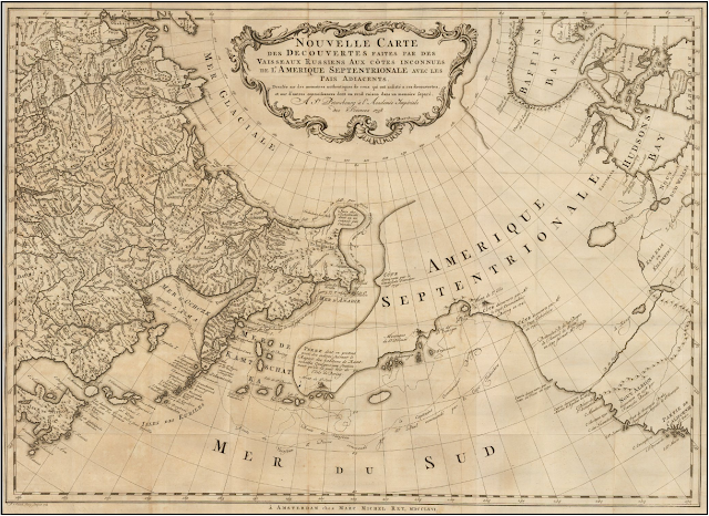
Anyway, the tweet led me to the Vetus Carta site where this gorgeous 1766 of eastern Russia and western North America is on sale.

Nouvelle Carte Des Decouvertes Faites par Des Vaisseaux Russiens Aux Cotes Inconnues De L'Amerique Septentrionale Avec Les Pais Adiacents ('New Map of Discoveries Made by Russian Vessels on the Unknown Coasts of North America with Adjacent Countries') published in Amsterdam in 1758 by Gerhard Friedrich Müller.

The image above is from Barry Lawrence Ruderman, where the image is available to zoom into in high-quality (and where it's on sale as well). Vetus Carta, though, provides an impressively detailed overview of the map, which, by the way, is properly titled Nouvelle Carte Des Decouvertes Faites par Des Vaisseaux Russiens Aux Cotes Inconnues De L'Amerique Septentrionale Avec Les Pais Adiacents ('New Map of Discoveries Made by Russian Vessels on the Unknown Coasts of North America with Adjacent Countries') published in Amsterdam in 1758 by Gerhard Friedrich Müller.

Anyone interested in the finer details of the map's history should visit the Vetus Carta site. From my perspective, one of the most important points of this history is that this map not only went on to inspire many other, contemporary map-makers, but that it helped to debunk some of the popular, though incorrect thinking about the region at the time. It was a groundbreaking map in that it was more scientific than other maps of the region that were already available.

Vetus Carta goes on to note some of the inaccuracies in this map, which, again, was more accurate than most of what was already out there: first, it shows a “River of the West” at the “entrance discovered by Martin d’Aguilar in 1609.” This river, which supposedly ran from Hudson's Bay to the Pacific, is a figment of someones imagination. There is also a supposed entrance into the continent that the map-maker says was discovered by Juan de Fuca in 1576, this is incorrect as well. There's also the incorrect shape of Alaska.

From my perspective, as a layperson who really enjoys these antique maps, there are some different things that have caused me to add it to my wishlist other than its historic significance.

Nouvelle Carte Des Decouvertes Faites par Des Vaisseaux Russiens Aux Cotes Inconnues De L'Amerique Septentrionale Avec Les Pais Adiacents ('New Map of Discoveries Made by Russian Vessels on the Unknown Coasts of North America with Adjacent Countries') published in Amsterdam in 1758 by Gerhard Friedrich Müller.

I love the blanks on this map. Its amazing to think of a time when people looked at vast spaces of the world and said "we have no idea what's there". Of course, someone knew what was there, but the Russians who provided the information for this map, did not, and so we're left with an enormously large void whose contents could have been anything. For similar reasons, I love the inaccuracies in northern Quebec and around Hudson's Bay.

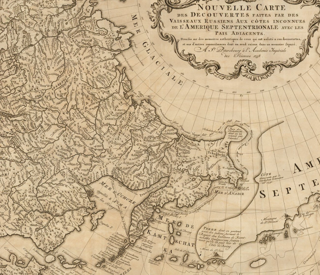
Nouvelle Carte Des Decouvertes Faites par Des Vaisseaux Russiens Aux Cotes Inconnues De L'Amerique Septentrionale Avec Les Pais Adiacents ('New Map of Discoveries Made by Russian Vessels on the Unknown Coasts of North America with Adjacent Countries') published in Amsterdam in 1758 by Gerhard Friedrich Müller.

I also love the contrast in this map between the detailed Russian territory which appears to be a place that was known to European map makers on the one hand, and the supposed emptiness of North America on the other. The places seem so tantalizingly close to one another, and yet, the people living in the east, who knew their own lands, knew nothing of the west or the people in it.

Nouvelle Carte Des Decouvertes Faites par Des Vaisseaux Russiens Aux Cotes Inconnues De L'Amerique Septentrionale Avec Les Pais Adiacents ('New Map of Discoveries Made by Russian Vessels on the Unknown Coasts of North America with Adjacent Countries') published in Amsterdam in 1758 by Gerhard Friedrich Müller.

Some of the annotations on this map are also wonderful. The indications of the voyages of Russian explorers are fascinating historic details, but comments like the one above are just great. It reads: 'Land about which we have claims from residents of Kamchatka, some of whom say that it can be seen from Bering Island'. This is just more reinforcement of how close the land of the map-maker is to the land about which he knows nothing, and how tempting such a place may be for an explorer.

This is really a great map, and one that I'd love to have if I could ever afford such wonderful things. Until then, I can enjoy it as part of my virtual wish-list collection.

Thursday, April 19, 2018

Add it to the Wishlist: Blau's 1635 Map of South Africa “Aethiopia Inferior, vel Exterior“

I recently wrote about my 1830 map of southern Africa. One reason I found that map so interesting, was that it showed an Africa which had tribes in it, but very few European powers were setting up colonies in that part of the world.

This map of Southern Africa from 1635 is on sale by Inter-Antiquariaat Mefferdt & De Jonge in the Netherlands (as always, no affiliation). Take a look:

1635 map of south africa by blau. Shows southern africa before the dutch colonized it.

The sellers of this map have some good information about it on their website. They note a few interesting points. For starters, this map pre-dates Dutch colonies in this part of the world. It also notes that much of this map is based off of Portuguese maps, which are of mixed-degrees of accuracy.

The map does a pretty good job showing off various coastal place names, but these seem to be the names of geographic features (i.e. bays, coves, etc). There are also a few towns shown in the interior, but like the 1830 map of the same region, this map does not try to pretend to know what lies just beyond the coast.

a close up view of the cape of good hope, caffaria, or kaffraria, and an illustrated sailing ship.

Also notable is the lack of names of tribes found on the 1830 map. It may be that Europeans were not sufficiently familiar with the inhabitants of Africa to name them. Part of South Africa on this map is named "Caffaria", or Kaffraria, which is a word that has at its root a derogatory term for Africans. The name of this place appears on the 1830s map as well, and so it seems that Europeans were either indifferent to the disrespectful use of the word, or that it only fell out of accepted usage at a later date.

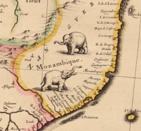
It's also interesting that even though there was little European presence in Africa at the time of this map, Africa is still divided into regions, for example, Mozambique--with its wonderful little elephants--clearly has a border. It's not clear what exactly prompted the inclusion of this border.

close-up of Mozambique with illustrated elephants.

Finally, aside from the historic interest and value of this map, being a Blau, one of the reasons it ends up on the wish-list is its aesthetic beauty. The cartouche, and this lonely little turtle in the Gulf of Guinea, make it a stunning map for the collection of anyone interested in this part of the world.

Cartouche of the map showing Africans holding an ox hide with monkeys and turtles

Turtle illustration.

Monday, April 9, 2018

1764 Bellin map of Santa Marta, Colombia

My wife and I took our honeymoon in Cartagena, Colombia. I really wanted to try to find an antique map of the city before I left, but had a hard time locating anyone who had any selection to sell.

We found one antique dealer who had literally one antique map. It was not of Cartagena, so that one is still on the wishlist, but I did get my hands on something great. Behold my 1764 Bellin map of Santa Marta, Colombia.

1764 Bellin Map of Santa Marta or Sainte Marthe Colombia

As always, David Rumsey has a better zoomable version, and I note as well that the map is held in the collection of the National Library of Colombia.

I don't know too much about Colombia's history, and almost didn't buy the map because I had never heard of Santa Marta--Sainte Marthe on the map--had not visited it, and didn't want a map of a place that meant nothing to me. The seller told me a bit about the town and then, I had to have the map.

Santa Marta was the first Spanish colonial city in Colombia. It's also the oldest surviving city in that country and the second oldest in all of South America. It was founded in 1525, contrast that with the first attempt at founding Quebec City in 1535.

The map is also a Bellin. Many map collectors and historians, recognize Bellin as an important cartographer, producing a wide range of high quality maps in France in the mid to late 18th Century. That was another hook for me, as well as the map's age. This one was produced in 1764.

There are a few elements of the map that make it visually quite interesting. For one, at a glance, I find it looks as though the ocean is to the right of the town, when clearly, it's to the left, in the west. One reason I think my mind plays this trick is the contours around the hill make it seem to be an island.

I also really like the depictions of the small forts and "castles" along the coast. They are not given too much detail by Bellin, but are an attractive feature of the map.


Though it's not from a place I've been, this map is still of historic significance, and makes a souvenir of the adventures we went through, off the tourist path, to find and buy it. I'm proud that it's in my collection!

Thursday, February 22, 2018

Add it to the Wishlist: Four Gorgeous 1757 Bellin Antique Maps of Canada - Hudsons Bay, St Lawrence River, Quebec City

I'm not a person with much money, so it's easy for me to decide that I can't afford a map I love. If I had the disposable income though, boy would I love this set of four, 18th century maps of Canada on sale by Classical Images, of Melbourne, Australia.

Here there are, four beautiful Bellin maps. I'll present them and what I love about them one at a time.


There's a lot to love about this map of Hudson's Bay. It's an attractive example, the map itself is nice to look at, it has a beautiful cartouche and nice geographic features, like mountains. It's also wonderful in that it seems to have totally made up islands, like "Isle de Bonne Fortune, which does not correspond with anything modern I can find. It also gets the shape of the Bay quite wrong (though James Bay looks pretty good), and Quebec seems to have no Ungava bay in its far north. I also love the note on the far left, in French, about the lands being 'entirely unknown' and a similar annotation at 65 north and 65 west of the 'strait without a name'.


At the time this map of the upper St. Lawrence River and Lake Ontario was made, there was considerable settlement in the colony of New France between the downstream city of Quebec and Montreal. For some reason, from this map, you'd hardly know it. Montreal is on the map, but as an island. There's not much there to speak of a settlement, or the importance of the settlement. The names of rivers appear to be quite detailed--perhaps because rivers were truly the highways of the time--and a number of forts and small settlements are indicated. The drawings of the mountains add to the attractiveness of the map, but points which probably should have been emphasized, are omitted.

Here's the downstream portion of the St. Lawrence. Another attractive map with surprising accurate naming of places like rivers, islands and mountains, but little in the way of cities and towns. A detail of this one, that appears in the others as well, is the identification of the longitude being from Paris, not Greenwich.


This last one may be my favorite, a view of Quebec City, from 1757 during the Seven Years War and while under French rule, before the "Conquest" by the British. In two years time, a battle at the Plains of Abraham (approximate location indicated on the map below), would dramatically alter the course of North American and Canadian history. This map gives wonderful details about the city and seems to make special note of its fortifications. Indeed, the city was very well defended, and it was a series of gambles and good luck that allowed for British success in their assault on the town. One of the most interesting details shown on the map are the walls of the city. Today, Quebec City is the oldest walled city north of Mexico City whose walls still exist.

Approximate location of the British landings at the Plains of Abraham
At the time that these maps of Canada were published, the Seven Years War was already ongoing. It's an amazing thought to imagine the possibility of British, or French officers studying any of these maps to plot strategies, attacks or routes. These maps may not have been practical for military purposes, but at a time when perhaps little was known about these places by rival powers, maps like this may have been the key to successful campaigns.

Thursday, February 8, 2018

"Canada" Makes its Debut: A Map that Exemplifies Sea Monsters in Cartography is the 1st Use of Canada

Following some of the Twitter feeds that focus on antique maps, and reading about the program from the Miami Map Fair earlier in February, the name Chet Van Duzer keeps popping up. Mr. Van Duzer is a cartographic historian, and in many cases, when his name has appeared online recently, it's been in connection with lectures about sea monsters on maps.

Sea monsters!? Cool!

In a publication he produced on the subject, one of the maps Mr. Van Duzer uses to illustrate (no pun intended) his point about drawings of monsters and other mythical creatures on maps is this one by Paulo Forlani in 1560, and held in the National Archives of Canada. Take a look:


This article features a discussion with Mr. Van Duzer about the reason map makers included animals on their maps. The reasons are varied. In some cases, they wanted to show people that the oceans were vast, scary and unknown. In other cases, they drew what they thought were faithful representations of what they had heard, or they simply hated the idea of blank spaces on their map.

Some examples of some really wild creatures that appear on maps can be found here. Particularly interesting is someone's idea of a walrus, described as a "a strange animal with “large, quadrangular teeth.”" Naturally, it lives somewhere way up north, but looks like something you'd expect to see on the Serengeti.


Another great thing about this map, and likley the reason it's in Canada's National Archives, is that it's the first map to say "Canada." All Canadians know that Canada is from the Huron word for village, and it was misunderstood that the Hurons were not giving the name of their country, but of their settlement. Some have also speculated it comes from the Spanish: 'ca nada' or 'this is nothing'. 


In any event, Forlani sure makes it something. His map shows a huge landmass which incorporates Greenland and seems to connect with China.

One thing about it that's so interesting though, is that the mountains and islands shown are largely fictional. They are placed wherever the map maker thought they should go.

This point is made by Van Duzer in the article, but it's an amazing thought to imagine a person, in a world before modern communication, compiling all this information, some of it being very new, inaccurate and vague and trying to make sense of it. It must be akin to having to draw a map of the moon based only on accounts from those who have been there, and those who have spoken to astronauts, nothing more. In such a context, it's no wonder that walruses have four legs and beasts ply the seas.

Monday, February 5, 2018

Caveat Emptor: The Lesson of the Fake Waldseemüller Gores

There have been stories recently, in major news publications, about an extremely rare, early 16th century map that was set to go to auction with an expected selling price of at least USD800,000, but that has turned out to be a fake. It's a cool story, and a cautionary tale worth recording.

The map in question is the Martin Waldseemüller "gores". Gores are meant to be cut out and pasted onto a sphere to create a globe. That's one reason why this map is so rare. Most of these maps would have been cut up after being produced and lost over time. In fact, only four originals were known to exist of a map believed to be the first printed globe and the first to use the word "America".

The map was described as "a huge deal". It was the first to show the world in 360 degrees. Showed an important new landmass, and introduced an important new word into our lexicon. It also gave arguably inflated importance to the explorer Amerigo Vespucci.

It's an amazing thought, that just 15 years after Columbus's voyage, a map-maker scrambled to compile all this new information he's learning about the new world and to try and express it in a new way.  

Apparently, the story goes that someone walked off the street into Christie's auction house and claimed to be a descendant of a well known British paper restorer who had found the map among his late-relative's papers. The experts at the Auction house were overjoyed. The felt they had chanced upon an amazing treasure. Too bad they were wrong.


A map expert named Alex Clausen, employed by the well known (in the map world) Barry Ruderman of Barry Lawrence Ruderman Antique Maps, spotted a few things amiss.

A drop of glue on the paper, that would have affixed it to something, had print on top of the adhesive, rather than under it, as might be expected. In other places, detail seems to have been added to the map, where it would have been expected to be missing as the printing process wore it down. Another concern, caught by another paper expert, was that there was a line on the map that matched a spot where a verified original map had been repaired. It was too coincidental for this new map to have an identical repair. Moreover, another copy of the map, previously presumed to be original also had this same line. That latter map's status as an original is now also being re-considered by its owner.

Such a map would likely never be in the hands of an amateur or casual map collector, but it raises a question: if most experts were nearly fooled, how could an amateur ever avoid being duped? If the nuances between the real thing and a fake are so hard to detect, it's discouraging to someone who may want to take a step into buying some of the rarer, older, and more expensive maps that are on the market. The best advice, is probably to ask lots of questions of the seller, including about the provenance--the historical chain of ownership--of the map. It also helps to have a high level of trust in the seller.

Above all, it reinforces the much older maxim: caveat emptor! Let the buyer beware.

Monday, January 29, 2018

Missing Pieces: Mitchell's 1867 Washington, D.C.

For the few years I lived in Washington, D.C., anytime I found myself in Georgetown, I would make a point of trying to stop in at the Old Print Gallery. This was a unique shop. It didn't have that dusty, feeling of some map shops that I love, but instead was clean, sleek and modern feeling. It had row upon row of cases of maps and prints arranged by location, alphabetically, and it had some true


gems, like Bunting's Cloverleaf of the world with Jerusalem at the center.

They also had a beautiful original of the first plans for the city of Washington, D.C. in 1792 by Andrew Ellicott. It was being sold for over US$40,000. Living in Washington, I knew I wanted a map of the city, and the Ellicott was truly the pinnacle of all such maps, but for me, at that price, it may as well have been one million dollars. It was unobtainable.


This image is in far worse condition than the one at the Old Print Gallery


I no longer live in Washington, but I'm disappointed to learn that the shop has closed, and merged with it's sister shop in New York City. It's a shame, because it was such a wonderful place, and I don't know of any other shops in D.C. that were as specialized.

The price of the Ellicott map being what it was, I turned to the internet to find myself a nice map of D.C. to add to my collection and came across a shop in Vancouver, British Columbia called Joyce Williams Gallery who had a great selection and very fair prices.

After speaking and corresponding with their friendly owner, I settled on this beautiful, very fine 1867 Augustus Mitchell Jr. map of Washington, D.C.


There's a lot to love about this map. Its wonderful to look at. It has an attractive floral border that somehow just pops out, without taking away from the map itself.

It also shows a number of details which may have been common for the time, but that today we would recognize as archaic, or simply unusual. For example, the White House is referred to on the map as the "President's House", This is a use that may be considered even more unusual because, as wikipedia notes, the place was called the White House as early as 1811, some 56 years before this map was published.

Another wonderful thing about this map is what it doesn't show. Some of the things tourists flock to D.C. for are absent altogether. For example, the Smithsonian is shown on the map, but only one building, not the many large facilities that make up its network. The Library of Congress is not on the map, as it would not be built for another 30 or so years. There's no reflecting pool either, and one may notice that the National Mall is not at its full length.


Most stark, perhaps, was something that actually did not jump at me right away: There's no tidal basin! The famous cherry blossom ringed body of water, the site of the Jefferson Memorial, just did not exist at the time this map was made. I looked at this map for quite some time before I even noticed that! Indeed, apparently, the idea for the basin didn't even originate until the 1880's, almost 15 years after this map.


The Mitchell map certainly lacks the historic value of the Ellicott, but it's a gorgeous piece, and one that I'm very pleased to have in my collection.


Monday, January 22, 2018

Add it to the Wishlist: Map of Cartagena, Colombia

My map collecting began as a way to bring home interesting, historical souvenirs from places I travel to. I don't have or seek out maps of countries I have never visited, even if sometimes I have a map of a city I have not been to in that country. That's why this gorgeous map of Cartagena, Colombia makes the wishlist. My wife and I honeymooned in Cartagena, and while there, the only antique map I was able to find was from a nearby Colombian town, but not Cartagena itself.
This is an uncolored version of the map in question

This beauty, however, goes right onto the wishlist.

I noticed the map on twitter, here, as one of the new acquisitions of a New York City based map-dealer Geographicus, rare antique maps. There's plenty of information about the map itself and the cartographer on the Geographicus website, so I don't need to repeat any of that, but I want to point out a few things I love about this circa 1766 map by Dutch cartographer Isaak Tirion.

First, one of my favourite things about any old map is seeing the obvious changes to the place over time. Today, Cartagena feels sprawling, and the undeveloped area on the map labeled Terra Bomba is now a modern, developed area with narrow high rises and hotels, reminiscent in many ways of Miami Beach.
The fortress on the 1766 map named "Kasteel van St. Lazarus" is no longer referred to by that name anymore. It's now the impressive
Castillo de San Felipe de Barajas that my wife and I reached the top of in a sweaty, somewhat miserable hike (it was worth it).

Second, I love the artistic detail of the map. The hills outside the walls being drawn as hills, the beach is clearly a beach, the shores are clearly marshy and vegetated and areas on "Eil Manga" are under cultivation.

I love the detail of the walls surrounding the city, with even the smallest turn or curve appearing on the map, nothing is glossed over.

I also love the identification of the hospital outside the city walls, which I'm guessing was done historically to keep the sick away from the rest of the population. A detail which if true, is a fascinating bit of history enshrined in the map.

Also, item number one on the legend is called, in Dutch "de dom of hoofdkerk" which seems to translate to "the main Church or Cathedral". What's interesting here is that it appears to also show the Palace of the Inquisition, which is across the street, but not named.

I also get a kick out of what seems like a quirky element of the map. The ocean beyond Cartagena is the Atlantic, but this map simply says "the sea". It simply assumes that the viewer knows where in the world the city is, and has no need to name the Atlantic, probably the most important Ocean in the world for the Dutch at the time.

The map is truly gorgeous, and is on the market, only far beyond my means. I have no relationship whatsoever with the seller, but I do hope it finds a good home. 

Wednesday, January 17, 2018

Caribbean Vacation Map

The third map I'll feature here (though I don't think it's the third I ever bought) is of the Lesser Antilles and it's one of C.S. Hammond's.


I know the image quality here isn't the best. Perhaps I can try again later and update this post.

The map is not the most beautiful I own. I bought it mostly as a souvenir of a cruise I was on that stopped in Puerto Rico, or as this map says "Porto Rico".

The map is a fun one to me. It offers that snapshot of history I love, showing places which are currently sovereign states as colonies, unusual spellings and a case where the map spills outside it's own borders, as does Trinidad and Tobago.

Originally, I thought that the map was cut out of an older magazine, based on the paper and because it's not a full page, just an imperfectly cut out map. After researching the information in the map legend though, I believe it almost certainly came from an atlas.


The problem with this legend, and the mystery of this map is that it doesn't give me a year. I know Hammond began publishing maps in 1900. This map, came in a folder upon which the seller had jotted down circa 1910. So-far, so good. Only, just because a vendor says a thing, does not make it true. Especially this person, who was a general antiques dealers and had no maps other than this one. (By the way, I paid nowhere near the price listed under the date).

My first search ended up at David Rumsey (as do all searches for antique maps). He has a map that's nearly identical to mine, but published in 1948.


If you take a look at his site, you'll see that the map is very similar to mine, but zoom in on Porto Rico. The map on Rumsey's site lists the island as Puerto Rico. So these maps are not the same, and given that Puerto Rico replaced Porto Rico, I think I'm safe to assume that my map predates 1948. See, for example, this website (which I have nothing to do with) selling a different Hammond map of Porto Rico from 1910 with the same spelling as mine.

Then I came across a fabulous site for maps of the Caribbean called Caribmap. They have a map, produced by Hammond, very similar to mine from "the New World Loose Leaf Atlas" published in 1931. Take a look at it here. It's hard to spot any differences. The only one that jumped at me is not part of the map itself, but is the note "rb-29" in the bottom left corner. I know my map is poorly cut out, but I think it has enough of a margin that if my map was the same as the Caribmap one, I'd see that annotation.

So again, a map leads me on a little mystery, and I've learned a lot in the search. I know Hammond did publish world atlases circa 1910, but I don't have images of any of them to readily look through. I don't have an answer to this one though, and hopefully, once more, some friendly expert out there can point me in the right direction.

Sunday, January 14, 2018

The Mystery of the Turkish Map: Solved


As an amateur map collector, I find that sometimes my acquisitions can be hit or miss. Sometimes I buy something and it turns out I make a great purchase from someone who may not realize exactly how good an item they're selling, and sometimes I pay too much for something I think is beautiful, but is not really an item of any value other than the aesthetic.

I wrote here about my second ever map purchase. It was this beauty:


I explained a bit about how I came to doubt its authenticity as an antique, and how I could not find anything else like it anywhere. It turns out, not only was I right to doubt it's age, but I should have questioned whether or not it was truly a map, or meant as one.

When I originally posted about this map, I tweeted about it to my followers and hoped that someone could have some insight for me. I dug a bit deeper after a commentor on the blog suggested I try reaching out to Turkish diplomatic missions, which I did. This turned out to be an excellent suggestion.

In a triumph of digital diplomacy, the Turkish Embassy in Dublin responded relativley quickly. I'll reproduce their helpful reply.


So right away, I received more information on my map than I had ever had. I knew the name of the man in the image on the map and learned that not only might the map be new, but that the language may not be right. I reached out to the two twitter accounts the Embassy suggested and heard back, fairly quickly from the very friendly person behind @JourneyHistory.

He responded that the map, wasn't really a map, was a modern miniature painting, made to look like it was in the Ottoman style, and on paper that was probably distressed, to make it look old. He sent me a link to dozens of images, none of which are maps, but many of which have a strong stylistic resemblance to my piece. 

For example:

Image result for Eski Osmanlı minyatür

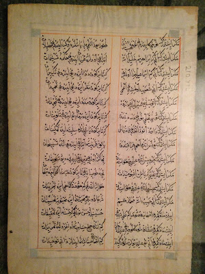
What's more, I was told that the writing on the artwork may actually be complete gibberish. Essentially, the equivalent of mashing the keys on your keyboard and putting whatever comes out into fancy calligraphy. His theory being that not many people read that language any longer, and that the artists making these images probably even less so.

Another helpful commentor on my blog, the helpful and friendly Halim, suggested that it's possible that the writing on the map is another language transliterated, maybe Italian or Ladino. Ladino, or Judaeo-Spanish would be especially interesting, given that it was a language spoken primarily by Jews in the Ottoman Empire. A group that would not ever have represented a majority, and also strange for a modern artist to use.

So, thanks to this blog, the powers of the internet and what I believe is a human inclination to bend towards kindness and helpfulness, I have an answer to my own, personal map mystery: My map is not a map, it's basically just a painting, and it is not old, nor is the paper it's on likely to be. That said, it remains on my wall because it's beautiful, and it now comes with an even better story.

Thursday, January 11, 2018

Exceedingly Rare Aztec Map

Thanks to National Geographic, I came across this story about a map that is as much archaeology as it is geography.

The map is called thCodex Quetzalecatzin, was recently acquired by the U.S. Library of congress and is one of fewer than 100 Mezoamerican maps that predate the year 1600. In other words, it's an extremely rare, Aztec map from sometime between 1570 and 1595. 


Image of the Codex Quetzalecatzin frm the U.S. Library of Congress
The map shows the family tree and land holdings of an Aztec family and "...covers an area that runs from just north of Mexico City to just below Puebla, roughly 100 miles away to the southeast"

It contains both Aztec imagery as well as clear Spanish influences, not least the Spanish writing on the map. It appears to represent some of the earliest contact between the indigenous people of Mexico and Europeans. 

From looking at it, what strikes me is that it barely looks like a map at all. It looks more like a drawing of a landscape, or what we may call a "view", than a map. To the layperson like me, it also seems to have a strange scale and it is not immediately clear that it represents such a vast area. 

It is beautiful though, with vibrant colours and images such as this snippet: 


The U.S. Library of Congress has at least one other map like the Codex Quetzalecatzin. It's called the The Oztoticpac lands map, and though it has no doubt been the subject of extensive study, I cannot find very much about it online.


This one is even older than the Codex Quetzalecatzin and dates to around 1540. It's described as a "litigation map", relating to a property dispute. Some detail on it from The Library of Congress reads:

 The Oztoticpac Lands Map is an Aztec pictorial document with Nahuatl writing drawn for a court case surrounding the Oztoticpac estate within the city of Texcoco around 1540. The document, written on amatl paper, involves the land ownership of the Aztec ruler Chichimecatecotl, who was executed by Spanish officials in 1539. It is not clear from surviving information who won the case. Most of the document consists of black-and-red line drawings showing fields, houses, palaces, trees, and measured plots of land. In the lower left, twenty trees that have been grafted with European fruit stock in a local orchard are shown. These include apples, quinces, pears, grapes, and pomegranates.

Here's an image with a better look:

There are some fascinating details on this map, some of which probably require a better historical and cultural knowledge to understand, but which to the layperson, are interesting and fun to look at.

For example, the map contains images of various plants. The quote above explains what they are, but some of the images are so curious. For example, in the image of the plant below, whose disembodied hands are those, and why are they there at all? Whose disembodied heads are these and, what's this man doing all alone on this plot of land? These seem to be more than just decorative, and when considering that this map was used in a court case, one has to imagine that they are meant to reflect a certain ownership of a particular area shown on the map.


One reason I love antique maps is because they represent a snapshot of what a place was like at a specific moment in time. These maps do that, and then some. There are not just about what places looked like, but they tell us about who lived there and how they lived. This is more than you would get from your average antique map. It's why, as I wrote above, that maps like this fall into the category of archaeology. They help us understand how people who are long gone structured their lives and societies. They're windows into history and a pleasure to look at.

Monday, January 8, 2018

My Mystery Map: Istanbul

The second map I ever bought was in Istanbul, but it's the map I know the least about, and the more I read and hear about it, the more I'm convinced that it's more of a pretty work of art than it is an actual antique map. In fact, after extensive searching, I can't find anything that even looks like it online.

When buying the map, I faced a real language barrier, but it was from what appeared to be a reputable shop that had a small number of other, somewhat similar maps. What I understood from the strained conversation was that this was a page from an antique Ottoman atlas showing a map of Istanbul. I'm pretty sure now that this was not correct. Take a look and I'll try to break it down.


So above is the front of the map I bought and to the right is the reverse of the page. This map is framed and hanging on my wall, so I can't handle it, but my recollection was that the paper seemed authentic, or at the very least, not modern. Also, I cannot read the writing on this map, but it seems clear to me that it was not printed and was probably done by hand. I believe that it's the Ottoman Turkish Alphabet, which borrows from Arabic and Persian.

There are some clues about the map, but I have a hard time deciphering them. For example, I can't figure out who the hirsute chap in the photo is. I would guess he's supposed to be an Ottoman Sultan, but maybe he's a governor of the city, or some other important person.

There's also the banner at the top-center of the page. From what I can tell from searching here, it looks like an Ottoman banner that may have been used in the 18th century, but this is anything but certain.


Then there's the cityscape itself. I'm not sure what vantage this view was taken from. As best as I can tell from playing around with google streets view from Istanbul, this image is meant to be taken from the Bospherous, looking south from Galata. Somewhere around the area marked in blue.


This brings me up against a few problems. The mosque on the right hand side has three minarets and the one on the left has four. I'm pretty sure, just from the drawing, that the mosque with three minarets is meant to be the Hagia Sophia. That's simply what it looks like. The problem is, the actual Hagia Sophia has four minarets. The other mosque, which is blue in colour, could be meant to be the Blue Mosque, but that one has six minarets. Even playing around on google streets view, I can't figure out what possible vantage point would give the viewer a sight of two mosques, on on the right with three minarets and one nearby on the left with four.


I brought this map for an informal appraisal to a shop in Washington, D.C. where I used to live. The appraiser agreed that the paper it was on was old, and was less concerned than I was that the colours of the map were too vibrant to be old. Her view, however, was that the drawings themselves looked modern, that they do not reflect the way something may have been drawn long ago and that the painting of the map was probably quite new. She may be on to something. A close look at the map (not something I can show in a photo) reveals that there is text behind it, in the same script as the text on the reverse.

I'd love to know more about this map if there are any knowledgeable or sleuthy people out there who can help (or anyone who can read the Turkish).

In the meantime, despite it probably not actually being an antique map, it's still a beautiful bit of work and I'll happily keep it on my wall.

Wednesday, January 3, 2018

Add it to the Wishlist: 1714 Map of North America

I enjoy looking at websites that showcase antiquarian maps and follow accounts of that type, as well as map vendors on Twitter. As a result, I often come across maps that I think would be so wonderful to have in my collection if only I could find or afford them.

Since maps like that make me mappy, I thought my mappy place would be a great place to keep a running wish-list and explain what it is about certain maps that I love.

Today's wishlist map is this beauty of North America from 1714 that I found on mapmania:


There's so much great stuff going on in this map, but first, here's the little I could learn about it, thanks to this always great source, there's a good deal of information available. This map comes from an atlas meant to show recent and new long voyages of European discovery in different parts of the world. The language on the map is French, but the publisher, Pierre Van der Aa, is Dutch and was working in Leiden. Apparently, many of the other maps in the Atlas are similarly beautiful, featuring elaborate cartouches with titles.

I want to point out a few things about this map that I love and that piques my interest in it.

First, I love that it's incomplete. The map is virtually blank to the west of the Mississippi and north of what would today probably be Texas. The Arctic is unexplored, it appears that Greenland is attached to the North American mainland and California may or may not be an island.

Greenland 

Is California connected to anything?

I also love how political boundaries are drawn on this map. European spheres of influence dominate. There is Canada/New France, which extends to the Southern United States and as far west as the Mississippi. Pre-Seven Years War, New England is hemmed in by the Appalachians, with the French on the other side, and there appear to be a number of polities that I had originally thought were all Spanish. This map identifies them separate: Florida, New Mexico, New Spain and California are all distinct from one another. I admit to being surprised by this and not knowing the history of these regions well enough to understand the distinctions.

Under each of these European polities, however, are the identification of First Nations groups that lived in these areas. For example, there are regions listed as being dominated by the Illinois, the Outaouais and that 'the Apaches are powerful to the west of here'.

Powerful Apaches to the west

 There are a few other things I love about this map. Other than the beauty of the cartouche, and the identification of certain routes of exploration by great navigators, the map has a couple of elements I find somehow whimsical. My favorites are the annotations that in some places there is floating vegetation, though, not as bad as in other places on the same map. This was probably important for navigators to know,
and interesting for Europeans to learn about, but to me, today, it seems somehow comical.

This map definitely makes the wishlist!